How to Create Conceptual Images Using AI (and Why Human Touch Makes All the Difference)
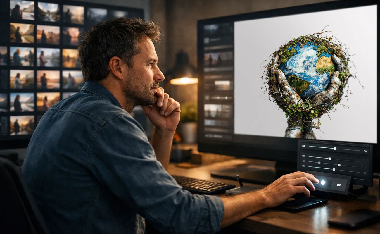
Not long ago, we worked on a visual for a brand that wanted to communicate trust. The image looked sharp, modern, and well-made. But something felt off. When we stepped back and looked at it, we realised the problem wasn’t the quality of the image. It was the meaning. It showed all the right elements, but it didn’t make you feel trust. It just looked like another polished picture.
This happens a lot with automatically generated visuals. They can look correct and still miss what they are supposed to say. That’s because conceptual images are not about showing things clearly. They are about showing ideas clearly. And ideas need more than visual accuracy to land.
What’s usually missing is human judgment. Tools can produce images quickly, but they do not decide what an idea should feel like, what should be subtle, or what should be left out. That part still needs thinking, restraint, and context.
In this guide, we explain what conceptual images are, how tools help create them, where they fall short, and why human input is what turns a good-looking image into one that actually communicates.
What Are Conceptual Images
A brand once used a photo of a rocket to show “business growth.” The picture looked bold, but the message didn’t land. People saw a rocket. They didn’t see growth. The idea got buried under the image.
That’s where conceptual images come in.
Conceptual images are made to show an idea, not just a thing. Instead of showing something exactly as it looks, they are built to explain what it stands for. A literal image shows an object. A conceptual image shows meaning.
This matters in branding and communication because most business messages are not physical. Brands talk about progress, trust, pressure, or change. You cannot photograph these directly. Conceptual images turn these invisible ideas into something people can quickly understand and remember, helping the message travel further than words alone.
The Role of AI in Creating Conceptual Images
The AI tools can help you move quickly when you have an idea and need to see it visually. You can quickly consider multiple options rather than devoting hours to sketching or developing just one. Instead than settling on a single appearance too soon, this makes it simpler to investigate how a concept might be presented.
The real advantage is comparison. You can see the same idea as calm, dramatic, minimal, or detailed, and understand how each version changes the meaning. This helps clarify what works and what doesn’t before committing to a final direction.
Where these tools help most is at the thinking stage. They are useful for testing possibilities and sparking new approaches. But they do not decide what the image should stand for. Choosing the right visual, setting the mood, and judging whether the idea is coming across still depend on people who understand context, tone, and purpose.
In short, the tool can suggest options, but meaning comes from the choices made after.
The Process of Creating Conceptual Images Using AI
Step 1: Define the idea
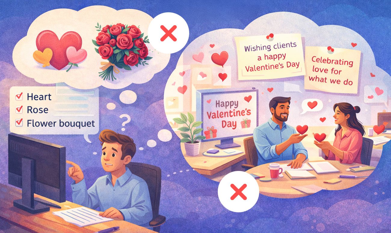
Start by clarifying what the image should communicate, not just what it should display.
For example, a brief like “wishing clients a happy Valentine’s Day” or “celebrating love for what we do” provides a stronger creative direction than simply saying “show a heart, rose, or flower bouquet.”
This clarity ensures the image is built around a meaningful concept, not just a decorative visual.
Step 2: Convert meaning into visual cues
Break the idea into visual elements such as symbols, metaphors, contrast, scale, and context.
For example, Valentine’s Day doesn’t have to be shown only through hearts or roses. It can be expressed through subtle interactions, meaningful moments, or visual metaphors that connect to the message you want to convey.
This approach helps your prompt describe the concept in visual terms — rather than simply listing objects, styles, or producing generic visuals.
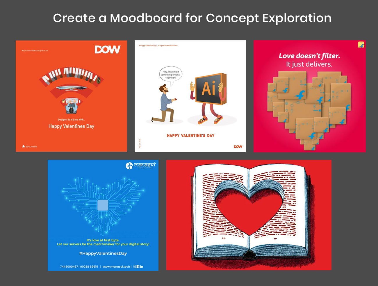
Research existing visuals and concepts related to your idea, then identify opportunities to differentiate. The goal isn’t to copy what already exists, but to understand patterns, spot gaps, and find a fresh angle. Your concept should feel inspired by what you’ve seen — not limited to it.
Step 3: Sketch the Idea or Select a Direction
Once you’ve created moodboards and explored multiple ideas, start identifying which concept connects best with your message and creates a meaningful difference. The goal is to express the idea through symbolic or conceptual visuals, not literal representations.
At this stage, simple sketches or doodles are extremely helpful. You can also use AI generative tools to create a few visual options. AI allows you to quickly visualize the concept, refine directions, and translate the idea into a stronger, more accurate prompt.
For example, if the concept is to express love for design, creative process, and high-quality standards, you could sketch a heart-shaped desk viewed from above, with a designer working on it. From a top-down perspective, the workspace itself forms a heart — subtly communicating both love and design.
Let’s start with giving prompt surrounding this ideas to chat GPT:
“Create a Sora image prompt to generate a bold, conceptual, photorealistic image of a heart-shaped desk viewed from above, with a designer working on it. The background should be violet, and the desk should be white. The image should look like a real photographic shot, not an illustration.”

Here are generated some Image options through Sora/ChatGPT on above prompts:
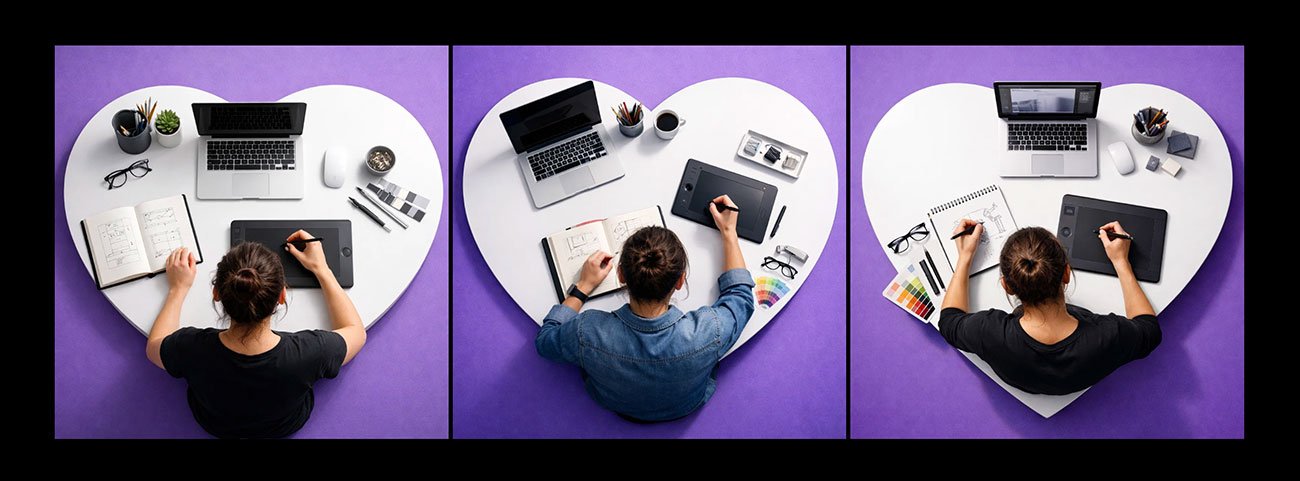
Now we selected the first options better aligned with the my concept and I tried refine further giving additional prompt mising with first image.
“Make the background rend color and overall visual downsize to 20% so that there is breathing space surround desk. Color swatches should be colored on the desk”
Below are the outputs we received after using this prompt in ChatGPT. Both options are about 95% close to what we wanted to achieve.
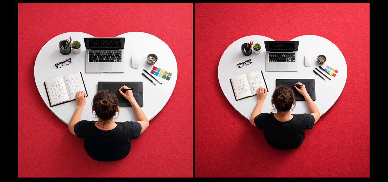
In this conceptual visual, you’ll notice that instead of using obvious elements like hearts, flowers, or other generic Valentine’s visuals, we approached the idea at a thinking and concept level. AI helped us translate that thinking into a strong, meaningful image within seconds.
This is where human strategy and creative direction matter most — and something AI alone cannot replace.
Where AI Alone Falls Short
When images are created automatically, ideas are often shown in the most obvious way. Concepts like love, Valentine, growth, pressure, or innovation quickly turn into familiar visuals such as rockets, light bulbs, or breaking walls. These symbols are easy to understand, but they also make images predictable and dull. Instead of letting the viewer think, the picture explains everything too directly.
Another problem is context. Image tools do not understand emotional or cultural meaning the way people do. A visual that feels fine in one situation may feel wrong in another, which is risky for branding where tone and trust matter. There is also a tendency to add too much detail. Too many elements make the message harder to understand.
The Significance of Human Input
Intent and restraint
Human input gives the image a clear purpose. Instead of showing everything at once, it controls how much is shown and how strongly. This prevents the visual from becoming loud or obvious and helps it communicate the idea in a more thoughtful way.
Brand alignment
People ensure the image fits the brand’s tone and personality. A serious brand needs a different visual language than a playful one. Human judgment helps match colours, mood, and style with what the brand stands for, so the image feels consistent and believable.
Message clarity
Human input makes sure the image supports the message instead of distracting from it. The focus stays on what the image is meant to say, not just how it looks. This keeps the concept easy to understand.
Editing and refining
Rough outputs need shaping. Humans adjust composition, remove unnecessary elements, and improve balance so the image feels intentional rather than accidental.
Choosing what stays
Not everything generated needs to be kept. Human input decides what adds meaning and what should be removed. This selection process is what turns a visual into a clear concept instead of a crowded picture.
Conceptual Image Design Using AI and Human Input
This kind of image design works best when tools and people do different jobs. The tool helps make many picture options quickly. The person decides which one actually makes sense for the idea. One helps with speed. The other helps with thinking. When used together, it becomes easier to try ideas and see what works before choosing one.
What really matters is giving clear direction. It is not about writing fancy instructions. It is about knowing what you want to say with the image. If the idea is clear, even a simple request can give useful results. Without direction, the pictures may look nice but mean nothing.
At the very end, human judgement is most important. At this point, a person determines what needs to change and what seems good and wrong. A random image can be transformed into one that truly conveys a message by making decisions on what to add, remove, and modify.
Best Practices for Conceptual Image Design
Begin with the idea
Before thinking about style or colours, be clear about what the image should say. If the idea is not clear, the picture may look nice, but it won’t communicate anything meaningful.
Keep the message simple
Trying to show too many ideas in one image usually creates confusion. One clear visual thought works better than several mixed together.
Choose symbols carefully
Use visuals that actually relate to the idea. Avoid picking symbols just because they look dramatic. The image should feel thoughtful, not forced.
Make sure the mood feels right
An image meant to show trust should not feel playful. An image about growth should not feel tense. The feeling of the image should match what it is trying to say.
Remove what is not needed
If something in the image does not help explain the idea, it should not be there. Fewer elements make the message easier to understand.
Stay close to the brand’s style
The image should look like it belongs to the same world as the brand. When visuals change too much from one piece to another, the message feels less reliable.
Common Mistakes to Avoid
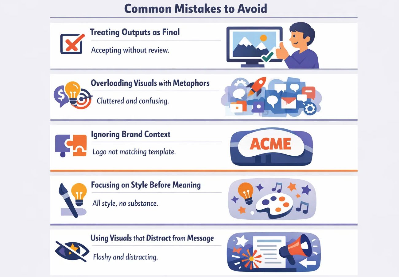
- Treating outputs as final
Using the first image that looks good often leads to weak communication. Without review and refinement, the visual may look polished but fail to express the intended idea clearly. - Overloading visuals with metaphors
Trying to show many ideas in one image makes it hard to understand. When too many symbols are used together, the message becomes confusing instead of strong. - Ignoring brand context
A visual that looks fine on its own may not fit the brand using it. If tone, style, and mood do not match the brand’s personality, the image feels out of place. - Focusing on style before meaning
Choosing a look or trend before defining the idea often results in images that look attractive but say very little. Meaning should guide style, not the other way around. - Using visuals that distract from the message
When you select a style before establishing a concept, then the final image might look good, but most probably won’t be very expressive. Style should be guided by meaning, not the other way around.
Ready to Turn AI Images into Meaningful Visuals?
Anyone can create an image. But to create an image that clearly expresses an idea is a skill very few master. When a visual looks polished but still fails to land its message, the issue is not in how it was made, but in the thinking behind it.
At Visual Best, we help businesses turn rough visual ideas into focused, concept-driven images that support real communication goals. We work on what the image should mean, how it should feel, and what needs to be removed so the message comes through clearly.
If your visuals are meant to influence decisions, shape perception, or tell a story about your brand, this is where to begin. Explore our work at visualbest.co and see how we create visuals that do more than just look good.

FAQs
1. Can Visual Best help us create conceptual images for our brand?
Yes. We help shape visual ideas around what your brand wants to say, not just how it should look. Our focus is on meaning, tone, and clarity.
2. Do you work with existing images or only create new ones?
We do both. We can refine visuals you already have or create new ones based on your message and brand style.
3. How do you make sure the visuals match our brand identity?
We study your brand’s tone, colours, and communication style before designing. This helps the visuals feel consistent with how your brand already speaks.
4. Can you design conceptual visuals for decks, websites, and campaigns?
Yes. We create conceptual visuals for presentations, websites, social media, and marketing campaigns, wherever an idea needs to be communicated clearly.
5. What makes your approach different from using image tools directly?
We focus on what the image should mean, not just how it should look. Our work involves selecting, refining, and shaping visuals so they support a message instead of just filling space.
6. What is a conceptual image in simple terms?
It is an image made to explain an idea, not just show an object. It helps people understand meaning instead of just seeing a picture.
7. Why are conceptual images better than literal images for business?
Because businesses talk about ideas like growth, trust, and change. These cannot be photographed directly, so conceptual images help make them visible.
8. Why do some visuals feel empty even when they look good?
Because they focus on style instead of meaning. If the idea is not clear, the image looks polished but says very little.
9. How do you know if a conceptual image is working?
When people understand the idea without explanation. If they only describe what they see and not what it means, the image needs improvement.
10. What is the biggest mistake in conceptual image design?
Trying to show too many ideas at once. A strong image usually communicates one clear thought, not many mixed together.