Logo Design
Logo Design Trends in 2025
Imagine scrolling through Instagram or LinkedIn…
There’s barely any attention; just the lazy rhythm of your thumb swiping up. Then – pause. Something catches your eye. A logo. But not just any logo: this one looks and feels different. The color scheme, the form, the aura-it just right through the noise! Touch the screen. Dive in. Remember.
Logos of today don’t just sit quietly in a corner. Now they are dynamic. Visualizing were shifting, stretching, morphing; often communicating more than any tagline ever could at a single glance to build familiarity and trust.
Modern logos no longer translate to just a face; it is an entire story. A handshake filled with emotion between a brand and its audience.
Design is always in evolution, and logos are at the forefront of this change. If your brand mark is stuck in the past, you are not only missing out on a design trend but also on connection.
So, what will the logos be like in the forthcoming world?
Let’s delve into the boldest and game-changing logo trends of 2025– how you, too, can apply them to imprint your brand forever in customers’ minds.
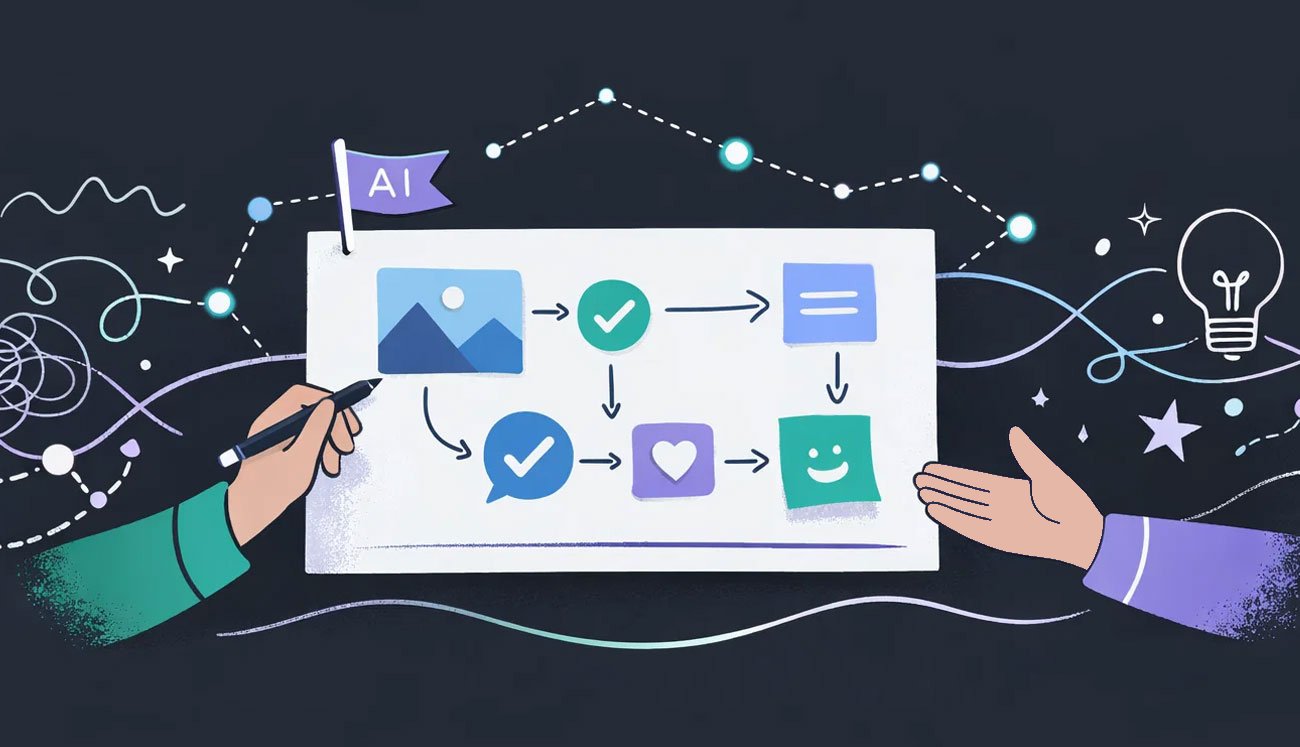
The 2025 logo design trends are built around flexibility, sincerity, and future-proofing. They incorporate a mix of technology, customers, and culture changes in order to provide not merely fashionable logos- but logos that are strategically correct and reflect brand perspective.
Why Logo Design Trends Matter in 2025
The truth is, we are truly amid an attention economy. There are no longer browsers. People simply scroll. You have barely two seconds to arrest someone’s attention before the person disappears. Those two seconds are just about enough for your logo to try to capture someone’s attention.
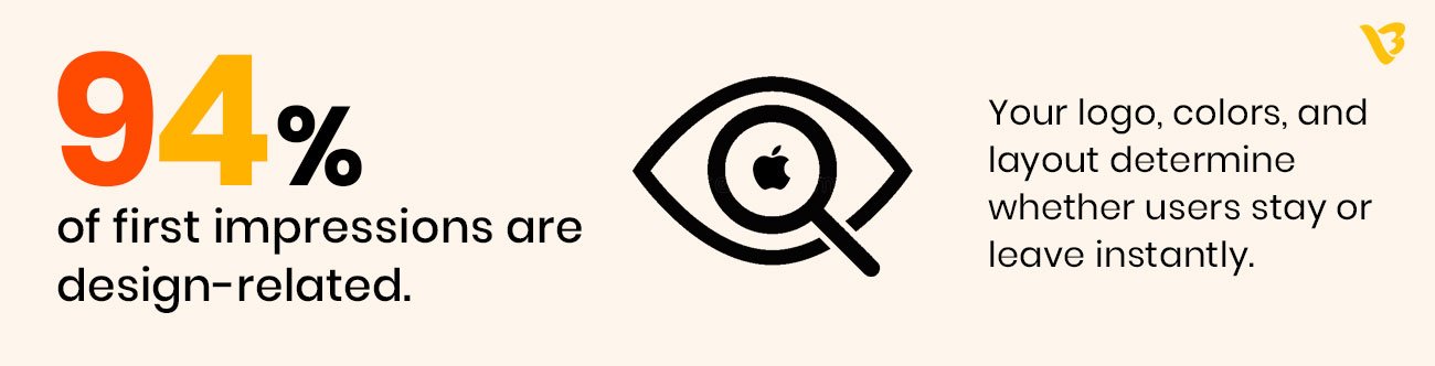
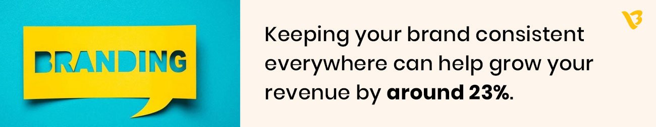
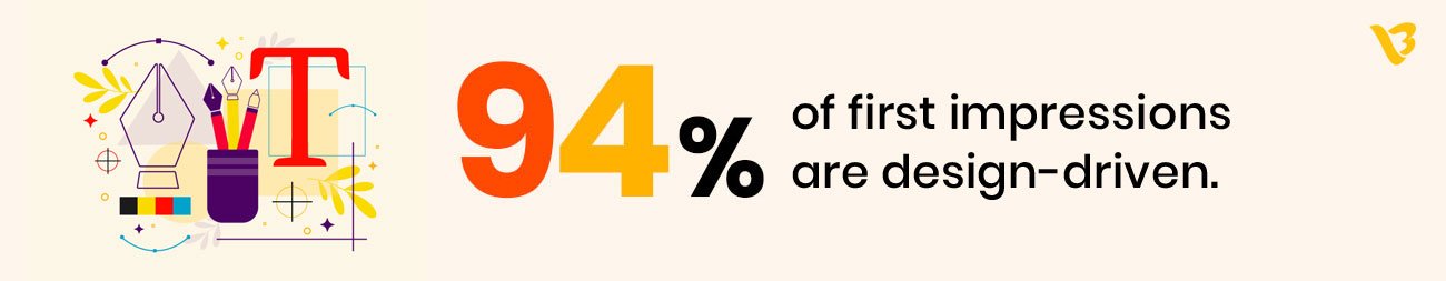
This is exactly what makes design trends very important. Logos are not simply a pretty picture. It is your first impression, a silent salesperson, a verbal handshake of your brand. In 94% of cases, the very first impression is based on design only.
Being behind or unsuspecting of trends means your brand is looking stuck or, simply, irrelevant. In contrast, a trend-conscious logo instantly communicates that you are an up-and-coming, trustworthy brand in the spotlight. In 2025, logo design will not be about following trends but about standing out.
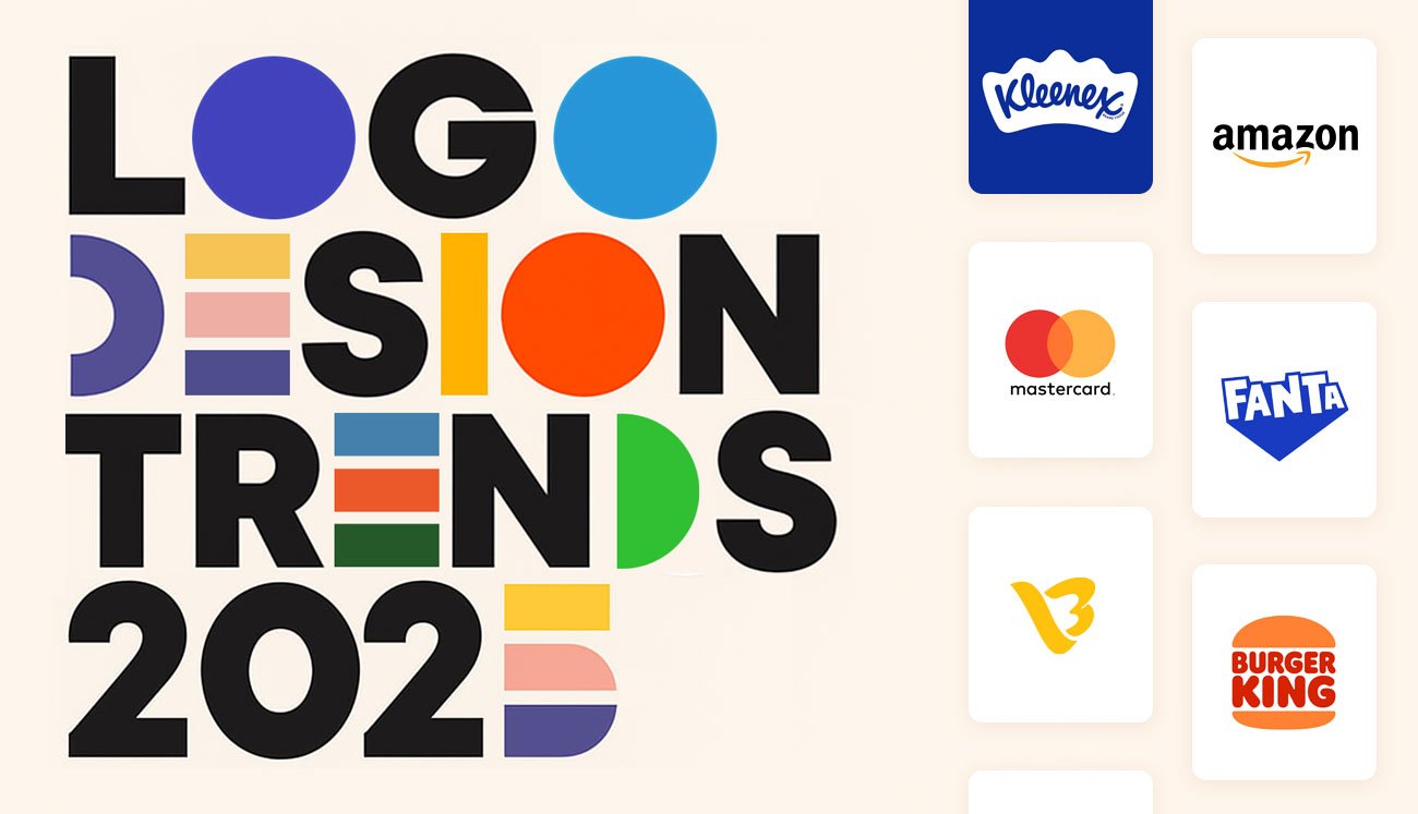
Top Logo Design Trends 2025
The modern way of branding is all about pushing creativity, merging innovation with emotion, and appropriating mechanistic stories for their logos. The trending, win-current-heart kind of keyword for this year include:
- Modern-Retro Mashups
![]()
Charm from the past has come back again, and this time it does so with a modern accent. In 2025, it is all about mixing classic color schemes and typography set in good structure and applied with a crisp modern layout of its own. Imagine minimalism with a touch of the 1970s or 1990s.
Why it works: Because strikingly modern layouts buoy the perception of interest and current, nostalgia crosses an emotional appeal to feelings. This combo makes your logo design trends look aged yet modern.
That was the exact reverse marketing they did at Burger King with their rebranding in 2021. It reinstated retro warmth into modernism. So there was brand recall and instant viral love appeal.
![]()
2. Typographic Experiments
![]()
Fonts are going rogue, and brands totally love it. Designers are bending it, slicing it, stacking it, stretching it to form downright beautiful, unforgettable wordmarks.
Why it works:
Customized typography gives your brand a unique voice and character. It is what differentiates them from any blunt logo on Canva.
Example:
Balmain’s logo is an ideal blend of bold geometry with minimal luxe feel. It says very loud feminine talk-the-chic-way. Just the very thing you can’t ignore.
Best Use:
Suitable for those that want to boldly assert themselves in fashion, lifestyle, and contemporary art.
3. Minimalism with a Twist
![]()
Minimalist logos are being perfected. Designers nowadays are layering them with gradients, shadows, 3D depth, and even motion.
Why it works:
Minimalism manages to keep logos scalable and clean, not the subtle complexities that add to visual stimulating interest onto different platforms.
Example:
Airbnb’s icon is itself a minimalistic one-but its myriad animated versions bring it alive on digital screens.
4. Handmade & Imperfect Lines
![]()
In an age of polished pixels, imperfection is refreshing. Logos with hand-drawn icons, sketch-style lettering, and textured strokes are unrefined and real.
Why it works:
They speak to authenticity, craftsmanship, and that human touch with which people seem to be craving more in this fast-paced automation-dominated world.
Example:
Eco-friendly cafés, wellness brands, and artisanal crafts are obvious candidates for the style. A yoga studio, for instance, would feel right at home with a painted or sketched logo.
Tip:
Use a mix of organic lines with deliberate spacing and alignment, keeping the balance between rustic and professional.
5. Responsive and Variable Logos
![]()
One logo just won’t do anymore. Brands are moving toward dynamic logo systems in 2025, with versions that scale, shift, and adapt to a particular screen or context.
Why it works:
These logos are visible and legible everywhere-from smartwatches to billboards.
Example:
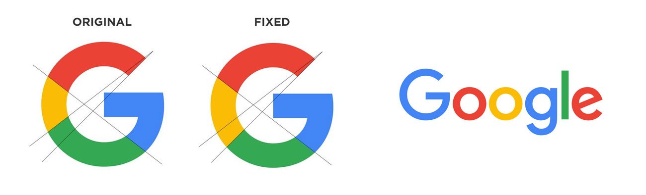
On mobile, Google’s logo shortens to a ‘G’ icon and fills the screen on the desktop. Spotify varies in spacing and iconography on different devices.
6. Gradient Color Schemes
![]()
Many new logos use gradients today because they look cool, fresh, and friendly. That’s why Google chose it for their new Google logo 2025. In short, the new logo is not just about looks—it also helps with branding and user experience.
Why it works:
Because they stir feelings, grab attention, and make the brand feel very ‘now’ and innovative. The brighter the colors, the better they appear in digital format.
Example:
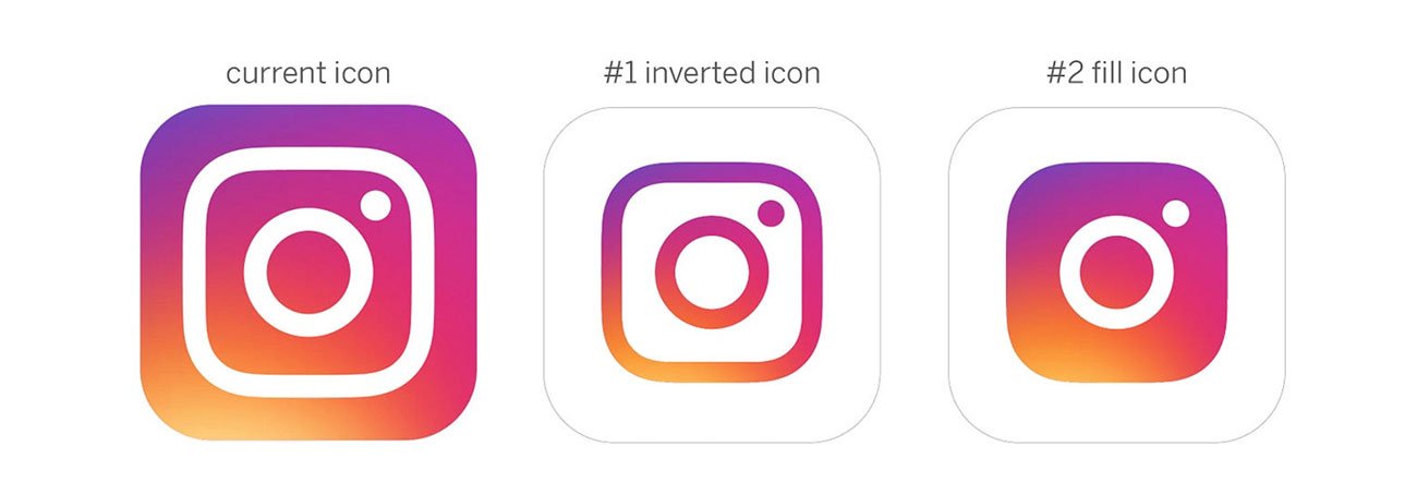
While Instagram made the transition from a flat camera icon to the totally bold neon gradient, the trend not only held but was kick-started.
Tip:
Use gradients where it matters: the tones should have some meaning with respect to the brand’s personality.
7. Sustainability Signals
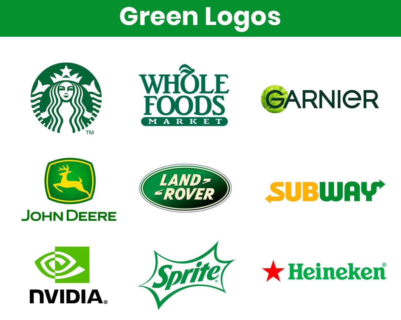
Eco-conscious is not a market any more; it is just mainstream. Logos have lately been depicting sustainability in green hues, organic shapes, recycled textures, and calming earthy tones.
Why it works:
Customers are increasingly tying their consumption choices to their value set; hence, the more instant credibility and trust that a ‘sustainable-feeling’ logo awards to a brand.
Example:
Oatly and Beyond Meat use raw, textural elements and earth tones to emphasize their eco-conscious philosophies.
![]()
How Visual Best Can Help You Stay Trend-Forward
At Visual Best, there is simply no concept of following design trends; we believe the brand itself should be setting the trends.
Our creative procedure starts by way of listening to the client’s brand personality, target audience, and long-term objectives. Strategy is then married with creativity to create logos that are beautiful and meaningful yet scalable and ready for every screen.
Whether it’s a bold startup or mature company seeking an identity change, we can provide:
- Logo design that follows trends but feels relevant today and ready for tomorrow
- Responsive logo kits suited for desktop, mobile, packaging, and beyond
- Custom typography that gives the brand its voice
- Rebrand support of converting dated visuals into contemporary-day icons
Your logo is not merely a symbol, it is your story, and we will ensure that the story is told in the most unforgettable manner.
Conclusion
Trends die out, but your logo should be built to last. Being trend-aware does not mean being a slave to trends; it means evolving on purpose. Major logos are a perfect mix of timeless identity and in-a-modern-way.
Winning brands of 2025 are those that will manage to push for visual adaptations without losing their core value. Your logo is no longer a simple graphic; it is an investment in ways people perceive, feel about, relate to, and remember your brand.
Is your current logo design not according to trend? Visual Best help you design a logo with the weight of relevance and bolder for the future.
Frequently Asked Questions
1. Do small firms need to follow logo trends?
Absolutely. Even a tiny firm feels new, current, and reliable with a trend-aware logo. It lets your audience know that you are invested in your brand.
2. How frequently should my logo be updated?
Every five to seven years is often a reasonable standard. However, your logo should change as your brand does. The ideal moment to reconsider your design is during a rebranding or audience change.
3. Which trend will be most significant in 2025?
Adaptive and responsive logos are setting the standard. Everything from a billboard to a wristwatch screen should display your logo.
4. Are gradients still popular?
Definitely! But now, they take on different characteristics: think multilevel, multidimensional, and with meaning rather than just flashy displays. Now, gradients belong to the realm of smart, strategic branding.
5. Can Visual Best do a logo revamp for me?
Yes! We will work with you to update your existing logo while still respecting the essence of your brand. We bring together trend knowledge and custom design to give the identity a fresh upgrade with an eye toward the future.