Graphic Design
The Role of Color Psychology in User Experience: How Color Choices Shape User Behavior

Imagine opening an app and instantly feeling calm, excited, or even inspired. Ever wondered why some apps feel more trustworthy, while others seem fun and playful? The answer lies in color psychology. It is not only all about color. It is a strong device that establishes feelings, trust and directs the decisions of users. In design, each of the shades selected affects the interaction of people regarding digital products. This blog post will discuss the role of color psychology in design and its impact on design and user experience, what it is, how different brands use it, and how it directly affects behavior and conversions.
What Is Color Psychology?
Color psychology involves the effects and impacts of colors on human behavior, emotions and decisions. It says why some shades may leave the people with a feeling of being happy, calm, energetic and even anxious. These principles are applied by designers and marketers in order to elicit certain responses amongst the users, since these people do not just want the products to appear beautiful; they want them to be effective as well.
Color psychology performs the role of storytelling once used in design. As an example, a soothing blue background may give a feeling of trust at a glance, whereas a decisive red button may arouse a sense of urgency and trigger some action. The decisions are not arbitrary. They ground on the manner in which the human brain processes the visual signals.
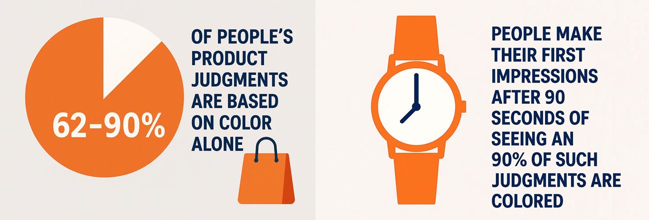
Colors impact emotions in powerful ways. The research has found that human beings make their first impressions after 90 seconds of seeing an object and 90 percent of such judgments are colored. This provokes the importance of color as an aspect of design without which it is not possible to reach significant experiences.
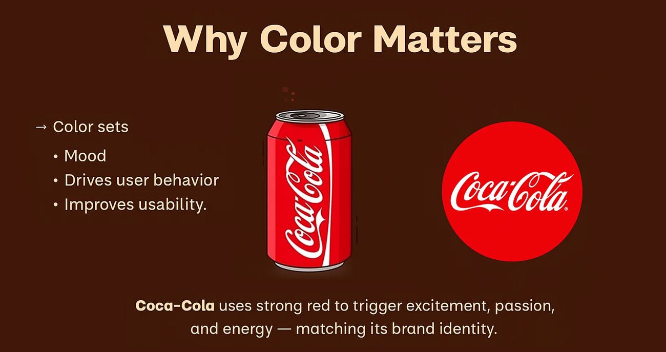
The origins of color psychology trace back to advertising and marketing where companies have been using color to soothe their perception to a long time. Consider Coca-Cola and red color to mean excitement and energy or Facebook and blue color to mean trust and community. The principles are also the same in the case of digital design. Each color option represents a narrative vis-a-vis the brand and informs users how they must engage the brand.
Concisely, color psychology is a mix of science design. It assists brands to convey without using words and guarantees the user gets to experience a product just how they should. Designers can now create an emotional journey that extends beyond what is on the surface by knowing the Role of Color Psychology in design.
Why Color Matters in UX Design
The use of color is thus critical to the user experience since users tend to make judgements within a few seconds when regarding the products. It is that initial perception that will make them spend time with you or rush ahead. Considering that color is one of the fastest effects we see and identify as design, it can prove a strong factor in usability and trust.
Here are a few explanations as to why color is important in UX design:
- Readability: Adequate contrast of color allows text to be readable. Low contrast results in the users straining their eyes and frustration.
- Accessibility: the inclusive design demands that the colors be combined in a fashion that will be compatible with individuals with visual challenges like color blindness. Easy to use palettes make it usable by all.
- Emotional Response: All colors have different moods that wake up a person. Warm colors can energise whereas cool colors bring serenity to the brain.
- Brand Perception: The use of colors is the same to enable recognition and trust. As an example, brand reliability is strengthened by the same blue throughout a web site, an app and the advertisements.
Studies back this up. According to COLORCOM, 62–90% of people’s product judgments are based on color alone. This means a poor color choice can reduce user trust, while the right palette can improve loyalty.
In UX, color goes beyond making things “look nice.” It helps organize content, highlight actions, and direct attention to what matters most. A bright call-to-action button stands out because color helps guide the eye. Subtle background tones, on the other hand, create balance and avoid distraction.
Color is a discrete encoder, ultimately. It is working behind the scenes conditioning perceptions and actions where individuals are ever aware of its presence. By prioritizing the role of color psychology in design, businesses can create digital experiences that feel intuitive and emotionally engaging.
How Different Colors Influence User Emotions
Colors carry meaning, and each shade can evoke distinct emotions. Here are some common psychological associations:
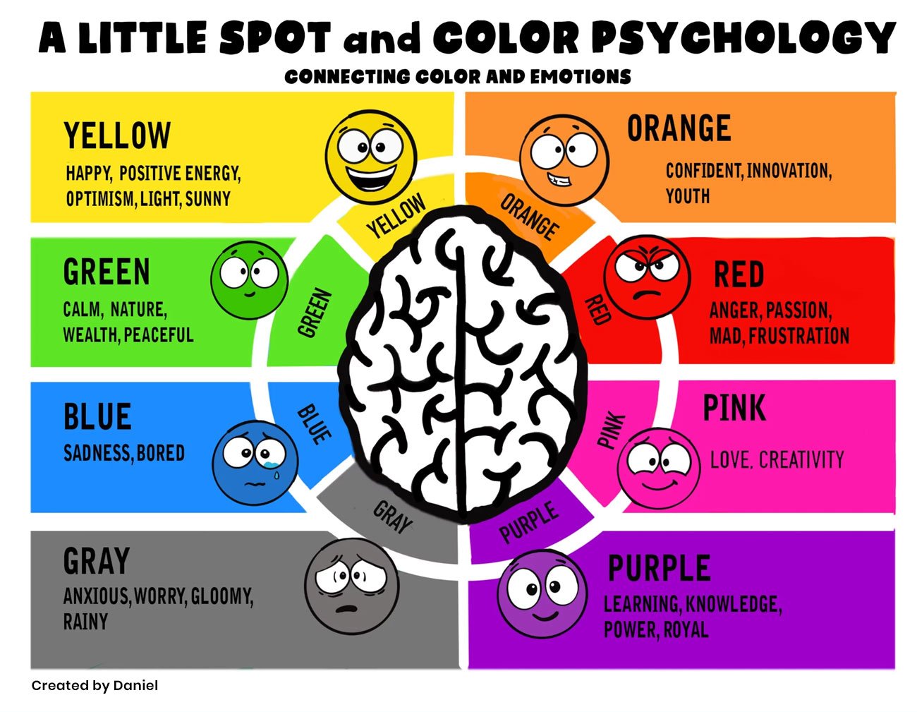
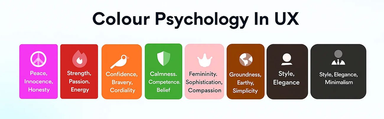
- Blue: Creates a sense of trust, security, and calmness. Often used by banks, healthcare apps, and tech companies.
- Red: Signals urgency, excitement, or danger. Commonly used in sales banners, alerts, and notifications.
- Green: Represents growth, health, and balance. Used by wellness, sustainability, and finance brands.
- Yellow: Symbolizes optimism, energy, and attention. Often used for callouts or to spark positivity.
- Black: Conveys luxury, sophistication, and power. Frequently seen in premium products and fashion brands.
- White: Suggests cleanliness, simplicity, and clarity. Commonly used in minimalist design and healthcare.
These associations do not apply universally, since perception is also a cultural factor. As an example, the color white refers to purity in western cultures whereas in some eastern cultures it may depict mourning. This is why it is important that designers know their consumer and only then proceed with a palette.
Brands should pay attention to the choice of colors that will help them draw the user to the necessary step as subtly as possible. Green Confirm button will be instinctively attributed to proceeding and red Cancel item will bring the sense of warning. These choices apparently are minor, however, they build the overall experience.
How Brands Use Color Psychology to Guide User Behavior
Role of Color psychology in user experience is one of the main ways in which brands use color to help them to reach out to their audience and even make decisions. The color does not just decorate. It invokes emotion, creates trust and focus.
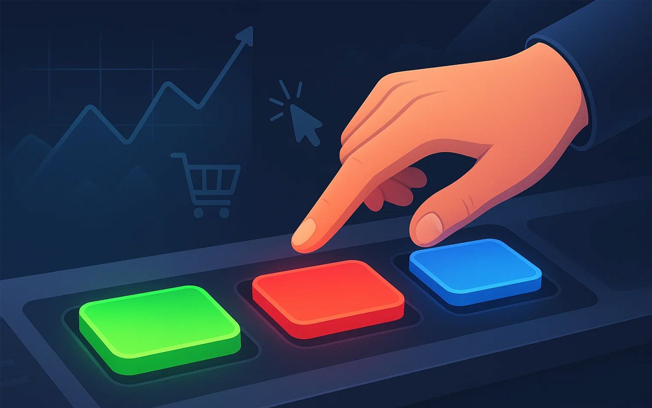
Among the most widespread uses is that in call-to-action (CTA) buttons. Contrast and bright colors such as orange, green, or red will make CTAs visible. This invites clicks since they attract the attention of the user automatically.
Another factor is how user behavior varies by demographics.
- Age: Younger audiences may prefer bold, playful colors, while older users appreciate subtle and mature tones.
- Gender: Studies show men often prefer blue and green, while women lean toward purple and softer shades. However, stereotypes are fading as inclusivity in design grows.
- Culture: Color meanings differ globally. For instance, red is associated with luck in China but danger in Western contexts. Global brands adapt their palettes accordingly.
Brands also use color to build recognition. McDonald’s uses red and yellow for energy and appetite stimulation. Spotify uses green to symbolize growth and creativity. Apple relies heavily on white and silver for simplicity and innovation. These examples show how consistent use of color reinforces brand identity across touchpoints.
Smart color strategy goes beyond logos. It influences everything from app backgrounds to error messages. A brand that uses consistent, psychology-backed colors builds credibility and trust. When users feel emotionally aligned with the design, they are more likely to stay loyal.
Ultimately, color is a brand’s silent ambassador. It communicates values, attracts attention, and directs users toward actions without saying a word.
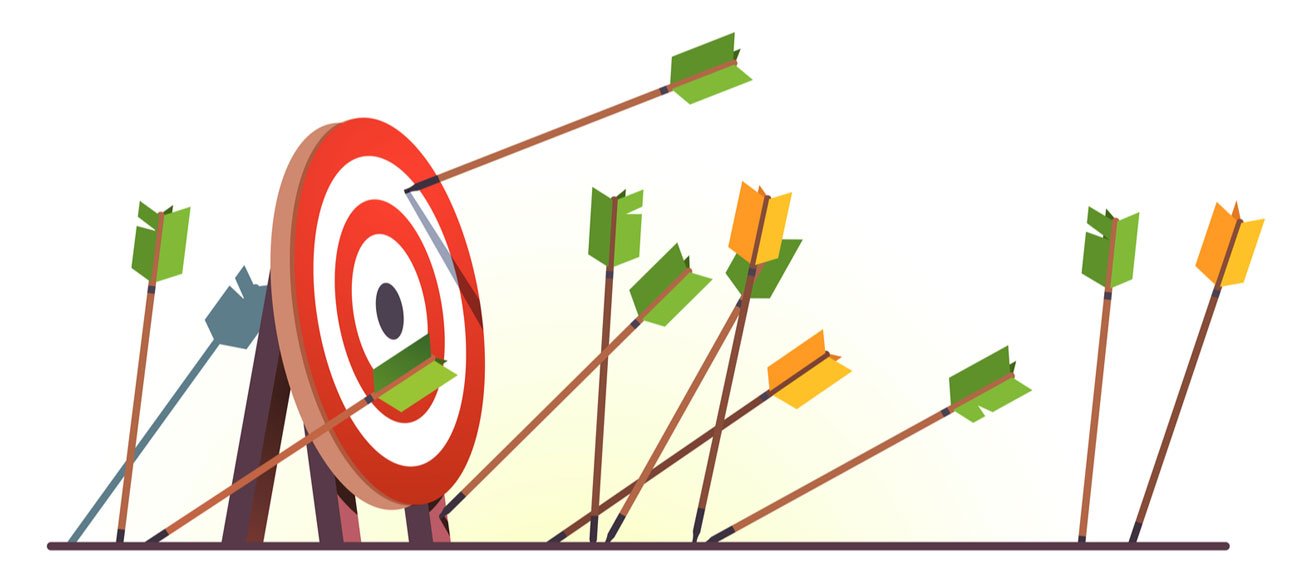
How Color Affects Conversion Rates
Color choices directly affect conversions, and many real-world examples prove it.
- HubSpot Case Study: A company tested green vs. red CTA buttons. Surprisingly, the red button outperformed green by 21%. The reason was contrast. The red button stood out more against the background, catching the user’s eye.
- Performable Example: When Performable changed its CTA color from green to red, it saw a 21% increase in clicks. This demonstrates that small changes in color can significantly impact user behavior.
- Google Experiment: Google tested 41 shades of blue for link colors to see which drove the highest engagement. The experiment showed even subtle color variations can influence user decisions at scale.
Such examples bring to focus one of the major tenets: context is important. A color that would be applicable on one site would not work on another site. The issue is how the color is contrasting to the rest of the design and how it fits in the purposes of the brand.
Conversion rates also get better once the colors are used purposefully. Orange CTA placed appropriately can boost the number of clicks, whereas a relaxing blue background helps to establish trust. The more comfortable and guided the users feel, the more prone they are to complete an action.
In short, color psychology is not just about emotion. It directly influences results. Companies that test and optimize their color strategy gain a competitive advantage in improving conversions.
Common Mistakes to Avoid
The role of color psychology in user experience is poor usage and can have the opposite effect. Here are common mistakes to avoid:
- Use of excessive bright or contrasting colors: This makes the customer too dizzy. It generates confusion and it diminishes attention.
- Forgetting consistency: Divergence in shade of the same color to be used across the touch points undermines brand recognition. Trust is made by consistency.
- Overlooking accessibility: Colors that fail to comply with accessibility exclude vision-impaired users. An example is where the light gray text is to be placed on a white background and the settings are hard to read.
- ignoring cultural context: What will be appropriate in one cultural region could have negative connotations in the other. There should always be research on cultural interpretations prior to leaving palettes behind.
- The emphasis on solely aesthetics: Making decisions of color choice on the basis of aesthetics rather than the psychology of colors or purpose diminishes the user experience.
The solution lies in balance. A consistent, accessible, and strategically chosen palette can improve usability and build trust. Designers must remember that every shade communicates something. When colors are chosen carelessly, the experience suffers.
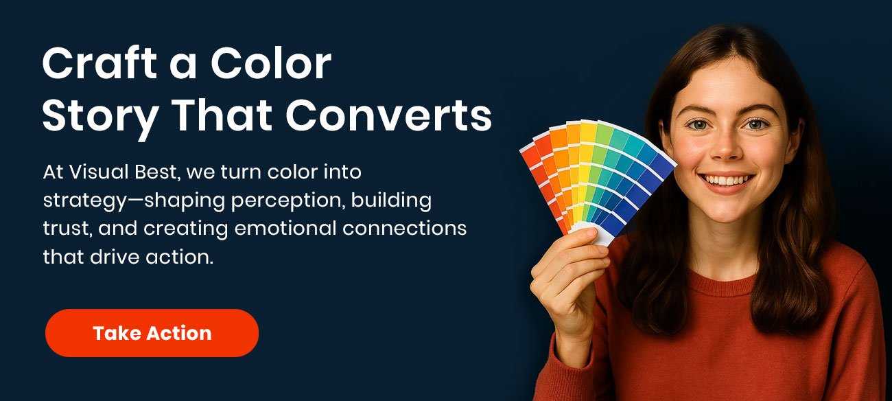
How Visual Best Can Help
We know that color can do more at Visual Best than be a design decision. It is the language through which perception is created and relationships between brands and audience are developed. We produce color plans that fit your brand image and purpose of the user.
Whether in logo design, web designs, product presentations, etc, we make sure that each color tells the correct story. We thoughtfully select palettes that play to your strengths, evoke emotion and influence user behavior. Whatever the feeling you desire; trust, luxury, creativity or energy, we design-with-purpose.
Visual Best offers designs that are both beautiful to behold and are effective by combining creativity and a research-supported psychology. We are concerned about what makes your brand stand out as well as developing the feelings of connectedness and engagement among your audience.
When you have decided that you want to take advantage of the position of color psychology in user experience, we can assist you in creating digital experiences that really resonate.
Conclusion
The psychology of color is a critical aspect in design and the user experience. It frames feelings, exudates trust, informs actions, and even increases conversion. Different shades affect even the first impression and final action of the users of whatever is the digital product. Competitive advantage is obtained by brands that know and practice color psychology. They make the experiences natural, intuitive, and emotionally appealing with the help of the usage of colors in strategic ways. Color psychology in user experience is no longer a matter of choice. It is a line of attack by business firms that want to get closer to their audiences in meaningful ways.
FAQs
Q1. What is the role of color psychology in design?
The psychology of colors assists the designers to manipulate the feelings and actions. It makes visuals not only attractive but effective and purposeful.
Q2. Why is color important in user experience?
Color affects first impressions, readability, accessibility, and brand trust. The right palette makes digital products intuitive and engaging.
Q3. Do colors affect conversion rates?
Yes. Case studies show that changing a CTA button color can significantly increase clicks and engagement.
Q4. Are color meanings the same across cultures?
No. Cultural differences impact how colors are perceived. For example, red means luck in some countries but danger in others.
Q5. How can Visual Best help with color strategy?
Visual Best creates customized color strategies for logos, websites, and product designs. We focus on colors that align with your brand values and user needs.