UI/UX
10 UI UX Design Mistakes to Avoid

Imagine opening an app that looks beautiful but leaves you confused about where to click next. That’s the difference between good visuals and great user experience. UI/UX design is not just about making things look nice. It is about making them work for the user. Even skilled designers can fall into common traps that frustrate users and hurt engagement.
In this blog, we will look at the top 10 UI UX design mistakes to avoid and share practical tips to help you create designs that both look good and feel right.
Understanding the Basics of UI UX Design
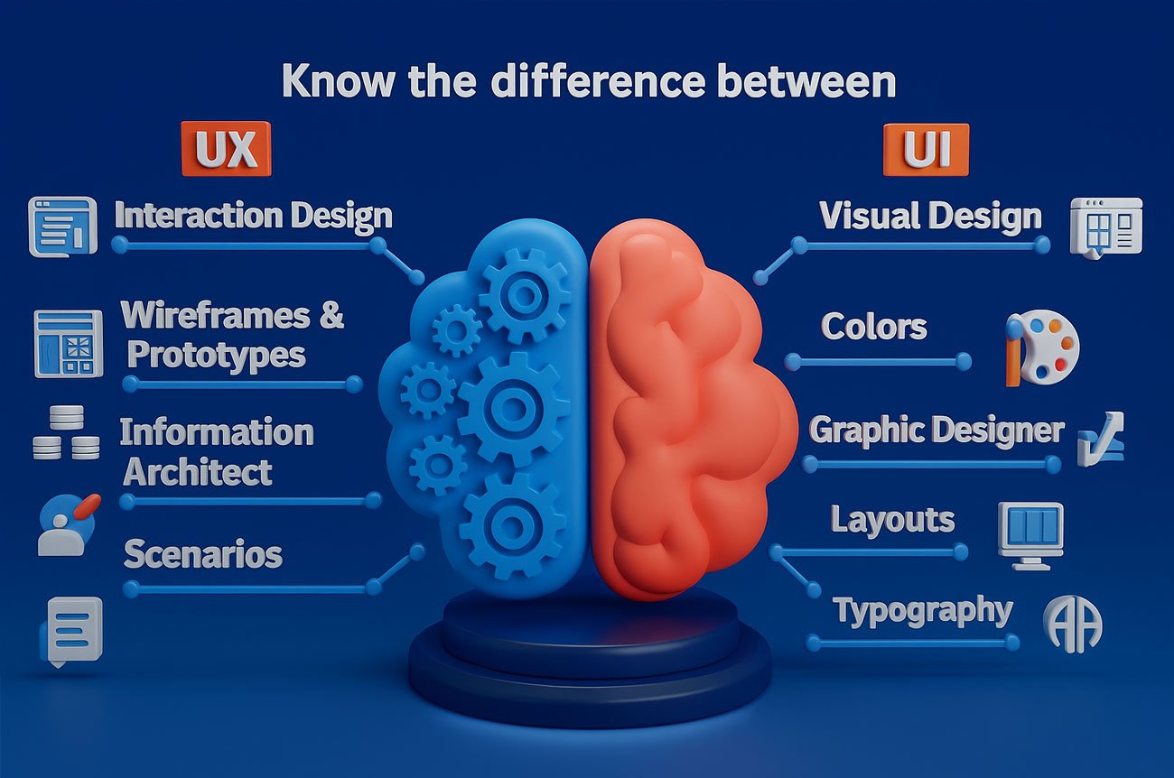
The visual component of a product is called UI (User Interface). It incorporates layouts, color, typography, buttons and icons. An effective UI makes a product appealing, user-friendly and consistent. It has a direct influence on the user experience as soon as a user comes into contact with the design.
UX (User Experience) concerns the way a user feels using the product. It is written with emphasis on usability, effectiveness, and the emotional touch. An efficient UX guarantees that users do not feel frustrated in accomplishing their tasks.
The UI and UX relationship is of paramount importance. Users get frustrated when the UI is beautiful but the UX is not smooth. Similarly, a fantastic UX and a terrible UI can make them turn away. The two collaborate to develop an interesting and fulfilling product.
Key Principles of UI/UX Design
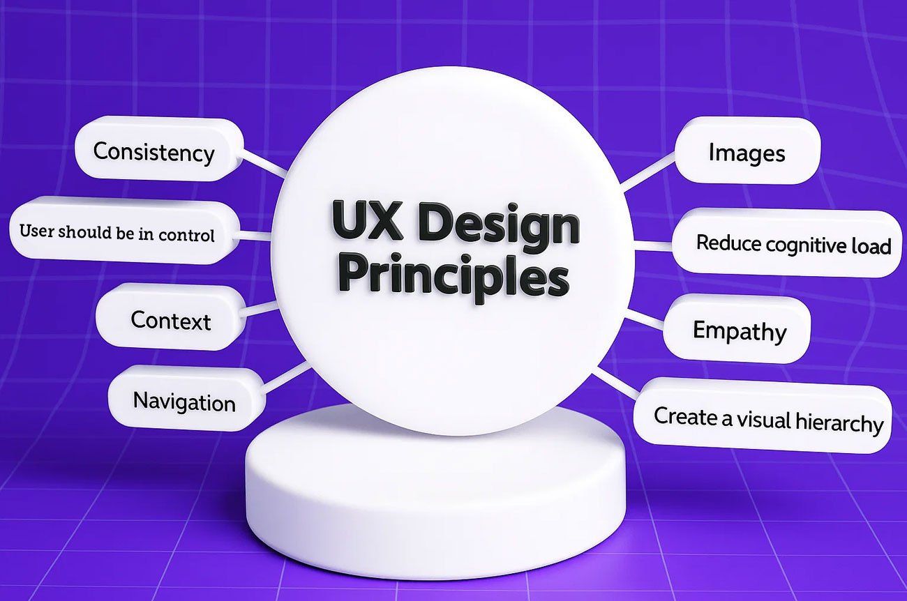
Simplicity
A clear, minimalistic interface allows the user to understand more easily with minimized cognitive load. Using minimal structures allows the user to work with ease and perform tasks quickly without unnecessary distractions. Make sure you do not over-crowd the screens with excessive information or features.
Consistency
Uniformity on the interface gains the trust and familiarity of the users. This also involves the same fonts, colors, icons, button design and pattern of interactions being used throughout the product. Design consistency makes users not re-learn actions as they navigate through different areas.
Clarity
Easy-to-understand layouts, simple wording, and clear icons minimize confusion. Labels must be short and explanatory, fonts should be easy to read, and the design must flow so that users know where to go. All the elements must have a purpose and can lead to understanding.
Accessibility
Inclusive design means creating products that can be used by people with varying physical, cognitive, and sensory abilities. This involves using proper contrast ratios, providing keyboard navigation, supporting screen readers, and ensuring all users can interact with the interface effectively.
Hierarchy
Visual hierarchy helps users identify the most important elements at a glance. Use size, color, spacing, and placement to guide attention toward key actions or content. A well-structured hierarchy improves comprehension and leads to faster decision-making.
The UI Design Process
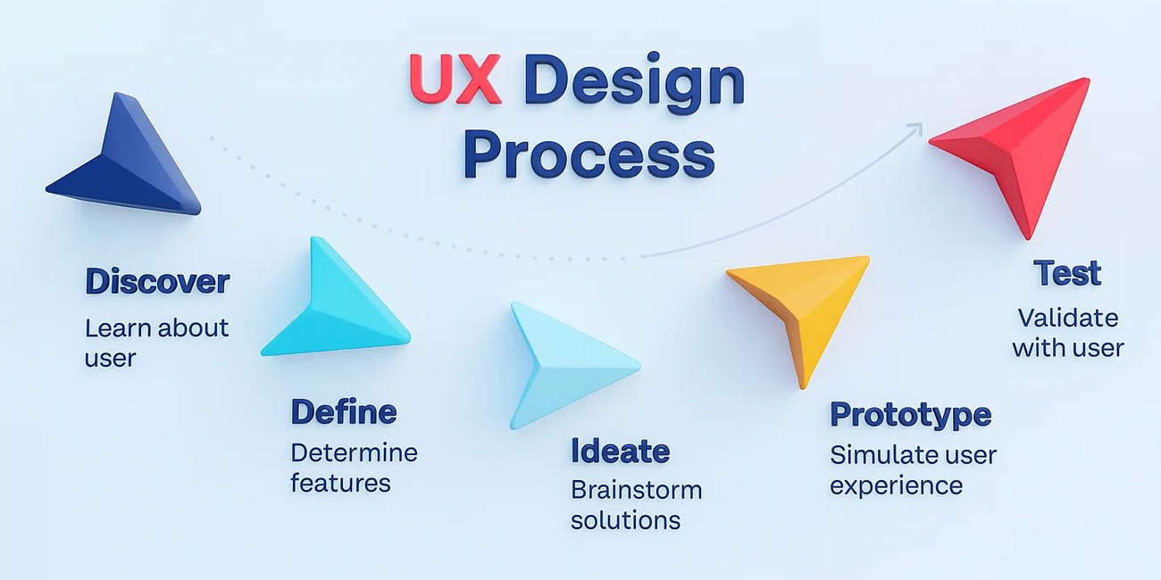
Know your Audience
It is crucial to do some research about the target users before even starting the design- know their target, how they struggle, and what they do. Employ research techniques such as interviews, surveys and analytics to enable you to get information that will inform your design decisions.
Wireframing
Wireframes are simple sketches, low-fidelity layouts which determine the structure of a page. Their design involves functionality, design, and flow without the need to be approached by color or image. Wireframes serve as a blueprint, and they are a starting point for design.
Prototyping
Prototypes are the interactive representation of the design, which is used to simulate user experience. They allow the stakeholders to see what the finished product will perform and enable groups to test applicability before development. Most commonly, they involve using tools such as Figma, Adobe XD or InVision.
Visual Design
This is the stage where brand elements like colours, typography, imagery and iconography is applied to the wireframes. Visual design needs to be not just aesthetically attractive but also lead to usability as well as consistency.
Testing and repetition
When a prototype or a visual is prepared, seek real feedback through actual users or stakeholders. Take this feedback to determine the pain points or confusion. The design will be tested iteratively and refined so that results get better each time, and the design will be based on the needs of the user.
The UX Design Process
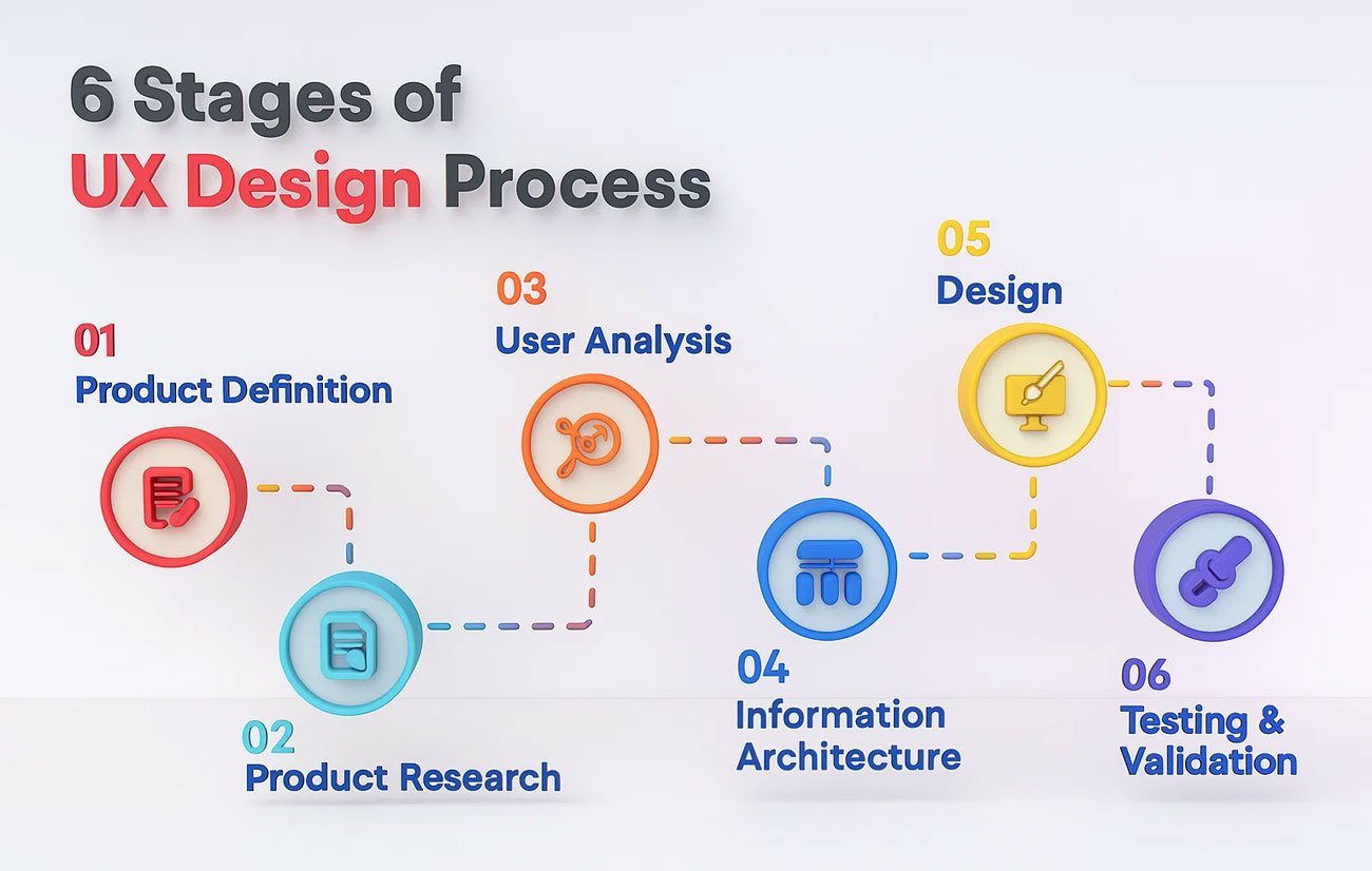
User Research
The UX design begins by collecting field data of users in the form of interviews, surveys, observations and web analytics. This will assist the designers to know the user motivations, negative experiences as well as preferences, which are what will constitute the foundation of user-focused decisions.
User Persona
They are fictional but evidence-based demographic descriptions of various components of your audience. Every character contains such information as demographics, objectives, behaviors, or challenges. They assist in ensuring that the team remains user-centred in the design process.
User Journey Mapping
This means creating a visual version of the actions taken by a user to perform an activity in your product. Mapping the journey allows designers to figure out areas of friction, areas that can be improved and areas where users could require more support or guidance.
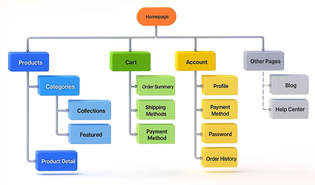
Information Architecture
Information architecture (IA) is the structure of the content and features which are in a product. Good IA guarantees that users can find what is needed without difficulties, with the help of categorization, organization of navigation, and labeling.
Usability Testing
Usability testing is feature identification by observing real people use the product to spot functionality or navigation problems. It is a crucial process to verify design choices and make sure the product will be easy to use and effective by the time it is released.
Top 10 UI UX Design Mistakes to Avoid (with Solutions)
- Ignoring User Research
Mistake: Designing based on assumptions instead of real user needs often leads to poor usability and a misaligned product.
Solution: Conduct thorough user research using tools like surveys, interviews, observations, and usability tests. Understanding your audience ensures your design choices are grounded in data, not guesswork. - Overcomplicating the Interface
Mistake: Incorporating too many features or visuals will make the interface feel overwhelming, and completing basic functions will be hard.
Solution: Go minimal. Focus on core functionality and cut the non-essentials. A less cluttered UI UX design mistakes makes navigation more convenient and gives satisfaction to the user.

- Poor Navigation Design
Mistake: Overly complex or inconsistent site navigation may cause users to lose or become frustrated, which means they are more likely to leave the site or app. 88 percent of users will never choose to go back to a site where they have had a negative user experience.
Solution: Navigation should be user-friendly, logical and accessible. Apply understandable labels, logical ordering of menus, and well-known patterns, such as breadcrumbs or sticky menus.
- Inaccessible Design
Mistake: Not considering people with disabilities would leave a good deal of your audience without access to your product, and could fall short of legal requirements.
Solution: Use WCAG (Web Content Accessibility Guidelines). The website should have good contrast ratings, images should include alt text, the navigation bar should be keyboard- friendly and screen readers should be supported.
- Inconsistent Visual Elements
Mistake: Implementing various fonts, colors, and buttons in various places around your production will puzzle users and devalue your brand.
Solution: Create and follow a design system or style guide to avoid UI design errors. This will enhance visual uniformity and give a professional look to the screen.

- Neglecting Mobile Responsiveness
Mistake: Focusing on a desktop design is insensitive to most users who consume goods through phones.
Solution: One of the solutions is responsive design. Test on different devices with varying screen sizes so that your UI appears good and performs well on all platforms.
According to a report by Appsamurai, 62% of users uninstall apps because of constant app crashes and error issues.
- Slow Load Times Due to Heavy UI
Mistake: Complicated images, huge pictures, and bloated code may significantly slow down speeds, thereby reducing user experience and SEO. Each additional 1-second delay in loading the page decreases conversions by 7 percent.
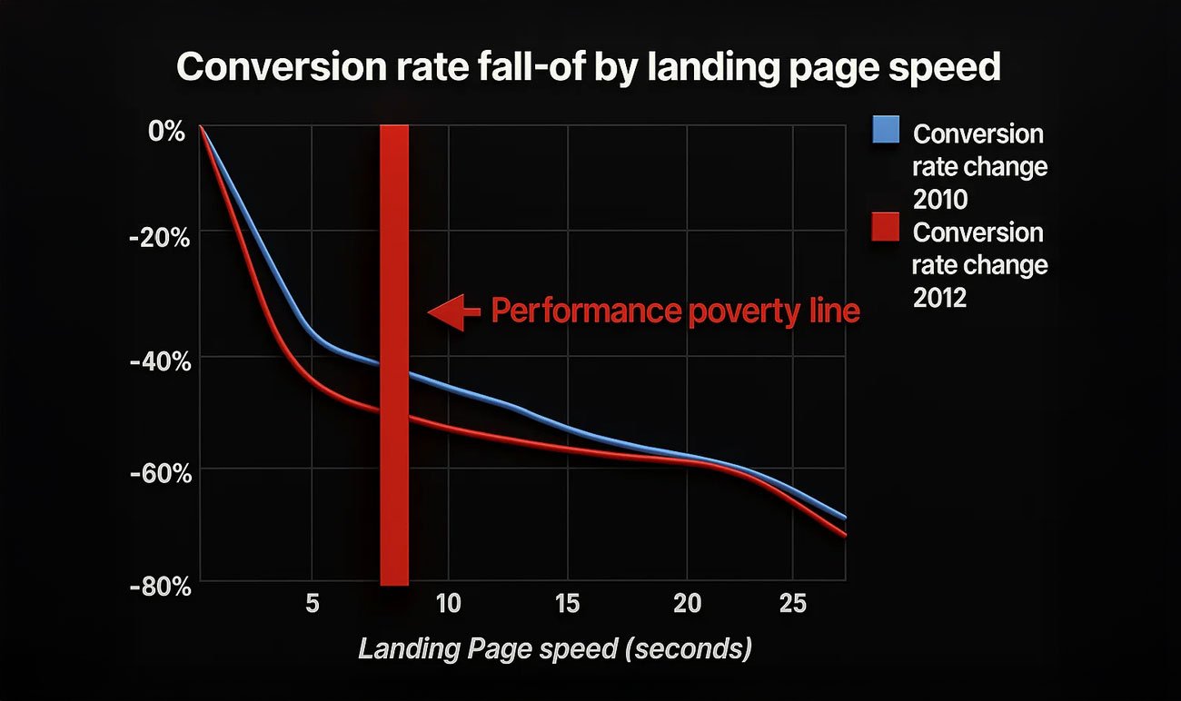
Solution: Asset optimization–image optimization, CSS/JavaScript compression and moderating excessive animations. Make speed a priority in your UI development.
- No Feedback to User Actions
Mistake: A user does something and nothing happens, and he or she gets confused whether the system has received the response or not, resulting in frustration.
Solution: Feedback should appear immediately and may include visual indicators (such as loading spinners, state of buttons) or low-key animations and sounds. Ensure verification of an action done. - Relying Only on Icons Without Labels
Mistake: Users do not necessarily use icons in the same way, in particular unfamiliar or ambiguous ones.
Solution: To keep things clear, text labels or tooltips should accompany icons. It is particularly necessary in cases of such crucial actions as delete, save, or share. - Skipping Usability Testing
Mistake: Launching a product without testing how real users interact with it can lead to unnoticed design flaws.
Solution: Conduct usability testing during various stages of development. Even small-scale tests can uncover major issues. Iterate based on feedback to improve the product before full release.
UI/UX Best Practices
- Mobile Responsiveness
People use web-based applications and sites on different devices such as desktop computers, phones and tablets.
Best Practice: Develop interfaces that fit well across various screens and resolutions by embracing a responsive layout, flexible grid and scalable components. Make sure to always test your UX design errors across a variety of devices to ensure your designs perform and look the same.
- Loading Time Optimization
Users are agitated by a slow-loading interface, and this could translate to a high bounce rate. It also has a bad impact on SEO ranking.
Best Practice: Minify the use of JavaScript and CSS files, compress the images and convert them into modern file formats (such as WebP). Apply browser caching and content delivery networks (CDNs) so that content loads quickly. Or begin design with speed in mind.
- Call-to-Action (CTA)
CTAs are used to direct users into some actions, including sign-ups, purchases, or downloads.
Best Practice: Have simple, short, and conversion-focused language (e.g., Get Started, Buy Now, Learn More). Use contrast and a suitable size of design CTAs so that they can be emphasized visually and harmonized with the rest of the design.
- Feedback Mechanism
Feedback from users is essential to continuous improvement as well as user satisfaction.
Best Practice: Have convenient forms to leave feedback, report a problem or make a suggestion. Apply feedback forms, questionnaires or in-app requests. Take action on this feedback regularly and inform users of this improvement to demonstrate to them that they are being listened to.
Balancing Creativity and Functionality
Emotional Design
Effective design does not always make something small and usable, but also generates feelings.
Best Practice: Employ the color theory, imagery, typography, and micro-interactions to develop positive emotions. Emotional design enables consumers to relate to your product more, and it can also affect trust, loyalty, and long-term interaction.
Brand Identity
Each of these design elements should match and support the character, principles and the voice of your brand.
Best Practice: Use consistent colours, font, tone and iconography as per brand guidelines. Where your brand is fun and playful, or more serious and professional, your UI must always attract that brand image in every screen and every interaction.
Design Trends
It is vital to be modern and up to date; however, not at the cost of usability.
Best Practice: Do not forget to follow the latest trends in design (rumor morphism, dark fashion, or minimalist instructions), but look at how they affect or hinder the user experience. Give more emphasis to functionality than to mere fantasies.
How Visual Best Can Help
At Visual Best, we combine creativity with precision. To create compelling designs, our team applies the best prototyping and wireframing tools. We specialize in both UI and UX to present the products that not only will look fabulous but will work flawlessly. We provide you with interactive prototypes, brand-suitable graphics, and a total makeover of your product, to ensure your product does not fall under the pitfalls of UX design errors and instead is a treat to the user.

Conclusion
The thing is this: the UI UX design mistakes cannot be overlooked. With a considered interface and an easy experience, conversions can also increase by 200 % and with a decent UX strategy, can rise to 400 %. Invest in user research, clarity, accessibility and performance. It is not either way–but necessary. Learn to avoid the typical pitfalls described, and your design will not only be pleasant to the eye but also convert visitors, count on them, and ensure it has a longer shelf life.
FAQs
Q: What’s the biggest UI UX design mistake?
Skipping user research tops the list. Designing without real user insight leads to features nobody uses or understands.
Q: How much does a slow interface hurt conversions?
Just a one-second delay can drop conversions by 7 %, reduce satisfaction by 16 %, and cause 11 % fewer page views.
Q: Are design-first companies more profitable?
Yes. Design-driven organizations outperform the S&P by 228 % over ten years.
Q: Why is mobile responsiveness so critical?
Mobile users are five times more likely to abandon tasks if the interface isn’t optimized.
Q: What’s the ROI on good UX?
In one example, investing in UX delivered a return of roughly $100 for every $1 spent.