UI/UX , Web Design
How UX Design Increases Conversions and Turns Visitors into Customers
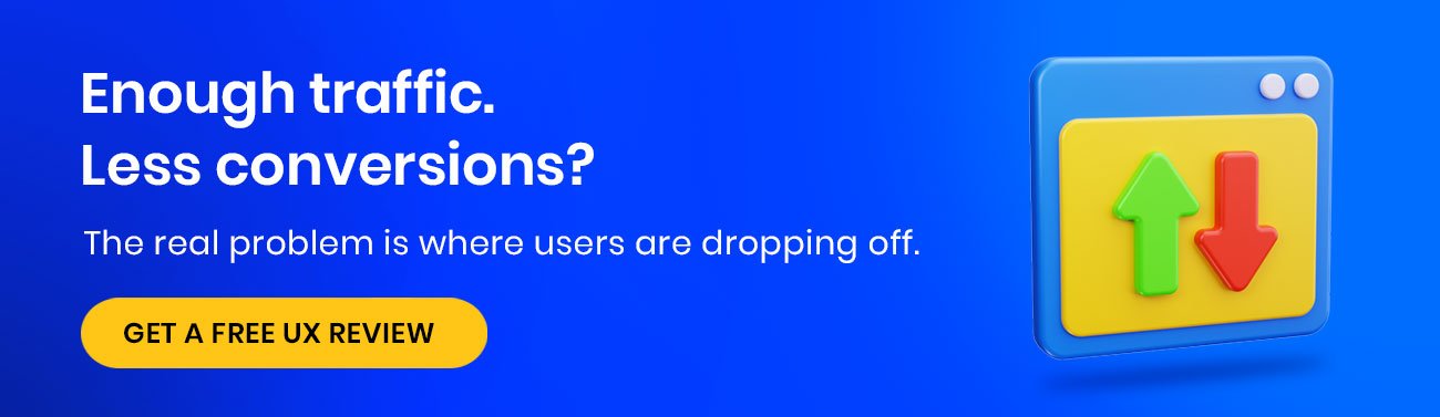
One of our clients had an e-commerce store doing pretty well on paper. 50,000 visitors a month, ads running, SEO ticked off. But barely anyone was buying. Less than 1%.
They went the usual route. More budget, fresh creatives, tighter targeting. Still nothing shifted.
When we actually looked at the site together, it was clear what was going on. The homepage was a mess. Too much happening, no clear direction, users had no idea what to do first. So they did nothing and left.
We see this constantly. Conversions drop and everyone panics about the campaigns. The website just sits there, quietly sending people away, and nobody questions it.
Traffic was never the issue. The experience was. Fix that and the rest sorts itself out.

What is Conversion Optimization in UX?
Let’s get clear on the basics first.
A conversion is when someone on your site does what you actually want them to do. Buys something, fills out a form, signs up for a newsletter, books a demo. That is a conversion.
Your conversion rate is just the percentage of visitors who do that. 1,000 visitors, 30 purchases, that is 3%.
Now, here is where a lot of people get it wrong. UI and UX design are not the same thing.
UI is how your site looks. UX is how it works. A beautiful website can still have terrible UX. And terrible UX bleeds conversions whether you notice it or not.

Why UX Design Directly Impacts Conversions
Analytics show a high bounce rate, and the first reaction is always to touch the ad spend. Most of the time, nobody even looks at the actual page.
-
First Impressions Matter
Users have not read a word yet, but they have already decided. Speed, layout, does it look like someone actually cared when they built it? Mess that up and they click away before you get a shot.
-
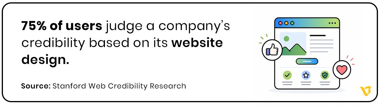
Trust and Credibility
A website that looks consistent and well put together quietly tells users they are dealing with a real business. That feeling matters more than most companies realize. It is often the thing that tips someone from browsing to actually doing something.
-
Reduced Friction
People have no patience for websites that make them work. Unclear buttons, slow load times, three clicks to find something that should have been obvious. Any of those and they are out. Make it easy and they stop second guessing.
-
Guided User Journey
When UX is built well nobody feels pushed toward something. They just go through the site, one thing leading to the next, and by the time they hit the buy button it just felt like the right thing to do.
Key UX Principles That Improve Conversion Rates
You can understand why UX matters all day. The real question is where do you actually start fixing things.
-
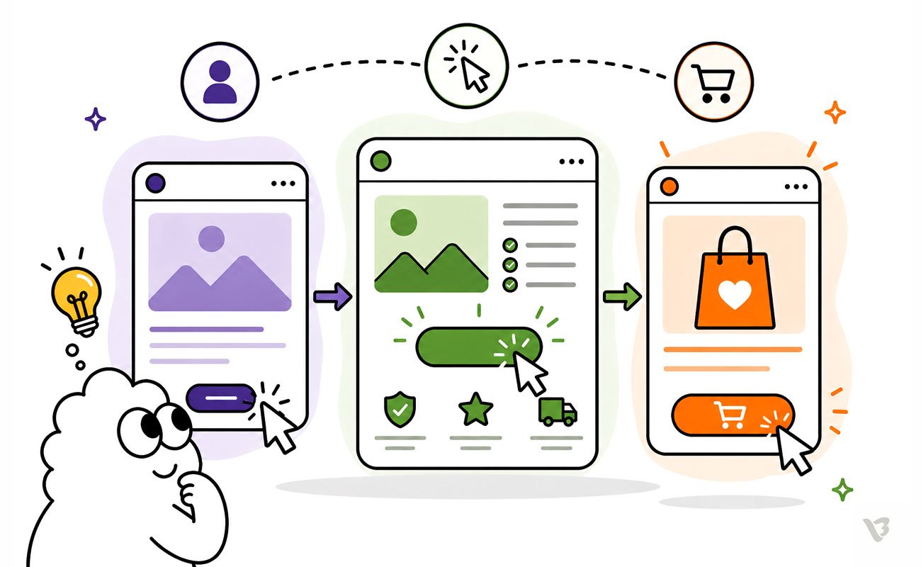
Clear User Journey
Land on a site and not know where to go and you leave. Keep the path obvious, keep the steps minimal, put the important stuff where people can actually get to it.
-
Strong Call-to-Action Design
Your CTA needs to tell people exactly what they are getting the moment they read it. If it blends in or says something vague, nobody is clicking it.
-
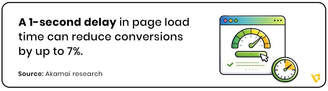
Page Speed Optimization
Shave a second off your load time and conversions go up. Add a second and they drop. Nobody is refreshing and waiting around, especially not on a phone.
-
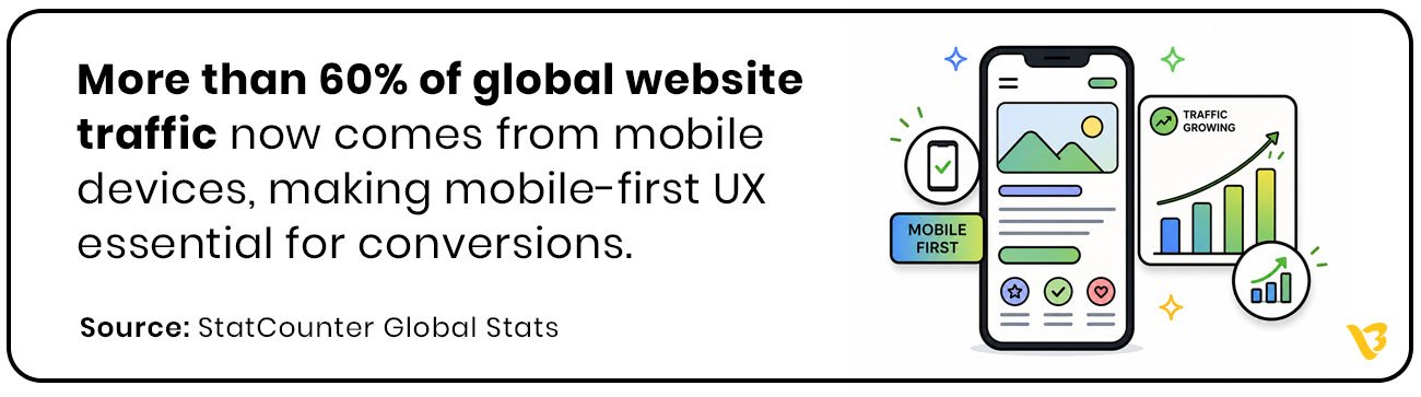
Mobile-First UX
Check your site on your phone right now. If it is awkward to use, slow, or things are hard to tap, that is the experience most of your visitors are getting.
-
Simplified Forms
Ask for too many details upfront and people bail. A shorter form with smart fields gets more responses. Simple as that.
-
Social Proof and Trust Signals
Your customers are more convincing than you are. One good review or a logo from a brand people recognize does more heavy lifting than anything else on the page.
Common UX Mistakes That Kill Conversions
Good UX brings people in. Bad UX pushes them out and most of the time you will not even notice until you look at the numbers.
- Cluttered Pages, Missed Conversions
Too much on the page and people do not know where to look. They scan, get overwhelmed, and close the tab.
- Too Many CTAs, Too Little Action
Six CTAs on one page and users end up clicking none of them. Pick the one action you actually want people to take.
- Hard to Find, Easy to Lose
Pricing hidden three clicks deep, contact page nowhere obvious, users are gone. They will just go to someone whose site makes more sense.
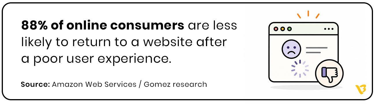
- Every Second Costs a Conversion
Pages that take too long to load lose people. Not some people. Most people. And every extra second makes it worse.
- Poor Mobile UX, Poor Results
Open your site on mobile and actually try to use it. If you are zooming in, struggling to tap buttons, or waiting on load times, your visitors are dealing with the same thing and leaving because of it.
- Lost at the Last Step
Check out forms that ask for too much, too soon, and lose customers who were already ready to buy. That is the worst place to create friction, and it happens more than it should.

How to Measure UX Conversion Optimization
Most businesses look at conversions only after sales drop. By then the damage is already happening.
Good UX leaves clues everywhere. People clicking, stopping, leaving halfway, ignoring buttons, abandoning forms. The numbers tell you exactly where the experience starts breaking.
Bounce Rate
Someone lands on the page and leaves without doing anything. Usually means the page did not load fast enough, make sense fast enough, or feel worth exploring.
Conversion Rate
This is the real metric. Not traffic. Not impressions. How many people actually took the action you wanted them to take.
Session Duration
If users spend time exploring the site, that usually means the experience feels natural. If they leave in seconds, something is pushing them away.
Form Abandonment
People ready to contact you or buy suddenly disappear halfway through the form. Most of the time the process is just asking too much too early.
CTA Click-Through Rate
If nobody is clicking the button, the problem is not always the button. Sometimes users are simply not convinced enough to move forward.
Heatmaps and User Recordings
This is where things get uncomfortable. You actually see where users get confused, hesitate, rage click, or give up. Most UX problems become obvious within minutes.
The best websites are not built on assumptions. They are improved by watching how real users behave and fixing the friction step by step.
UX Strategies That Drive Conversions and Business Growth
The brands getting the best conversion numbers are not guessing. They know how their users behave and they build around it.
- Personalization
Show someone content that actually matches what they care about and they stay longer, engage more, and are more likely to buy. Generic experiences get generic results.
- A/B Testing
Do not guess what works. Change one thing, see what happens, keep what performs better. No big theory needed.
- Micro-interactions
Little things like a button changing when you click it, a tick when a field is filled correctly, these do not seem like much but they make the whole experience feel smoother and more trustworthy.
- Visual Hierarchy
Put the most important thing where the eye goes first. If users have to search for what matters, you have already lost control of the page.
Put these together and you are not just improving the design. You are directly changing how many people buy, sign up, or get in touch.
How UX Design Drives Real Business Growth
UX is not a design expense. It is a business decision.
When the experience works, the numbers follow. Conversion rates go up because users are not battling the interface. Bounce rates drop because people find what they came for. Engagement goes up because getting around the site actually makes sense.
But it goes beyond what shows up in analytics. A site that feels consistent, well built, and easy to use tells people something about the brand behind it. That impression sticks. It affects whether someone buys, whether they come back, and whether they recommend you.
The businesses that take UX seriously are outpacing the ones still fixated on traffic alone. Because traffic without a good experience is just wasted spend.
Great UX Turns Visitors into Customers
Getting traffic is the easy part. What happens after the click is where most businesses lose.
Whether someone trusts you, sticks around, or ends up buying, that all comes down to the experience. Throwing more money at ads does not fix what is happening on the page.
Companies that sort their UX out start getting better results from the same traffic they already have.
Every brand out there is going after the same people. The one that makes things easiest for those people is the one that gets the sale.
Best UX Practices for Ecommerce Conversion Optimization
Most ecommerce websites do not lose customers because of bad products. They lose them because buying feels harder than it should.
People do not have patience online. The moment something feels confusing, slow, or uncertain, they leave and buy somewhere else.
Make Navigation Obvious
Users should never have to figure out where products are hiding. Clear categories, smart filters, and predictable navigation reduce friction immediately.
Prioritize Mobile Experience
Most ecommerce traffic now comes from phones. If product pages feel awkward on mobile, buttons are hard to tap, or checkout becomes frustrating, conversions disappear fast.
Use Clear Product Pages
Good product pages answer questions before users even ask them. Strong images, simple descriptions, pricing visibility, delivery information, and trust signals all matter more than flashy design.
Simplify Checkout
Every extra step in checkout gives users another reason to leave. Guest checkout, fewer fields, and simple payment flows almost always improve conversions.
Build Trust Quickly
People buy when they feel safe. Reviews, ratings, secure payment badges, return policies, and real customer photos reduce hesitation.
Improve Page Speed
A slow ecommerce website kills buying intent. Users might wait for social media apps to load. They will not wait for a product page.
Keep CTAs Clear
Buttons like “Add to Cart” or “Buy Now” should stand out immediately. If users need to search for the next step, the experience is already failing.
The best ecommerce UX does not feel impressive. It feels effortless. Users move through the journey naturally, without stopping to think about what to do next.

UX vs CRO: What’s the Difference?
A lot of businesses treat UX and CRO like the same thing. They are connected, but they are not identical.
UX is about how the experience feels.
CRO is about improving the number of people who take action.
UX focuses on:
- usability
- navigation
- clarity
- trust
- overall user experience
CRO focuses on:
- increasing conversions
- improving CTAs
- reducing drop-offs
- testing what drives action
Here is the mistake most companies make.
They try CRO tactics on top of a bad user experience. Bigger buttons, louder headlines, more popups. None of that fixes the actual friction users are facing.
Good UX creates the foundation. CRO improves performance on top of it.
Think of it this way.
UX helps users feel comfortable enough to continue. CRO helps guide them toward taking action.
The best-performing websites do both together. Because getting clicks means nothing if the experience makes people leave before converting.
Also Read : 10 UI UX Design Mistakes to Avoid

Turn Your Website into a Customer Magnet with Visual Best
Building good UX takes real thinking, proper decisions, and people who know how users actually behave and what makes them act.
Visual Best has spent 10+ years working with 250+ clients across the world building exactly that. Sites that feel right to use and actually bring in results.
Ready to turn your website into your best-performing sales channel? Let’s make it happen.
Frequently Asked Questions
1. What is UX conversion optimization?
UX conversion optimization is the process of improving the user experience of a website to increase the number of visitors who take action, such as making a purchase, filling out a form, or booking a call.
2. How does UX design improve conversion rates?
Good UX removes friction from the user journey. When a website feels easy to use, loads quickly, and clearly guides users toward action, people are more likely to convert.
3. What are common UX mistakes that reduce conversions?
Some of the most common UX mistakes include slow page speed, confusing navigation, cluttered layouts, poor mobile experience, weak CTAs, and long checkout or contact forms.
4. What is the difference between UX and CRO?
UX focuses on improving the overall user experience, while CRO focuses on increasing conversions. UX creates a smoother experience, and CRO optimizes that experience to drive more actions.
5. Why is mobile UX important for conversions?
Most website traffic now comes from mobile devices. If a website is difficult to use on mobile, users leave quickly, leading to higher bounce rates and lower conversions.