Design
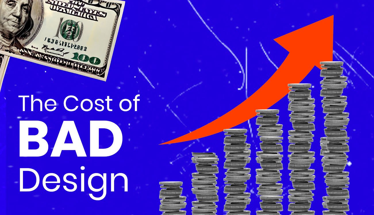
The Cost of BAD Design
In business, design is more than just an aesthetic choice—it’s a critical component of a brand’s success and reputation. Time and again, we’ve seen how powerful good design can be. But what happens when design goes wrong? This article delves into the costly consequences of poor design decisions. From infamous logo redesigns and disastrous UI/UX updates to controversial advertising campaigns and web design fiascos, we explore real-world examples where companies paid a hefty price for design missteps. These stories not only highlight the importance of thoughtful, user-centric design but also serve as cautionary tales for businesses everywhere. Join us as we unravel the tales of design gone awry and the valuable lessons they offer.
The High Price of Poor UX Design
Amazon’s Website Redesign Failure (2010)

In 2010, Amazon decided to redesign its website. The new design was intended to modernize the shopping experience but ended up making navigation more complex and confusing for users.
Impact : Amazon faced a dip in user satisfaction and engagement, as customers found it harder to locate products. This design misstep resulted in a temporary decline in sales and customer trust, emphasizing the importance of user-friendly design in e-commerce.
Snapchat’s Controversial Update (2018)

In 2018, Snapchat rolled out a major update that drastically changed its user interface. The update aimed to separate social interactions from media content but ended up confusing and alienating its user base.
Impact: The update was met with massive user backlash, including a petition with over 1.2 million signatures asking for the old design to be reinstated. Snapchat’s user growth slowed significantly, proving how crucial it is to consider user feedback in UX design.
Graphic Design Disasters and Their Costs
Tropicana’s Packaging Redesign Misstep (2009)

In 2009, Tropicana completely overhauled its packaging design. The new design was intended to give the brand a more modern feel but ended up alienating customers who were used to the original packaging.
Impact: Tropicana saw a dramatic 20% drop in sales over two months, amounting to a roughly $30 million loss. The brand quickly reverted to its original packaging design due to customer demand.
Pepsi’s “Live for Now” Campaign (2017)

Pepsi’s 2017 “Live for Now” campaign, featuring Kendall Jenner, received global criticism for appearing to trivialize social justice movements and protests.
Impact: The backlash was immediate and widespread, leading Pepsi to pull the ad within 24 hours of its release. This incident was a significant setback for Pepsi’s brand image and highlighted the importance of culturally sensitive design and marketing.
Poster Design Blunders
X-Men: Apocalypse” Promotional Poster (2016)

In 2016, the promotional poster for “X-Men: Apocalypse,” which depicted a scene of violence against a female character, was criticized for its insensitivity and sparked a conversation about gender representation in media.
Impact: 20th Century Fox had to apologize and remove the controversial posters, showcasing the critical need for sensitivity in marketing materials, especially in the entertainment industry.
Logo Design Fiascos
Gap’s Failed Rebranding Attempt (2010)

In 2010, Gap introduced a new logo in an attempt to modernize its brand image. However, the new logo was met with immediate public backlash for its generic and uninspired design.
Impact: Just six days after its introduction, Gap reverted to its original logo due to the overwhelming negative response. This quick turnaround not only incurred financial costs but also demonstrated the strong attachment of customers to the brand’s legacy.
London 2012 Olympics Logo Failure (2007)

In 2007, the logo for the London 2012 Olympics was unveiled, aiming to be dynamic and modern. Instead, it faced widespread criticism for its disjointed, abstract design, which many found visually unappealing and hard to decipher.
Impact: The logo, costing approximately £400,000, was not only unpopular with the public but also triggered health concerns, with reports of the promotional video causing seizures in a small number of people. The controversy around the logo sparked debates about effective branding and the value of design in major international events.
The Cost of Ineffective Web Design
HealthCare.gov Launch (2013)

The launch of HealthCare.gov in 2013 is a prime example of how poor web design can have significant consequences. The site, crucial for implementing the Affordable Care Act, was plagued with usability issues, glitches, and system crashes.
Impact: The initial failure of HealthCare.gov not only hindered the policy’s rollout but also cost the government an estimated $1.7 billion, including the costs of fixing the website. This instance underscores the importance of robust and user-friendly web design, especially in projects of national significance.
Impact of Bad Design in Advertising
Ford’s Offensive Ads (2013)

In 2013, Ford faced backlash for an unauthorized ad campaign created by its agency featuring caricatures of bound and gagged women in the trunk of a Ford Figo. The ads were deemed highly offensive and insensitive.
Impact: Despite being an unauthorized creation by the agency, the ads damaged Ford’s reputation and highlighted the need for strict oversight and alignment with brand values in all aspects of advertising. Ford issued an apology, but the incident had already sparked a global conversation about ethics and responsibility in advertising.
When UI Design Goes Wrong
Apple’s iOS 8 Update (2014)

Apple’s iOS 8 update in 2014 was intended to introduce exciting new features. However, it was criticized for numerous UI issues, including Wi-Fi and battery problems, and an unstable Apple Maps app.
Impact: The problematic rollout of iOS 8 caused significant user frustration, reflected in slow adoption rates compared to previous updates. Apple had to quickly release subsequent updates to fix these issues, highlighting the importance of thorough testing and user-centric design in software development.
Conclusion
The examples we’ve explored in this article underscore a critical truth in the business world: the cost of bad design can be staggeringly high, both financially and in terms of brand reputation. From the millions lost in sales due to a failed logo redesign to the user exodus caused by a poorly executed app update, each case study serves as a reminder of the crucial role thoughtful, user-centric design plays in a brand’s success.
However, it’s not all about avoiding pitfalls. Good design is an investment that creates immense value over the long run. It’s about crafting experiences that resonate with users, building brand loyalty, and ultimately driving business growth. This is where Visual Best steps in.
How Visual Best Can Help
At Visual Best, we understand the power of good design. Our approach combines creativity with strategic thinking, ensuring that our design solutions are not only visually stunning but also aligned with your business goals. Here’s how we can help:
- Cost-Effective Design Solutions: We offer design services that are affordable in the short term and valuable in the long run, avoiding costly redesigns or brand missteps.
- User-Centric Approach: Our designs are centered around your target audience, ensuring high engagement and satisfaction.
- Brand Consistency: We help maintain consistency across all your design elements, reinforcing your brand identity and message.
- Strategic Thinking: Our team doesn’t just create pretty pictures; we think strategically to ensure that every design element works towards achieving your business objectives.
Investing in quality design with Visual Best means investing in the future of your business. Let us help you create designs that not only look good but also bring tangible value to your brand. Contact Visual Best to discuss how we can turn your vision into impactful designs that drive success.
FAQs
Q1. What is the real cost of bad design for a business?
The cost of bad design can be staggering—both financially and reputationally. Companies have lost millions in sales, faced public backlash, and damaged their brand image due to poor design choices. Examples include Tropicana losing $30 million in two months, Gap reverting a logo in six days, and HealthCare.gov costing $1.7 billion to fix.
Q2. How much money did Tropicana lose due to its packaging redesign?
In 2009, Tropicana lost approximately $30 million in sales over just two months after overhauling its packaging design. The modern look alienated loyal customers, leading to a 20% drop in sales. The brand quickly reverted to its original packaging due to overwhelming customer demand—a textbook example of bad design hurting business.
Q3. What are some famous examples of bad design that hurt brands?
Famous bad design examples include Amazon’s confusing 2010 redesign, Snapchat’s 2018 update that triggered a 1.2 million-signature petition, Tropicana’s $30M packaging fail, Pepsi’s Kendall Jenner ad pulled in 24 hours, Gap’s six-day logo revert, the controversial London 2012 Olympics logo, and the troubled $1.7B HealthCare.gov launch.
Q4. How does poor UX design impact user satisfaction?
Poor UX design directly damages user satisfaction and engagement. When Amazon redesigned its website in 2010, users struggled to find products, hurting sales and trust. Snapchat’s 2018 update alienated users and slowed growth. These cases show that ignoring user feedback in UX design can quickly turn loyal users into critics.
Q5. Why do logo redesigns sometimes fail?
Logo redesigns fail when companies underestimate the emotional connection customers have with the original brand. Gap’s generic 2010 logo was scrapped in six days after public backlash. The London 2012 Olympics logo, costing £400,000, was criticized as confusing and even triggered seizures in promotional videos—showing how heritage and clarity matter more than novelty.
Q6. How does bad design affect a company’s reputation?
Bad design can damage a company’s reputation almost instantly. Pepsi’s tone-deaf 2017 ad was pulled within 24 hours. Ford’s offensive 2013 ads sparked global backlash. X-Men’s 2016 violent poster forced Fox to apologise publicly. These incidents show how a single design misstep can spark widespread criticism and lasting brand damage.
Q7. How can businesses avoid the cost of bad design?
Businesses can avoid costly design mistakes by investing in user-centric design, listening to customer feedback, maintaining brand consistency, and applying strategic thinking to every design decision. Partnering with a professional design agency like Visual Best ensures designs are not only visually strong but also aligned with business goals and audience expectations.
Sources:
- Amazon’s Website Redesign Failure (2010)
- Snapchat’s Controversial Update (2018)
- Tropicana’s Packaging Redesign Misstep (2009)
- Pepsi’s “Live for Now” Campaign (2017)
- X-Men: Apocalypse” Promotional Poster Controversy (2016)
- Gap’s Failed Rebranding Attempt (2010)
- London 2012 Olympics Logo Controversy
- HealthCare.gov’s Troubled Launch
- Ford’s Controversial Ads
- Apple’s iOS 8 Release Issues