Report Design
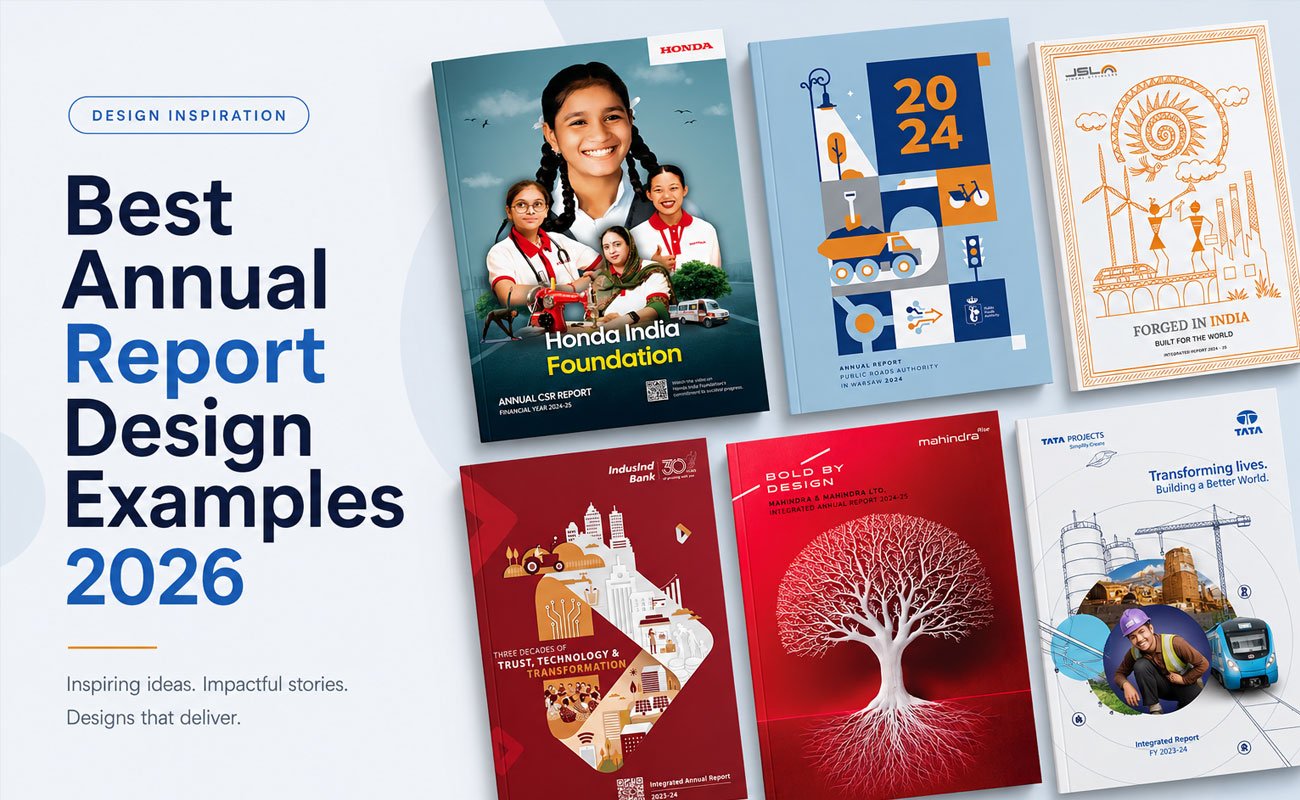
8 Best Annual Report Design Examples 2026
Reports That Understand Corporate Communication Better Than Most Companies
An annual report is the only corporate document almost every stakeholder will eventually see.
Investors read it. Analysts quote it. Employees forward it internally. Journalists pull numbers from it. Potential clients judge credibility through it. And competitors quietly study it.
Which makes one thing surprising:
Most annual reports still look like they were designed to be endured, not read.
The best annual reports in 2026 do the opposite. They understand that modern corporate communication is no longer just about disclosure. It is about perception, clarity, trust, and narrative control.
And the gap between average and exceptional reports is getting wider every year.
The reports below are not simply “well designed.”
They understand how communication works.
That is the difference.
What Makes an Annual Report Worth Studying in 2026
Before looking at examples, it helps to define the standard.
A great annual report in 2026 usually does five things exceptionally well.
1. It Has a Point of View
Weak reports summarize a year.
Strong reports make an argument.
Every memorable annual report is built around a central narrative:
transformation, resilience, innovation, operational discipline, sustainability, expansion, or strategic reinvention.
Without a thesis, a report becomes 250 pages of disconnected information.
2. It Understands That Design Is Navigation
Most companies think annual report design is about aesthetics.
It is not.
Good report design is fundamentally about reducing cognitive friction.
The reader should instantly understand:
where they are, what matters, and why it matters.
This is why the best reports obsess over hierarchy, pacing, visual systems, section architecture, and data clarity.
Navigation is not a technical detail.
Navigation is the experience.
3. It Treats Data Like Editorial Content
Poor reports bury important numbers inside tables.
Strong reports elevate them.
The best reports in 2026 understand that a chart can carry more narrative power than a paragraph.
Modern investor communication increasingly depends on infographic systems, KPI storytelling, visual comparison frameworks, and structured dashboards.
Not decoration.
Interpretation.
4. It Feels Native to the Brand
One of the fastest ways to spot a mediocre report is this:
Remove the logo — and the report could belong to anyone.
The strongest annual reports feel inseparable from the company behind them.
A manufacturing company should not communicate like a luxury brand. A fintech startup should not look like a government document. A sustainability-led company should not feel visually sterile.
Design language communicates strategic intent long before the reader starts reading.
5. It Understands Digital Behavior
A flippable PDF is not a digital annual report.
Most reports today are consumed on laptops, in browser tabs, during meetings, or on mobile devices.
Yet many companies still design primarily for print.
That mismatch shows immediately.
The best reports in 2026 are built for screen behavior:
shorter content blocks, scannable summaries, cleaner hierarchy, stronger spacing, and modular storytelling.
The experience feels intentional digitally — not merely exported.
Annual Report Design Examples Worth Studying in 2026
These examples matter not because they are famous — but because they solve communication problems intelligently.
We have grouped them in three sets: Indian listed companies, two reports from our own studio, and global benchmarks that taught us the most about what makes the format work.
Indian Listed Companies
1. Tata Projects: When the Visual System Is the Story
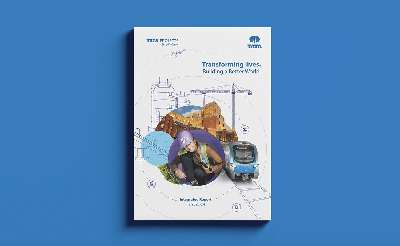
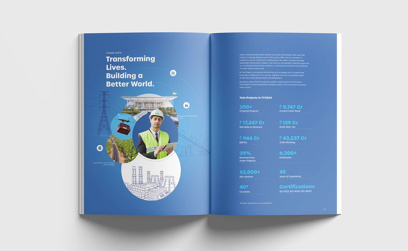
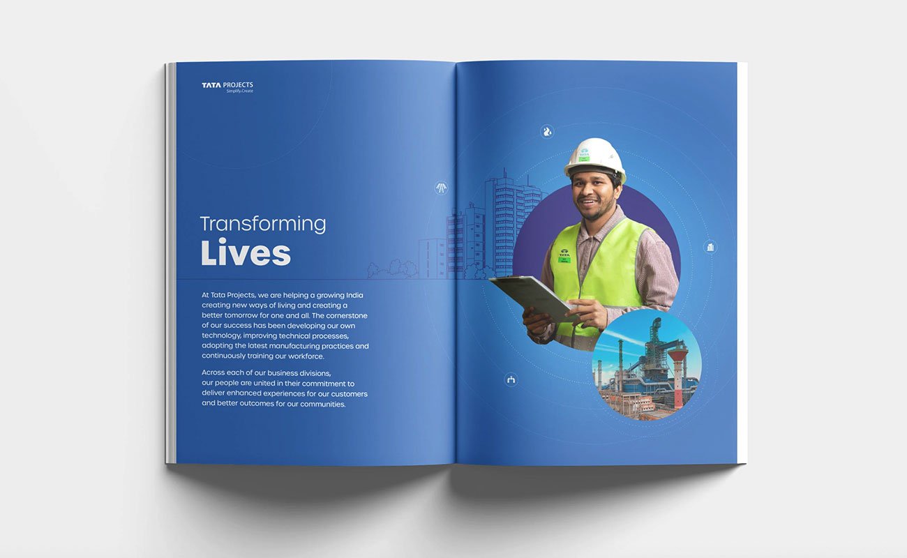
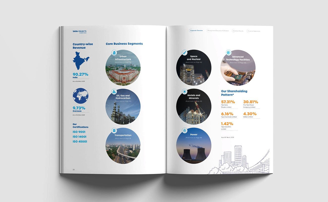
Most infrastructure reports get assembled spread by spread — different layouts, different grids, different visual logic every few pages. Tata Projects’ Integrated Report stands out because it avoids that entirely. The entire document is built around one clear organising system, and that single decision changes the reading experience completely.
The Orbit System as Design Language
The report uses a circular orbital framework throughout — concentric rings, dotted arcs, circular image masking, and infrastructure illustrations repeating consistently across spreads. Headlines, icons, photography, and data points all sit within the same geometric system, creating a strong visual rhythm across the document.
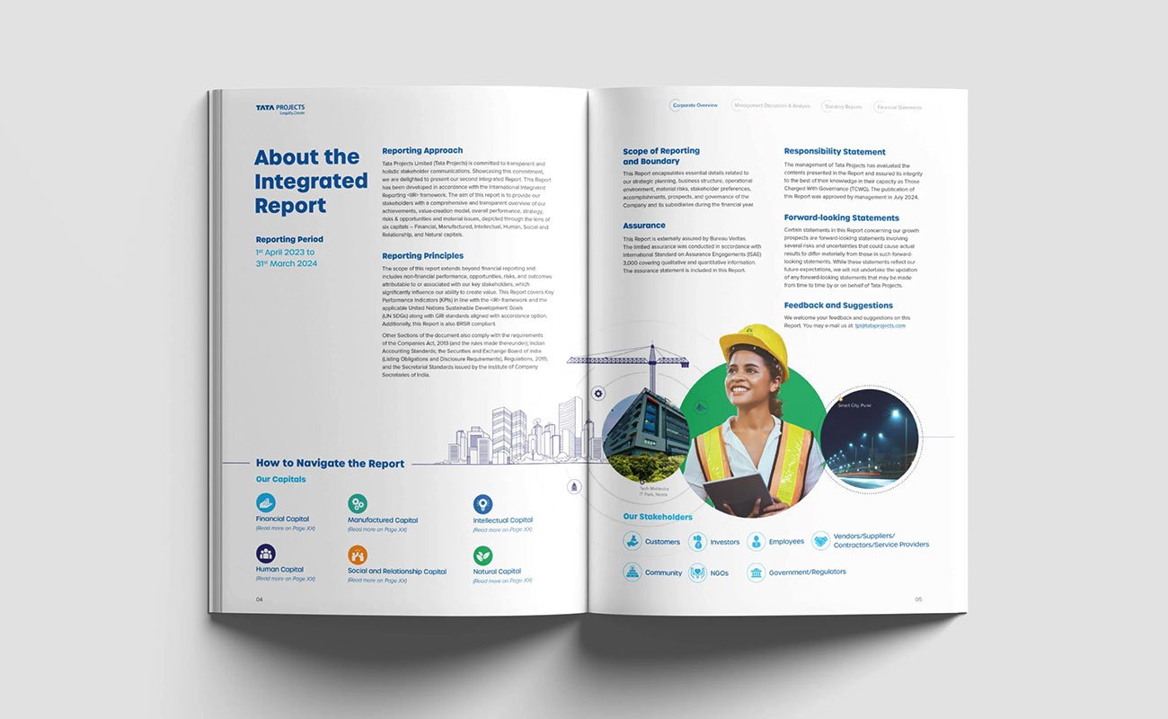
More importantly, the system creates continuity. Page 5 feels visually connected to page 125. Even across hundreds of pages, the report behaves like one designed experience instead of disconnected layouts assembled over time.
Visual Hierarchy That Guides the Reader
What works especially well is the hierarchy. The eye naturally moves from headline → to photography → to metrics → to supporting copy. That flow is intentional.
Even a reader skimming the spread for a few seconds can absorb the key message immediately, while a deeper reader gets the supporting narrative beneath it. The layouts never feel overloaded despite the amount of information being communicated.
The Lesson
Most annual reports confuse branding with a design system.
A real design system is a single visual idea applied consistently across every spread. Tata Projects demonstrates how disciplined visual consistency can transform a long corporate report into a cohesive brand experience.
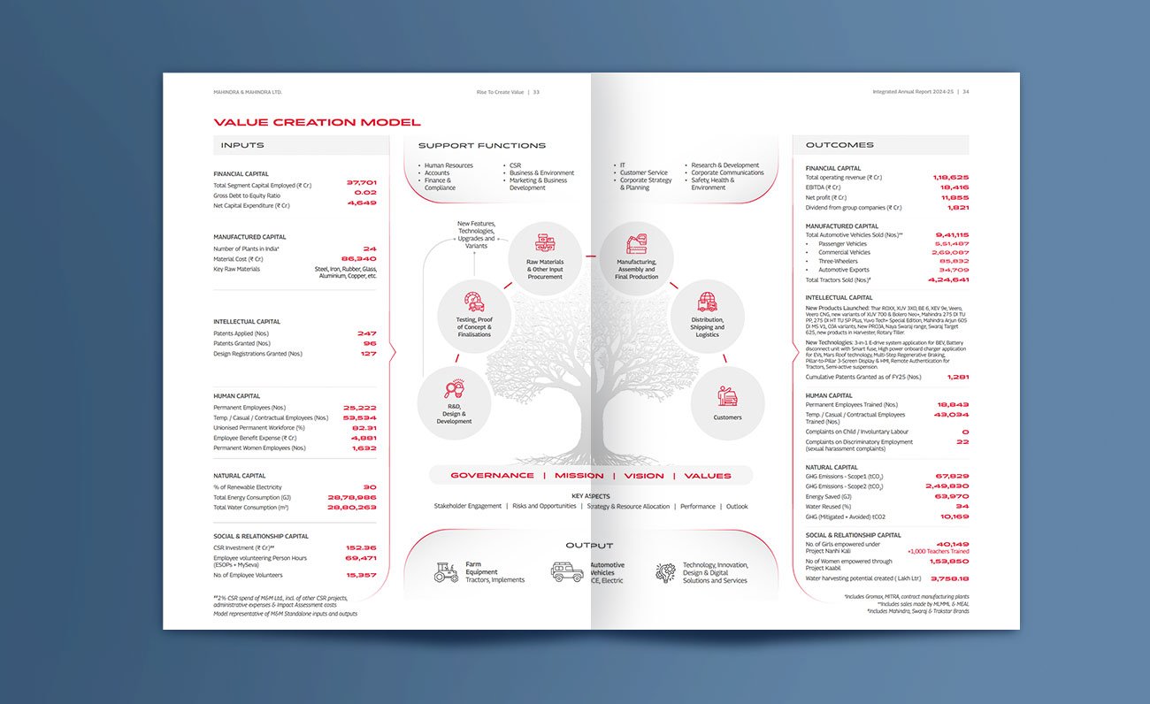
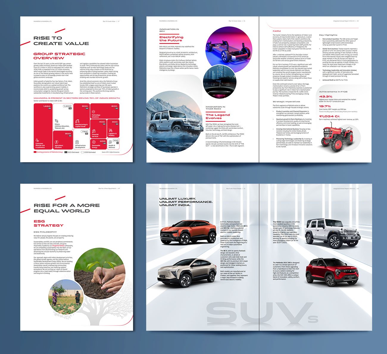
2. Mahindra Group — Design with Conviction
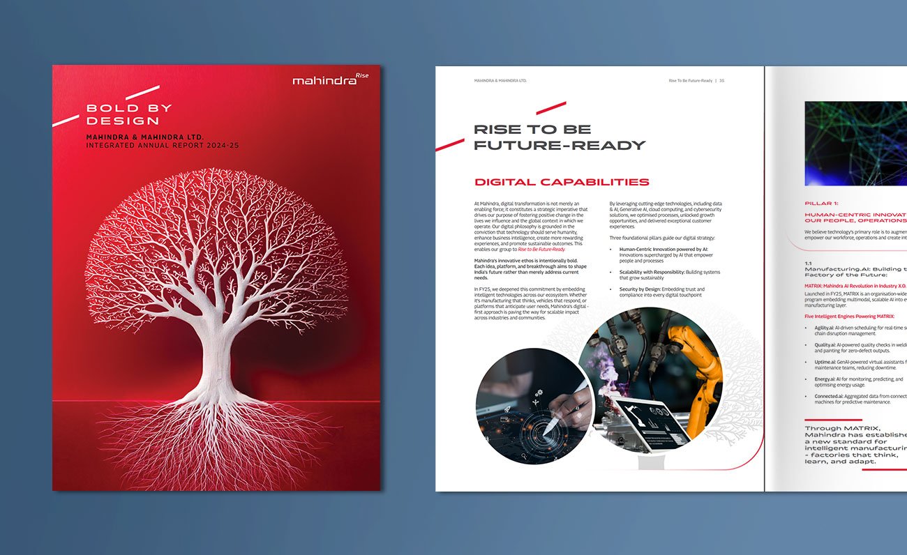
Most annual reports try to balance corporate storytelling with compliance.
Mahindra chooses direction instead.
From the opening cover to the ESG sections, the report operates with unusual visual discipline. A restrained palette, sharp typography, generous white space, and recurring tree-root symbolism create a system that feels intentional rather than assembled.
The “Rise” philosophy is not treated like a slogan.
It becomes the editorial framework of the report itself.
Clear Visual Discipline
The report avoids unnecessary visual noise. Red, white, and grey dominate almost every spread, creating consistency across financials, governance, manufacturing, and ESG sections.
That restraint gives the document confidence.
Symbolism Used with Purpose
The recurring tree and root imagery is one of the strongest aspects of the report. It subtly reinforces ideas of growth, foundation, scale, and long-term value creation without becoming overly decorative.
The visual metaphor carries through the entire narrative.
Structured Corporate Storytelling
Even complex sections like manufacturing capabilities, global footprint, and value creation models feel controlled and readable.
Instead of overwhelming readers with data density, the layouts create hierarchy first — then information.
The Lesson
Many companies mention purpose.
Mahindra operationalizes it.
The best reports are not assembled.
They are directed.
3. IndusInd Bank: Design Rooted in Transformation
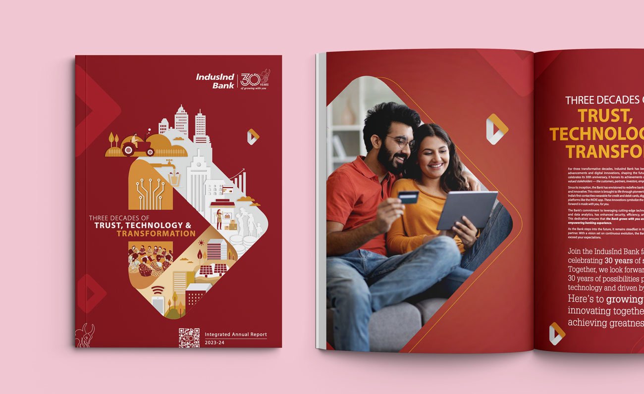
One Core Element Defines the Entire Report
The strongest aspect of the report is how IndusInd Bank builds its entire visual identity around one geometric directional shape. This triangular form is not just a graphic device — it symbolises the report’s core philosophy of T3: Trust, Technology, and Transformation.
From the cover to internal layouts, the shape becomes the foundation of the storytelling system — framing photography, carrying illustrations, supporting infographics, and guiding layouts across sections.
This creates a highly cohesive and memorable reading experience.
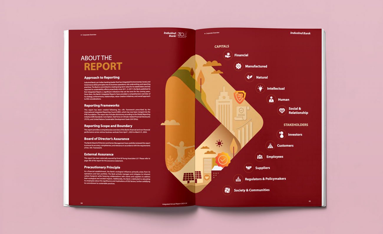
Consistency With Flexibility
What works especially well is how the theme element evolves throughout the report without becoming repetitive. The same visual language adapts naturally across strategy pages, ESG storytelling, leadership communication, and financial sections.
The report maintains consistency while still feeling dynamic and fresh.
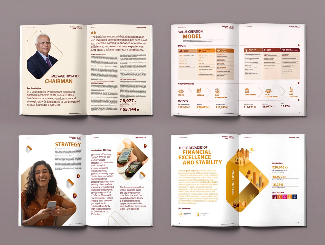
Typography That Feels Editorial and Premium
The typography system is clean, confident, and highly readable. Large bold headlines establish strong hierarchy, while serif typography in strategic sections adds authority and sophistication.
The layouts feel more like a premium editorial publication than a traditional banking report.
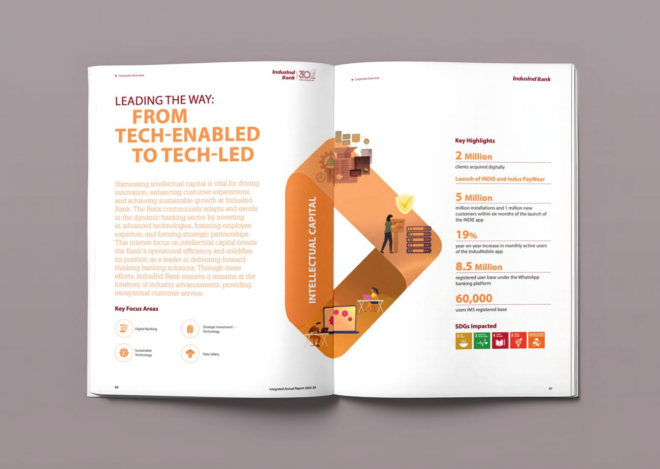
Thoughtful Use of Colour and Layouts
Deep maroon, gold, beige, and light neutral backgrounds help define different sections while maintaining brand continuity. The use of whitespace, structured grids, and balanced composition keeps the report visually clean despite being information-heavy.
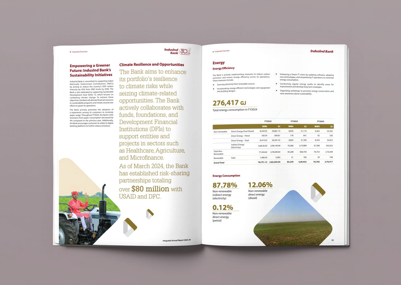
Data-Driven Yet Visually Engaging
Financial highlights, ESG metrics, value creation frameworks, and strategic information are presented with strong hierarchy and clarity. Icons, modular layouts, and clean spacing make the report easy to navigate and comfortable to read.
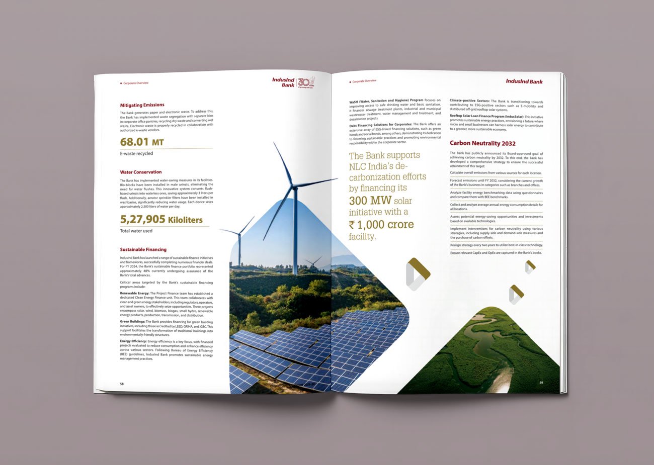
The Lesson
The best annual reports do not rely on multiple design ideas.
They choose one strong visual system and apply it consistently across every page. IndusInd Bank demonstrates how disciplined repetition, structured hierarchy, and cohesive storytelling can transform a corporate report into a powerful brand experience.
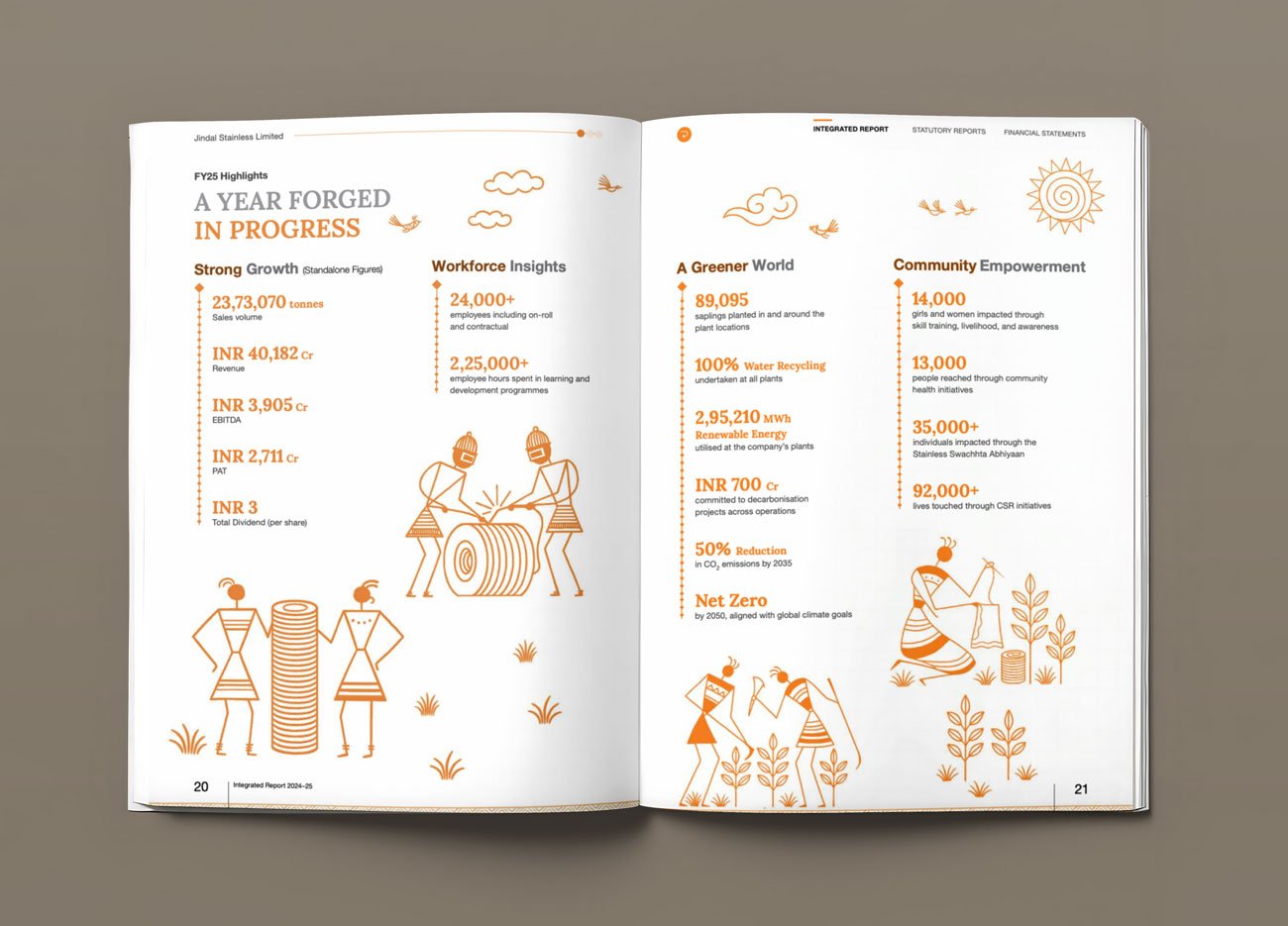
4. Jindal Stainless: Design Forged Through Culture and Industrial Identity
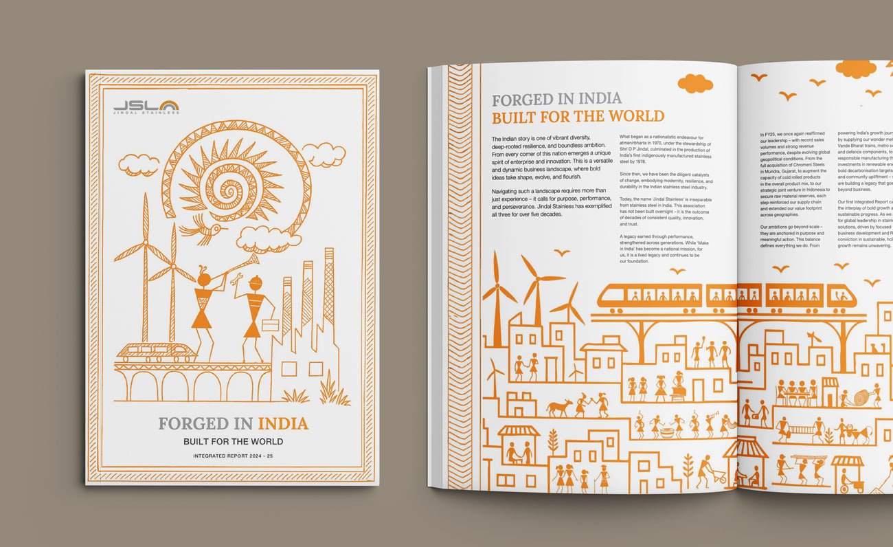
One Cultural Language Shapes the Entire Report
The strongest aspect of the report is how Jindal Stainless builds its visual storytelling around a culturally rooted illustration system inspired by traditional Saura art from Odisha. Instead of relying on generic industrial visuals, the report transforms indigenous art into a strategic design language that connects manufacturing, sustainability, people, and progress.
This creates a report that feels distinctive, authentic, and deeply connected to the company’s manufacturing roots.
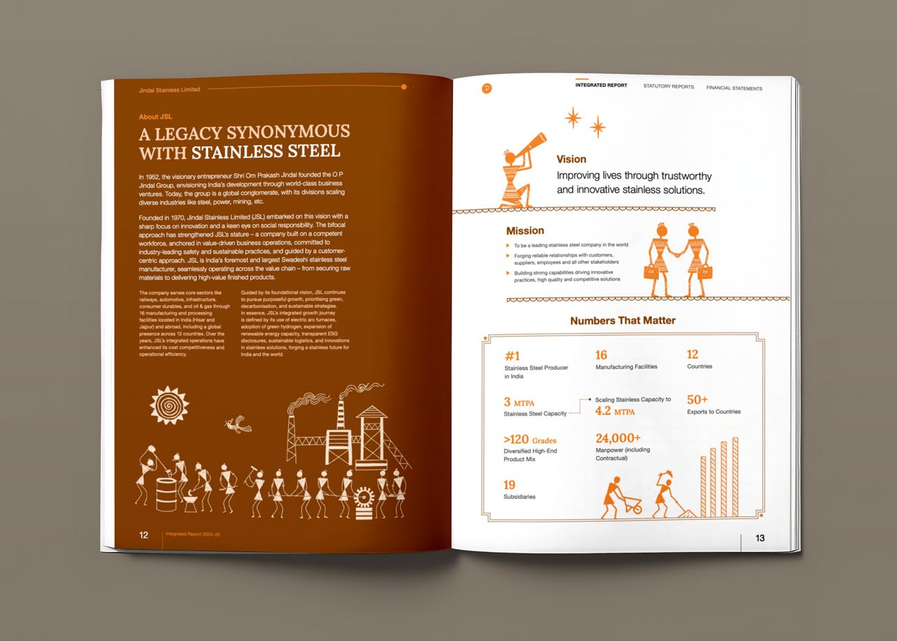
Industrial Storytelling With Human Warmth
What works especially well is the balance between heavy industry and human-centric storytelling. Stainless steel, infrastructure, manufacturing, ESG, and global expansion are visually softened through handcrafted illustrations, earthy colour palettes, and cultural motifs.
The report never feels cold or overly corporate despite being industrial in nature.
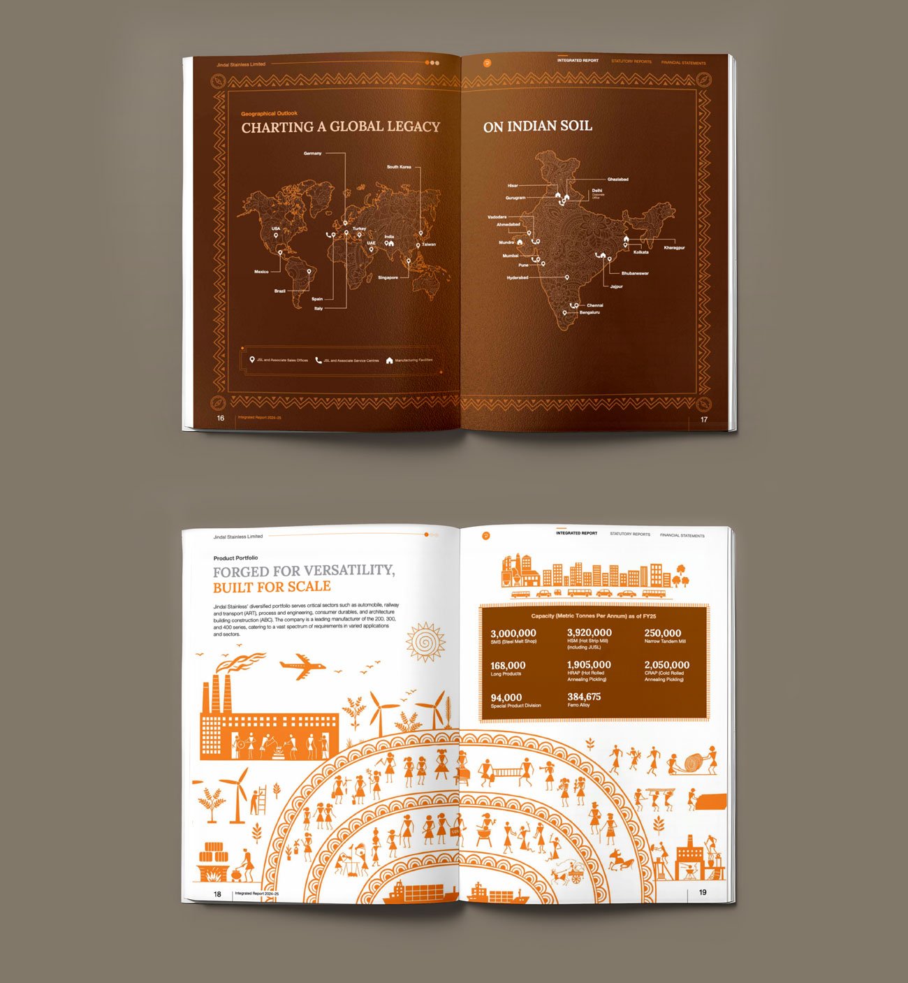
Strong Theme Consistency Across Sections
The illustration language flows consistently from the cover to strategy, ESG, governance, and performance sections. Patterns, icons, textures, and compositions evolve naturally without breaking the visual rhythm of the report.
This disciplined consistency makes the report feel intentionally designed rather than assembled page by page.
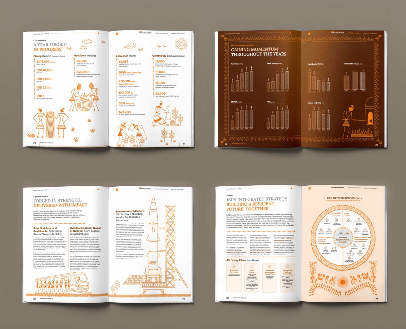
Illustration System Rooted in Culture
One of the strongest aspects of the Jindal Stainless Integrated Report is its culturally inspired illustration style. Instead of relying on generic corporate graphics, the report uses a handcrafted visual language influenced by traditional Indian folk art aesthetics.
The illustrations bring warmth and humanity to an otherwise industrial sector, helping simplify themes like manufacturing, sustainability, infrastructure, and community impact.
What works especially well is the consistency. The same illustration style flows across section openers, infographics, icons, and storytelling elements, creating a cohesive and visually engaging reading experience.
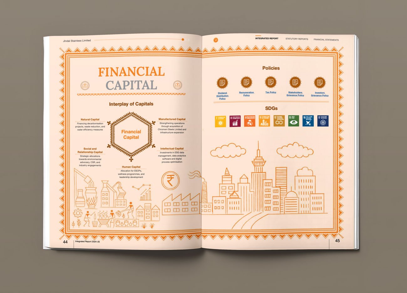
Data-Heavy Information Made Visually Accessible
Financial highlights, sustainability metrics, operational achievements, and governance disclosures are presented with clarity and visual balance. Infographics, icons, and sectional pacing prevent the report from becoming visually exhausting despite its scale and complexity.
The Lesson
The best integrated reports go beyond corporate branding.
They build a visual language that reflects the company’s philosophy, geography, industry, and long-term vision. Jindal Stainless demonstrates how cultural storytelling, disciplined design systems, and strategic consistency can transform an industrial annual report into an emotionally engaging brand experience.
Reports From Our Own Studio
The two reports below are projects from VisualBest. We include them not because they belong on the same shelf as Tata Projects or IndusInd Bank — but because each one taught us something specific about what separates a forgettable report from one that earns attention.
5. Honda India Foundation – Designing Social Impact With Clarity and Emotion
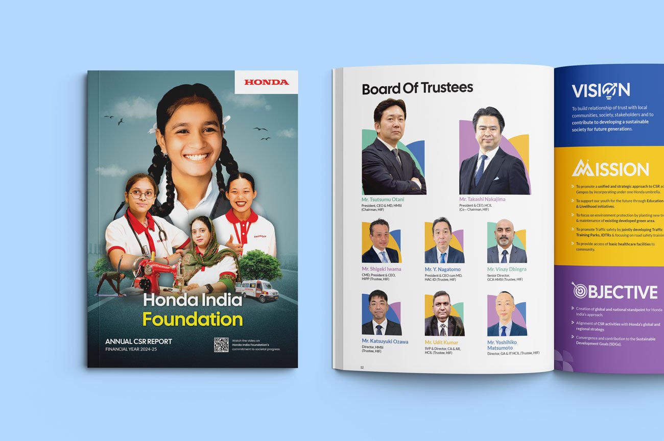
When designing this CSR report at Visual Best, the goal was simple: create a document that feels human first and corporate second. CSR reports often become overly dense and compliance-driven, so we approached this project as a storytelling experience — balancing emotional narratives, structured information, and strong visual accessibility.
Illustration System That Makes the Report Feel Approachable
One of the strongest aspects of the report is its illustration language. Instead of relying only on photography-heavy layouts, we introduced soft vector illustrations, simplified icons, rounded shapes, and visual storytelling elements throughout the report.
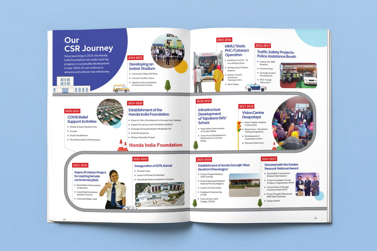
The CSR Journey spread transforms a traditional timeline into a visual storytelling experience. Instead of static year-wise blocks, we designed the layout around a flowing roadway graphic that symbolises progress, continuity, and long-term impact. The road-inspired design language also subtly reinforces Honda’s mobility identity throughout the page.
Colour-Coded Storytelling With Contextual Typography
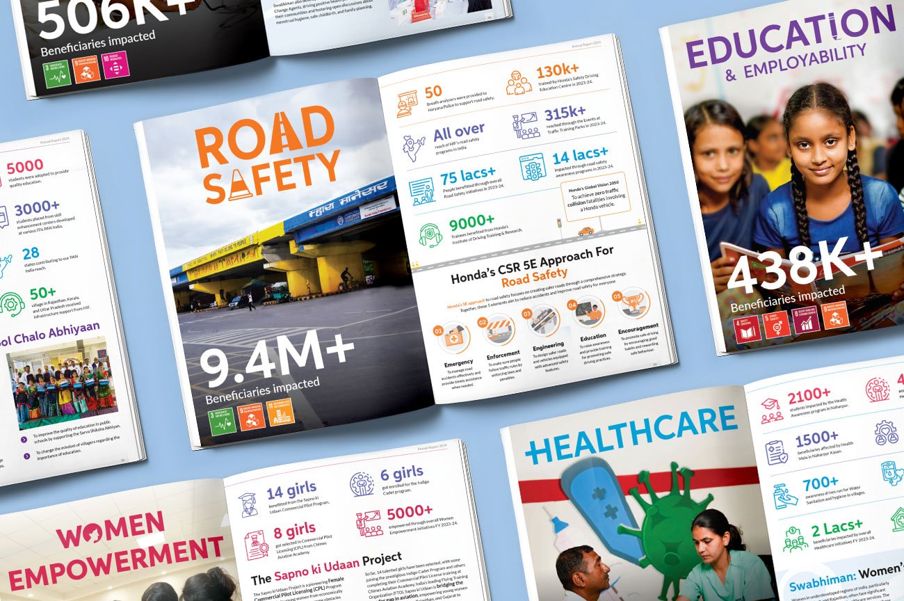
One of the key design decisions was creating a distinct colour identity for every CSR pillar. Orange for Road Safety, blue for Healthcare, purple for Education & Employability, pink for Women Empowerment, and green accents for sustainability-focused initiatives.
To strengthen the storytelling further, contextual icons were integrated directly within the typography system — like the traffic cone inside the “Road Safety” headline. These subtle visual details make each section feel more thematic, recognisable, and engaging.
Together, the colour-coded layouts, bold typography, and integrated iconography create a cohesive navigation system that makes the long-format report visually dynamic and easy to explore.
Infographics Designed for Non-Technical Readers
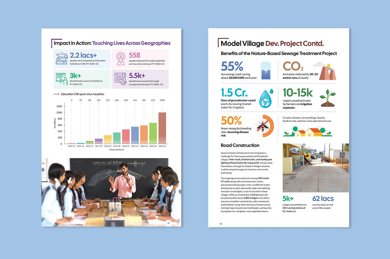
The report contains large volumes of impact data, timelines, statistics, maps, and program information. Instead of presenting this in a traditional CSR format, we integrated infographics directly into the storytelling system using the same illustration language, typography hierarchy, and colour palette.
The goal was not just to present numbers — but to make the information easier to understand and visually memorable.
The Lesson
Great CSR reports are not built only around information.
They are built around accessibility, emotion, and clarity. This project demonstrates how illustration systems, structured colour hierarchy, and human-centric storytelling can transform a large CSR document into a more engaging and impactful brand experience.
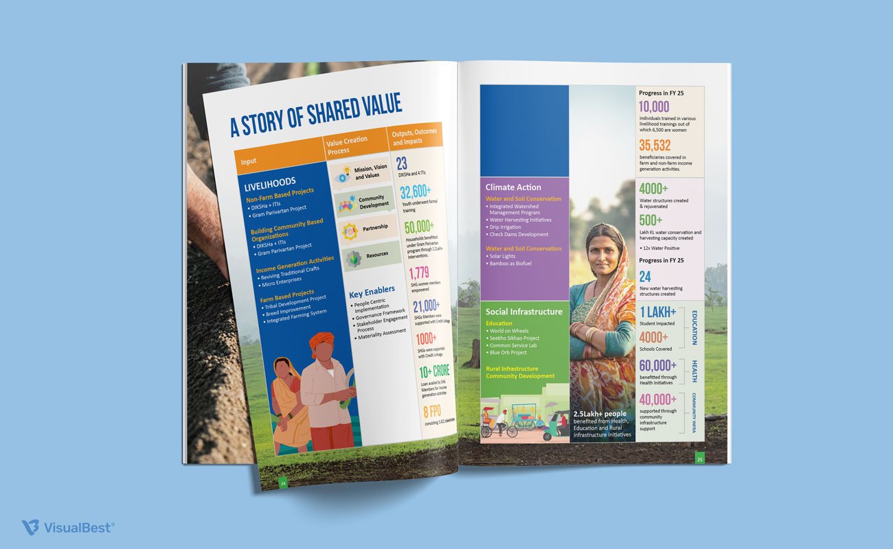
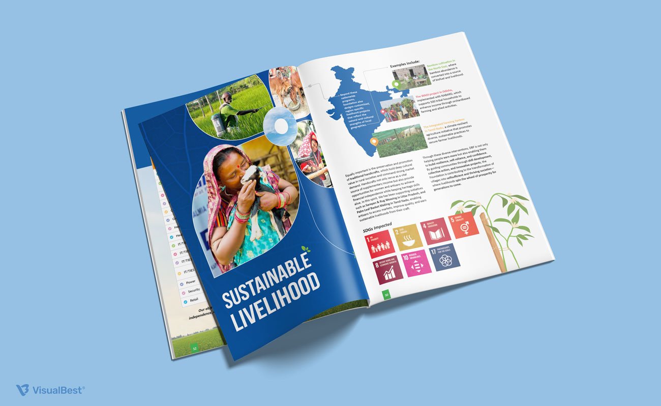
6. Dalmia Bharat Foundation: Designing Impact Through Human Stories
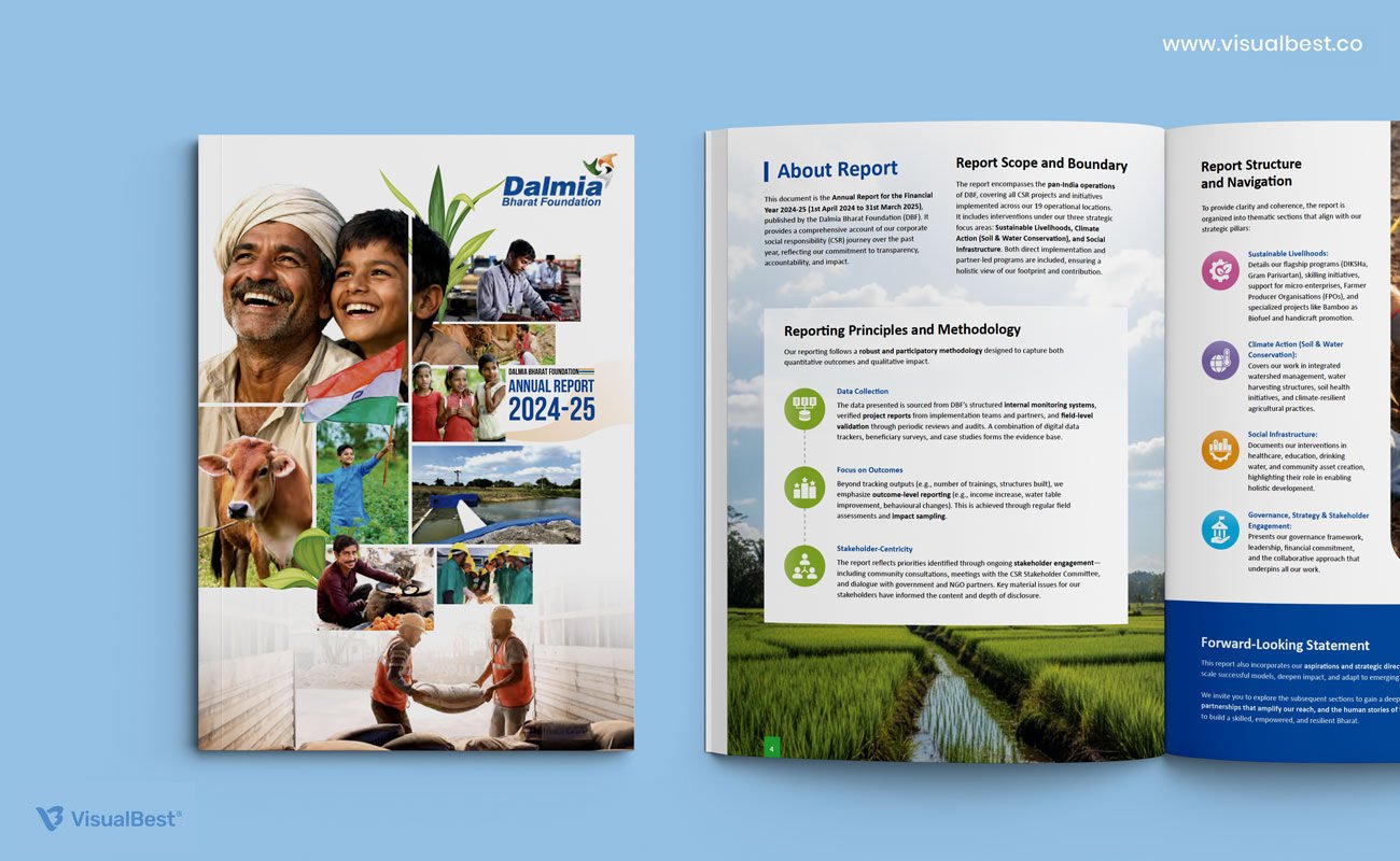
Many CSR reports become overloaded with program data, statistics, and operational language. For the Dalmia Bharat Foundation Annual Report 2024–25, our goal was different — to make impact feel human, grounded, and emotionally connected to the communities behind the numbers.
A Visual Language Rooted in Real India
One of the strongest aspects of the report is its visual authenticity. Instead of relying on abstract corporate graphics, the design uses real community imagery, rural landscapes, livelihood ecosystems, and beneficiary-led storytelling to create emotional connection throughout the report.
The cover itself establishes this direction immediately through a collage-style composition that combines people, agriculture, skilling, infrastructure, and grassroots development into one cohesive narrative.
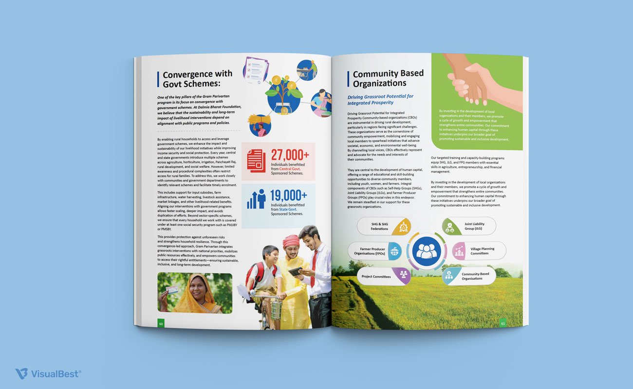
Structured Yet Highly Accessible Layouts
Despite containing extensive program information, the report remains highly readable because of its structured editorial system. Large section headers, modular grids, clean spacing, and colour-coded infographics help simplify dense content into digestible narratives.
Each spread was designed to balance storytelling and reporting — ensuring the report feels informative without becoming visually exhausting.
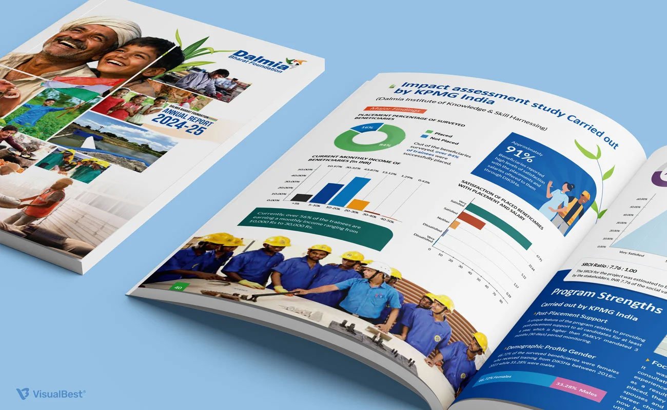
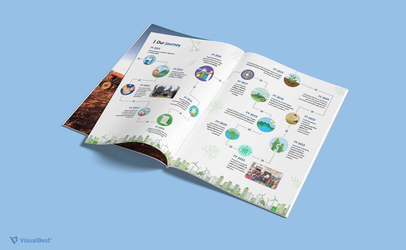
Infographics That Simplify Complex Impact
A major design focus was transforming impact assessment data into visual storytelling. Charts, timelines, maps, SDG indicators, and value-creation frameworks were designed with clarity-first thinking, helping readers quickly understand scale, outcomes, and program reach.
The layouts avoid “spreadsheet-style reporting” and instead create a guided reading experience.
Illustration and Iconography That Support the Narrative
Custom icons, simplified illustrations, and soft vector elements were integrated across the report to make technical and development-focused sections feel approachable. From journey timelines to community ecosystem diagrams, these visuals help explain complex relationships without overwhelming the reader.
The visual system feels educational, warm, and purpose-driven rather than overly corporate.
Strong Use of Colour and Section Identity
The report uses blue and green as its primary foundation — reinforcing themes of sustainability, trust, growth, and rural development. Supporting accent colours help distinguish healthcare, livelihoods, education, governance, and climate-action sections while maintaining overall consistency.
This colour segmentation improves navigation significantly across the long-format report.
The Lesson
Good CSR reports should not only communicate activities.
They should communicate people, progress, and purpose.
For the Dalmia Bharat Foundation Annual Report 2024–25, the design approach focused on making impact measurable, readable, and emotionally relatable at the same time — transforming complex development reporting into a more human-centered storytelling experience.
Global Benchmarks Worth Studying
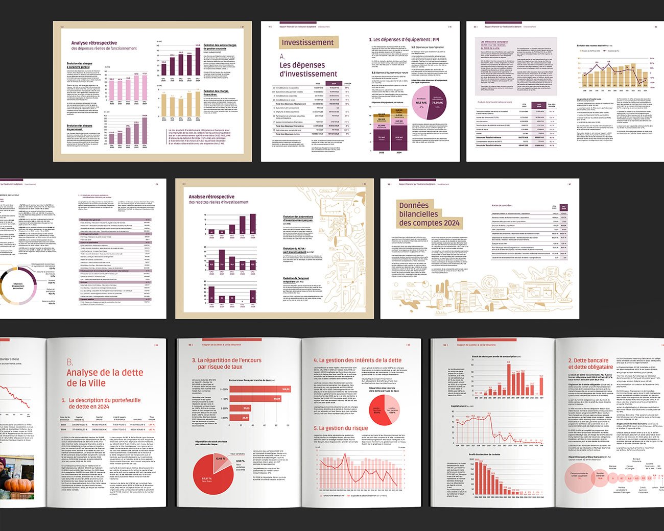
7. City of Lyon — Making Public Finance Feel Understandable
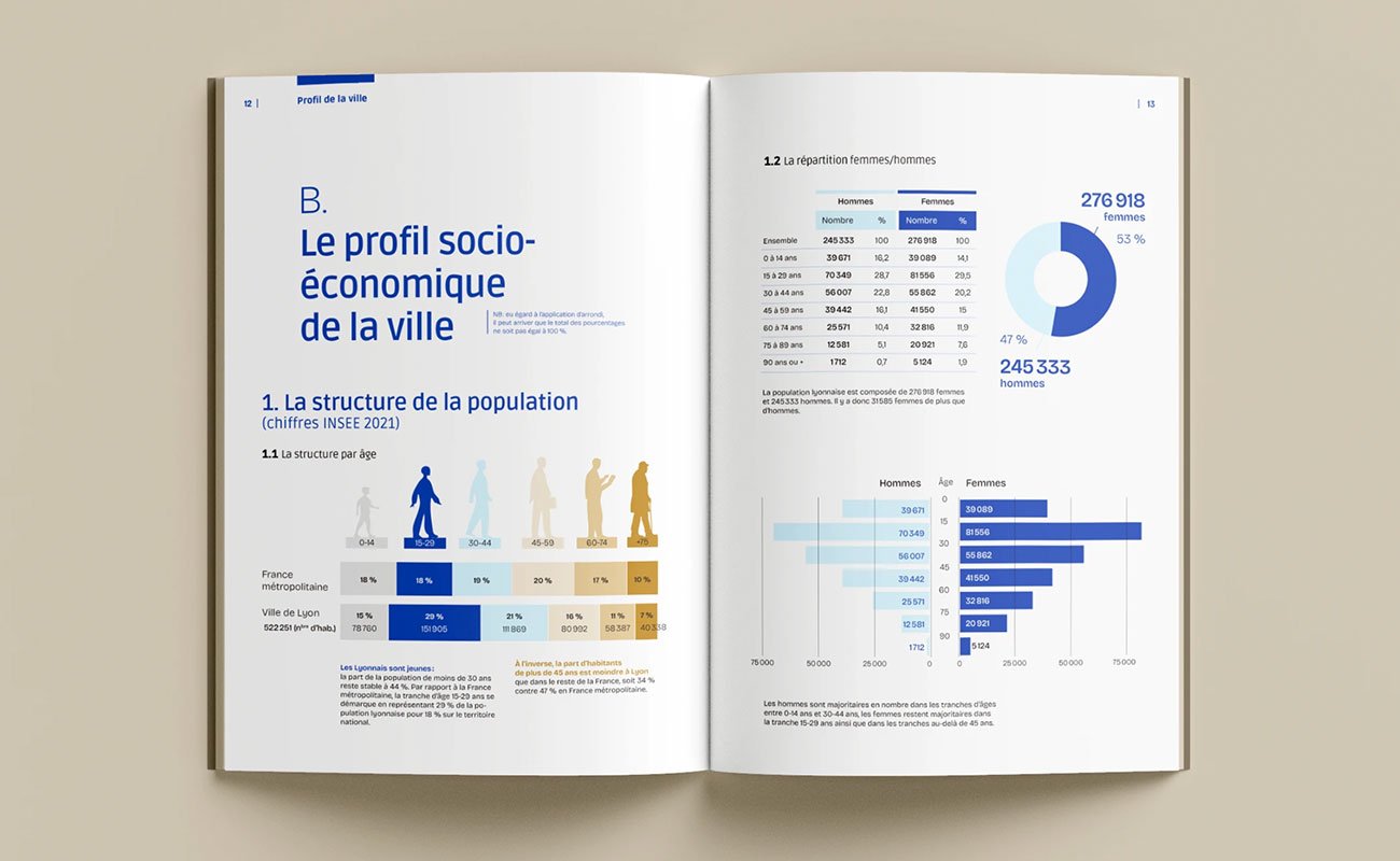
Most government financial reports are written like administrative archives — dense tables, endless paragraphs, and layouts that assume the reader already understands public finance. The City of Lyon’s 2024 Financial Report takes a very different approach.
Instead of treating design as decoration, the report treats design as a navigation tool. The report is beautifully crafted by designer Jeanne Schelle (France).
Information Design Built for Citizens, Not Analysts
What immediately stands out is the accessibility of the data presentation. Charts, diagrams, icons, colour coding, and editorial layouts work together to simplify highly technical financial information without oversimplifying it.
Every chapter has its own visual identity, making the document easier to navigate even at a glance. Education, debt analysis, public policy, mobility, budgeting — each section feels distinct while still belonging to the same system.
That matters in a report this dense. Readers never feel visually lost.
Editorial Layouts Instead of Spreadsheet Thinking
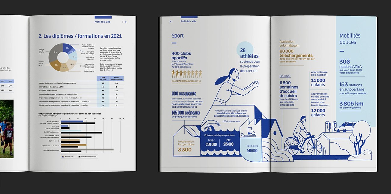
Many public-sector reports fall into what I call “spreadsheet design” — pages overloaded with tables and no reading rhythm. Lyon avoids that problem by treating the document more like an editorial publication.
Large typography creates breathing room. Data visualisations are given proper hierarchy. Illustrations soften technical sections without making them feel childish. Even complex financial pages remain readable because the layouts understand pacing.
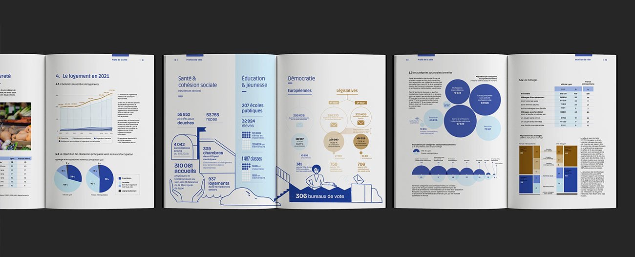
You can tell the design team thought carefully about reader fatigue.
A Strong Example of Civic Communication Design
The most impressive part of the report is not the aesthetics. It is the clarity.
The design acknowledges an important reality: public financial reports are ultimately communication tools, not accounting exercises. Citizens should be able to understand where money is being spent without needing financial expertise.
That mindset is what elevates this project beyond a typical municipal report.
The Lesson
Good information design is not about making reports look modern.
It is about reducing cognitive friction.
The City of Lyon report demonstrates how thoughtful hierarchy, structured navigation, and disciplined data visualisation can transform a complex financial document into something genuinely readable.
8. Warsaw Road Authority (ZDM) — Turning Urban Infrastructure Into Visual Storytelling
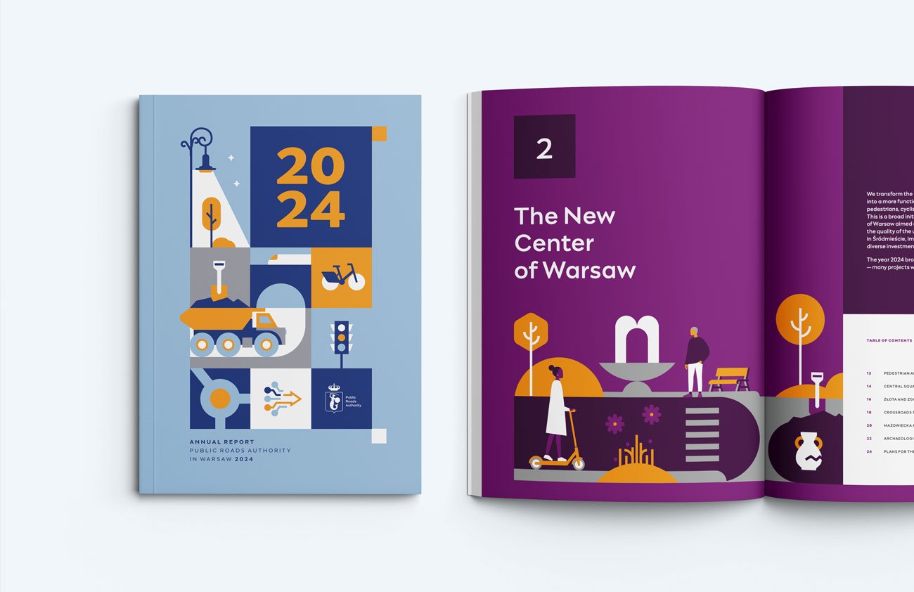
Most transportation and infrastructure reports tend to feel purely operational — heavy on statistics, project updates, and engineering documentation. The Warsaw Road Authority’s 2024 Annual Report takes a far more thoughtful approach.
Instead of presenting mobility data as administrative reporting, the document treats urban infrastructure as a human-centered public experience. The result feels closer to a modern city magazine than a technical government report.
Illustration Style and Colour System That Feel Instantly Recognisable
One of the strongest aspects of the report is its illustration language. The document uses playful isometric-style urban illustrations combined with simplified city graphics, maps, and mobility icons to make technical information feel approachable and engaging.
The illustration system creates a sense of movement throughout the report — perfectly aligned with themes like transportation, public mobility, cycling, roads, and urban flow.
The colour palette is equally effective. Bright yellows, blues, greens, reds, and soft neutral backgrounds give each section a distinct visual identity while maintaining overall consistency.
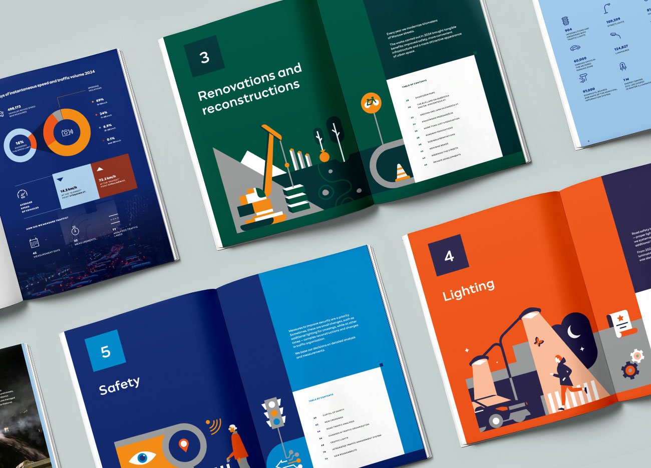
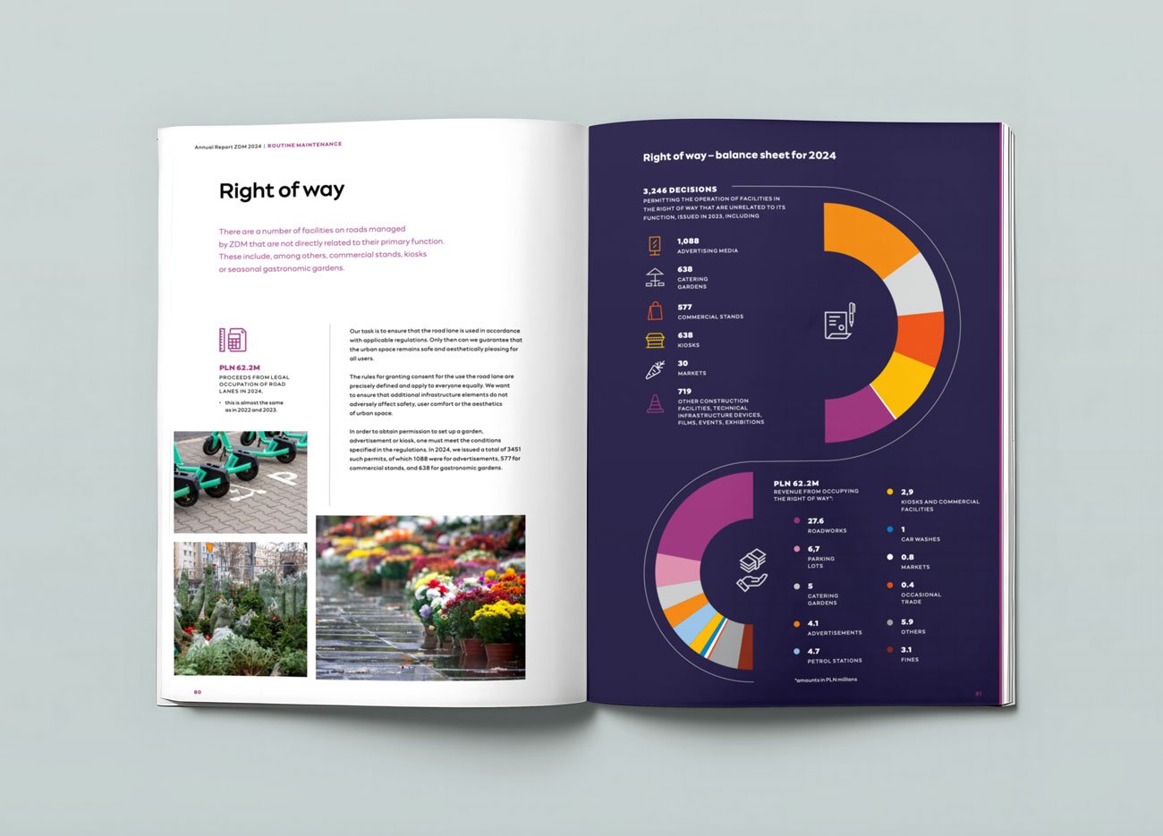
Information Design That Makes Mobility Data Accessible
What immediately stands out is the clarity of the visual communication. Maps, icons, timelines, diagrams, and infographic systems are used extensively to simplify complex transportation data and urban planning information.
Road safety, cycling infrastructure, pedestrian mobility, public transport integration, and urban development projects are all organised with strong hierarchy and pacing.
One particularly effective detail is the use of contrast spreads throughout the report. Bright editorial pages are often paired with dark, data-heavy infographic layouts, creating strong visual rhythm and helping key statistics stand out immediately. This contrast prevents the report from feeling monotonous while also improving readability and section separation.
The Lesson
Good civic communication design is not about making infrastructure look stylish.
It is about making complex urban information feel understandable, navigable, and human.
The Warsaw Road Authority report demonstrates how illustration systems, colour storytelling, and structured information design can transform technical reporting into an engaging public communication experience.
Patterns Across the Best Annual Reports of 2026
After studying hundreds of reports, certain patterns appear consistently across the strongest examples.
They Commit Early
Strong reports establish narrative direction within the first few spreads.
Weak reports spend 20 pages warming up.
Attention does not work that way anymore.
They Prioritize Reading Experience
The best reports understand that readability, pacing, and structure are strategic decisions.
Not formatting decisions.
They Use Fewer Design Ideas — Better
Mediocre reports often look visually inconsistent because too many concepts compete simultaneously.
The best reports usually operate through one typography system, one chart language, one visual rhythm, and one narrative structure.
Discipline creates sophistication.
They Write Like Real Humans
Corporate jargon destroys trust faster than companies realize.
Strong reports communicate with clarity, specificity, and editorial confidence.
The writing sounds accountable.
Not manufactured.
Annual Report Design Mistakes Still Common in 2026
Despite all the progress, most reports still repeat the same problems.
Generic Stock Photography
If the imagery could appear inside any competitor’s report, it weakens differentiation immediately.
Authenticity matters more than polish now.
The “Everything Matters” Layout
When every page screams equally loudly, hierarchy disappears.
Readers stop engaging.
Good reports understand pacing.
ESG as Cosmetic Communication
Stakeholders can identify performative sustainability language instantly now.
If ESG exists only visually — but not strategically — credibility drops.
Designing for Internal Teams Instead of Readers
Many reports become bloated because every department wants representation.
The result:
too many pages, too much repetition, and weak narrative control.
The best reports protect the reader experience aggressively.
Treating Cost as the Primary Filter
Companies that select an annual report partner purely on price almost always pay twice — once for the design, and again for the rework.
Annual report design is a category where the cost of getting it wrong is significantly higher than the cost of getting it right. (We have written separately about what annual report design actually costs and why useful reading before any agency conversation.)
What Separates Reports That Get Read From Reports That Get Filed
After all of this, the underlying principle is simple.
The reports that get read are the ones where someone — usually a small group of people — refused to let the document become a formality.
They argued about the thesis. They protected the editorial. They cut sections that did not earn their place. They chose a designer who understood that the report is strategy, not styling.
That last decision is often the difference.
The companies producing the best reports of 2026 are not necessarily the ones with the largest budgets. They are the ones who treat the annual report as a brand discipline — and bring in a partner who shares that mindset early in the process, not after the brief has already been compromised.
(If you are evaluating partners, our guide to how to choose an annual report design agency walks through the questions worth asking before any contract is signed.)
Working With Visual Best
We design annual reports, integrated reports, ESG reports, and sustainability reports for listed companies, NBFCs, and large private enterprises across India.
Our work tends to be a fit when:
– The leadership team treats the annual report as a strategic asset, not a compliance exercise.
– The brief allows for real editorial thinking — not just template application.
– The company values a partner who pushes back when something is not working.
If that sounds like the kind of process you want for your next report, we would be glad to talk.
Book a 30-minute discovery call →
A discovery call is exactly what it sounds like. No pitch deck. No pressure. We listen to what you are trying to build, ask the questions that matter, and tell you honestly whether we are the right partner — or whether someone else is.
Final Thoughts
The best annual report design examples of 2026 reveal something important:
Corporate reporting is evolving into a brand discipline.
Not just a compliance function.
The companies leading this shift understand that annual reports now influence:
investor perception, employer branding, media narrative, ESG credibility, and long-term reputation.
And increasingly, stakeholders judge companies not only by what they report —
but by how clearly they communicate it.
That difference is becoming impossible to ignore.
Frequently Asked Questions
1. What makes an annual report design “good” in 2026?
A good annual report in 2026 does five things at once: it has a clear point of view, treats design as navigation, uses data as editorial content, feels native to the brand, and is built for digital reading behavior. Reports that succeed on all five are the ones that get read and remembered.
2. How long should an annual report be?
There is no universal answer, but the best reports are shorter than they could be. Indian listed companies often produce reports between 200 and 400 pages because of regulatory requirements — but the narrative section that most stakeholders actually read should rarely exceed 60-80 pages.
3. Should an annual report be designed for print or digital first?
Digital first. Most reports today are read on laptops and phones, not in printed form. Designs that begin in print and “adapt” to digital almost always lose information, hierarchy, and engagement in the translation.
4. How early should we start designing the annual report?
For a listed company, work should begin four to six months before the publication date. The strategic and editorial decisions take longer than the design execution — and rushing those is what produces forgettable reports.
5. What is the difference between an annual report and an integrated report?
An annual report focuses primarily on financial performance and statutory disclosures. An integrated report (per the IIRC framework) connects financial performance to the broader capitals — manufactured, human, intellectual, social, and natural. Most large Indian companies are now moving toward integrated reporting.
6. How much does annual report design cost in India?
Costs vary significantly based on length, complexity, and the level of editorial involvement. We have written a detailed breakdown of what annual report design actually costs in India for companies trying to plan a budget realistically.