Presentation Design
Best Corporate Presentation Design Examples and Ideas in 2026: What Actually Makes a Deck Work
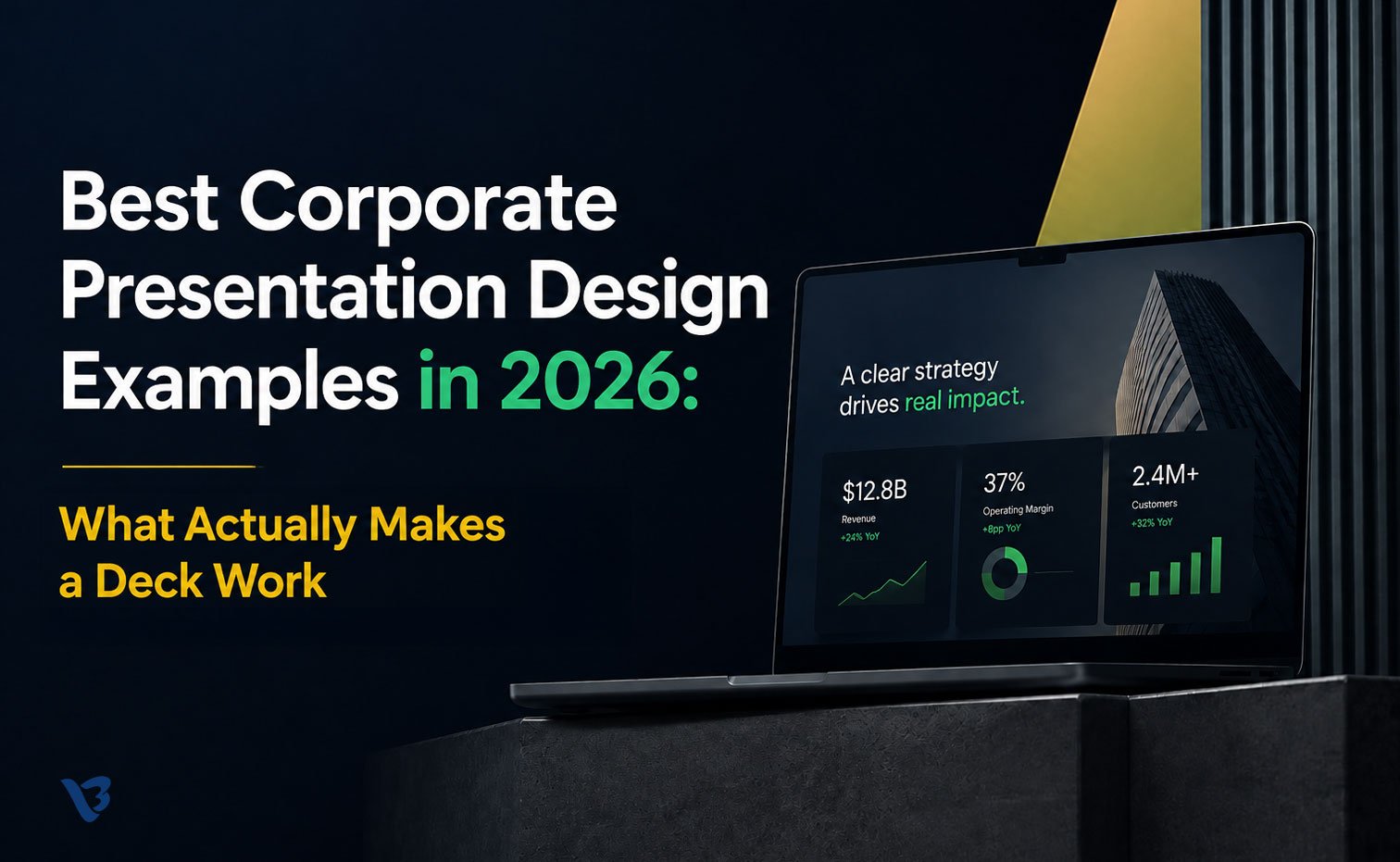
The most famous corporate deck of the last twenty years had ugly clip-art icons, three colors, and slides a first-year designer would redo today.
It raised $600,000 from Sequoia and helped build an $80 billion company.
The Airbnb deck wins every “best presentation examples” list on the internet — and almost every list misunderstands why. People bookmark it for the look. Investors funded it for the logic. That gap, between what looks impressive and what actually works, is the single most expensive misunderstanding in corporate presentations.
This guide is about closing that gap. We’ll walk through the corporate decks worth studying in 2026, the 2026 design trends actually worth adopting, and — more importantly — the principles underneath them that don’t expire when the trend cycle turns. Because the goal was never a beautiful deck. It was a deck that did its job.
First, a definition worth getting right
“Corporate presentation” is a lazy catch-all. The best examples are wildly different depending on the job, and copying the wrong archetype is how good companies end up with decks that misfire.
Four jobs, four different design logics:
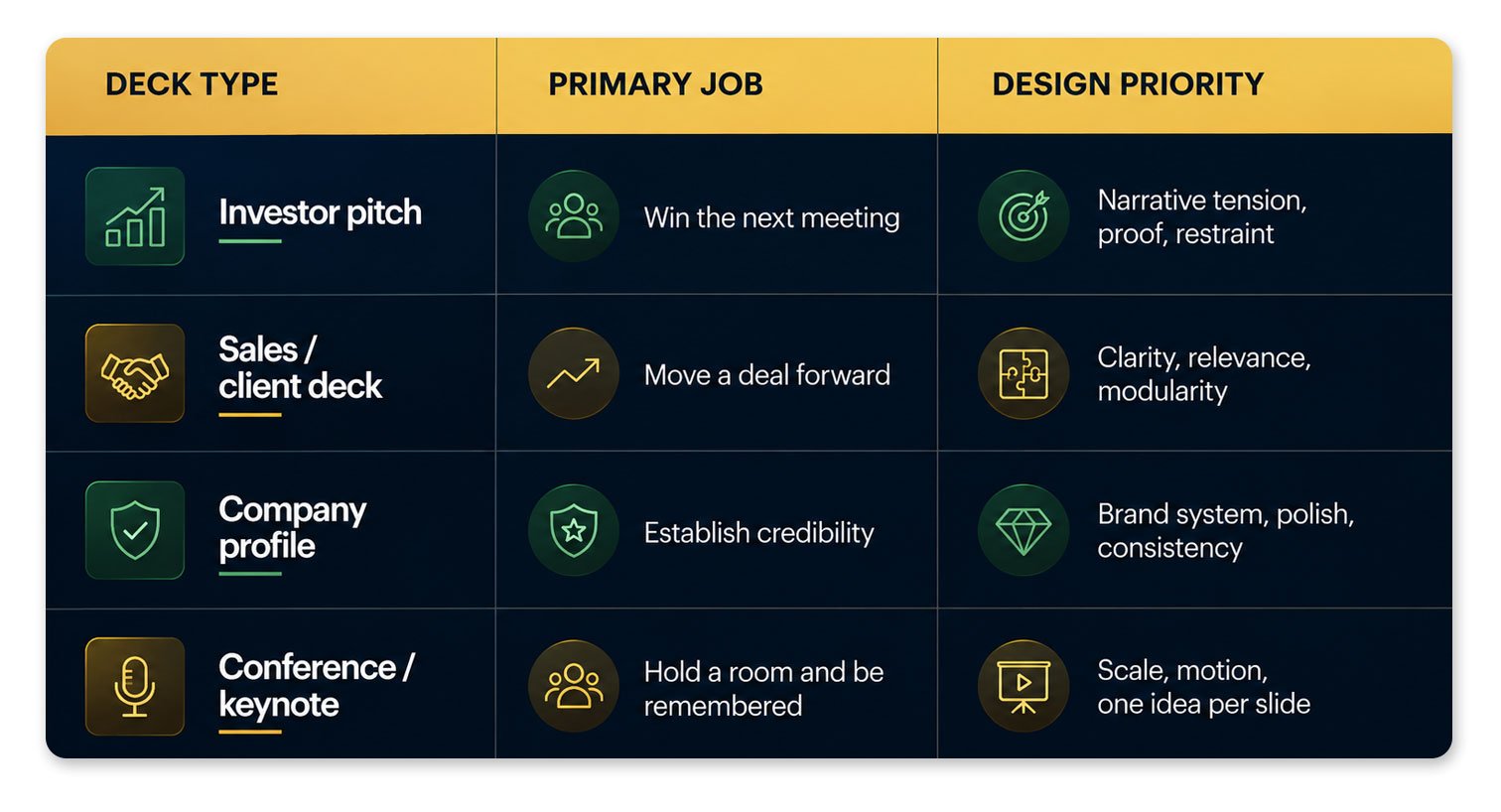
A pitch deck that looks like a corporate profile is too safe to fund. A keynote that looks like a sales deck dies on a large screen. The “best” examples below are best for their job — that’s the lens that matters.
The examples and trends worth studying in 2026
We’ve chosen these by what they teach, not by how they photograph. Every one is publicly viewable — links included — so you can study the actual slides, not our description of them.
For each, we name the single parameter that makes it a best-in-class example, the kind of deck it is, and the one thing worth stealing. The question is never “is it pretty?” It’s “what decision did this design make easy?”
How to read these examples: Don’t copy the look. Most of these decks are over a decade old and would be redesigned today. Copy the thinking — the parameter we flag for each is the transferable lesson. The pixels are disposable; the logic isn’t.
1. Airbnb seed deck — best example of ruthless clarity
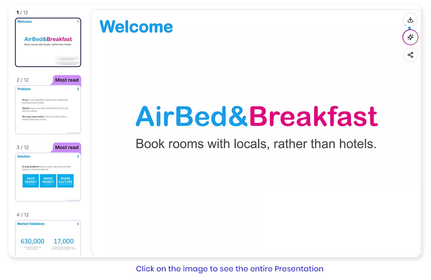
Type: Investor pitch (seed) · Raised: $600K from Sequoia · Parameter: clarity of argument
The most-studied startup deck in history is also the most misread. It’s not a design showpiece, and studying it as one misses the point entirely.
What it actually did well: the opening slide stated the offering in a single plain sentence — “Book rooms with locals, rather than hotels” — no jargon, business understood in seconds. Every slide carried one focused signal; the strength came from what the team chose to emphasise, not from complex design. The market slide used three numbers instead of dense analysis. The closing slide left a clean, memorable impression rather than clutter.
The lesson: these slides weren’t designed as beautiful objects, they were designed as arguments — each one a step in a logical proof that the business would work. Design served the argument; it didn’t replace it.
What to steal: one message per slide, plain language over clever language, the discipline to cut anything that doesn’t advance the proof.
🔗 Review it: CB Insights — Airbnb & 28 other unicorn decks · Slidebean’s slide-by-slide teardown
2. A satellite-sector strategy deck — best example of a deck built to shift a decision
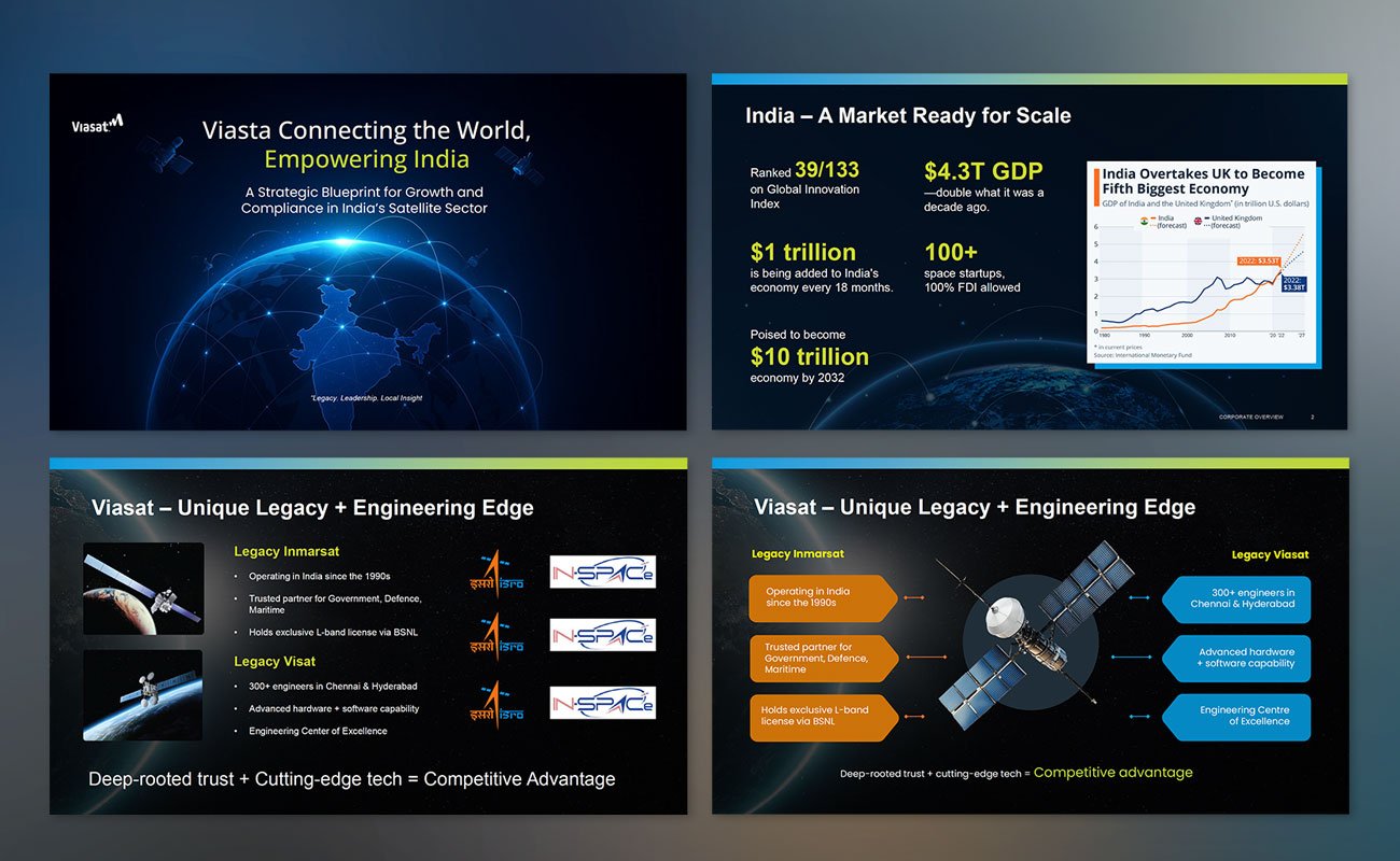
Type: Internal strategy / investment case · Built by: Visual Best · Parameter: narrative engineered to move the room
This is one of ours — built for a global satellite company entering the India market. The brief wasn’t “make slides look good.” It was “convince a global organisation to treat India as a growth engine, not a flyover zone.”
What makes it a best example: the deck is structured as an argument that builds, not a set of standalone pages. It opens by establishing the size of the prize (India’s economic trajectory), establishes credibility (legacy plus a 300-engineer base), then turns the screw — the regulatory maze, the L-band bottleneck, and a sharp risk line, “one compliance slip = Starlink-type shutdown risk,” that makes inaction feel dangerous. Only then does it lay out the roadmap and the ask. By the closing slide — “India isn’t the future, it’s the present” — the decision feels inevitable rather than requested. The visual system carries it: a consistent deep-space palette, lime accents reserved for the numbers and lines that matter, and one idea per slide throughout.
What to steal: sequence is persuasion. Establish the prize, prove you can capture it, raise the cost of doing nothing, then ask. A deck that builds tension closes; a deck that just lists information doesn’t.
🔗 Review it: See the deck in our portfolio
3. Uber (UberCab) seed deck — best example of a credible, narrow market
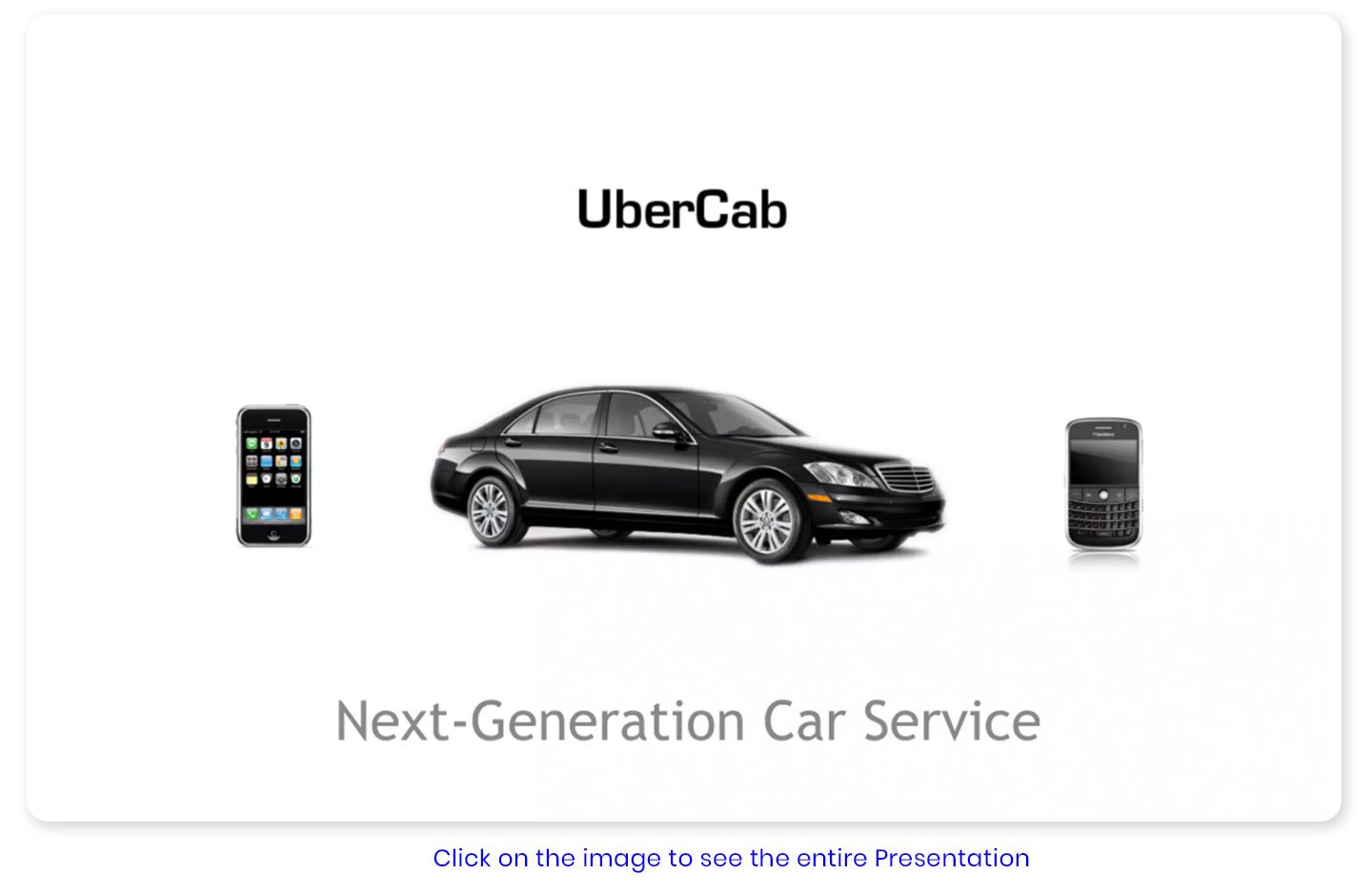
Type: Investor pitch (seed) · Raised: ~$200K initial · Parameter: specificity over grandeur
Uber’s original seed deck, built before wide launch when the company was still “UberCab,” made a single tight argument: black-car services exist, they’re expensive and hard to book, smartphones change the equation, and the market is global.
What makes it a best example: it framed the market not as “transportation” but as black-car and taxi spend in specific cities — a narrower, more credible total addressable market than a sweeping claim would have been. It paired that with an unusually strong team slide and a clear use-of-funds slide showing exactly what the capital would buy. Notably, the deck is almost entirely unstyled — pure content, no flashy graphics — and it worked precisely because the corporate presentation design idea was that clear.
What to steal: a specific, defensible market slice beats a vague enormous one. Investors already know big markets exist — show them which slice you take first.
🔗 Review it: Failory — the Uber deck breakdown · PitchGrade analysis
4. LinkedIn Series B deck — best example of narrative timing

Type: Investor pitch (growth) · Raised: $10M Series B · Parameter: making the moment feel inevitable
Reid Hoffman’s LinkedIn Series B deck is a masterclass in framing why now. Rather than leaning on aesthetics, it built the case for network effects and timing — positioning the professional network as the logical next wave after consumer social networks had proven the model.
What makes it a best example: it’s long, analytical, and unapologetically argument-driven — Hoffman himself has published an annotated version explaining the reasoning behind each slide, which makes it one of the most instructive decks a founder can study. It shows that a growth-stage deck earns the right to be denser than a seed deck, as long as every slide advances the thesis.
What to steal: match deck density to stage. Seed decks win on simplicity; growth decks win on rigour. Know which game you’re playing.
🔗 Review it: Reid Hoffman’s annotated LinkedIn Series B deck · Papermark — greatest decks analysis
5. Spotify early deck — best example of one-idea-per-slide at scale
Type: Investor pitch · Parameter: visual restraint as a system
Spotify’s early deck runs long — around 70 slides — but most carry a single image, phrase, or sentence. The effect is a deck you move through quickly, where each slide lands one point and gets out of the way. A dark background with crisp white text gives it a cohesive, premium feel without decoration for its own sake.
What makes it a best example: it proves slide count is the wrong metric. Seventy focused slides can be faster to absorb than fifteen crowded ones. It also nails the traction-and-stats moment that investors respond to, embedded in a clear product-and-team story.
What to steal: if a slide has more than one idea, split it into two. More slides with less on each almost always reads faster than fewer dense ones.
🔗 Review it: SlidePeak — Spotify deck breakdown · browse it alongside others on bestpitchdeck.com’s unicorn gallery
6. The data-story board deck — best example of narrative over numbers
Type: Board / investor update · Parameter: insight in the title, evidence in the chart
This one’s an archetype rather than a single public deck — board decks are rarely published — but it’s the deck type where the 2026 standard has shifted most sharply, so it earns a place.
The best board and investor-update decks don’t dump data, they frame it. A chart that shows a number is forgettable; a chart that shows a number and what it means changes the conversation. Pasting a spreadsheet screenshot is now treated as a presentation failure — the move is toward data simplification, clean charts that surface only the point that matters. The line between amateur and expert increasingly comes down to one skill: starting with the message, not the chart.
What to steal: never put a chart on a slide without answering “so what?” in the title. The headline is the insight; the chart is just the proof.
🔗 Reference for the principle: SlideEgg — 2026 data-storytelling trends
Where to browse more (curated galleries)
If you want to study decks at volume rather than one at a time, these collections are the most useful starting points — each lets you view real decks from companies that went on to raise or scale:
🔸 CB Insights — 29 unicorn pitch decks — the cleanest curated set, including LinkedIn, Airbnb, and BuzzFeed at pre-revenue stage.
🔸 bestpitchdeck.com — unicorn gallery — viewable decks from Uber, LinkedIn, Tesla, YouTube, DoorDash and more, with the raise amount noted on each.
🔸 PitchGrade — 12 best pitch decks of all time — analysis-led, covering Airbnb through Figma, focused on the argument each made.
Why Most Corporate Decks Fail
A brutal comparison section.
Example rows:
The 2026 design trends actually worth adopting
Trend lists are everywhere this year. Most of them are template-shop marketing. Here’s the honest filter: a trend is worth adopting only if it makes your message clearer or your deck more usable. By that test, these survive.
🔸 Typography as the visual. Bold, large headlines have become the content itself rather than a support for it — typography-led slides scan faster and scale better across screens. Worth adopting, because clarity is the point.
🔸 Data storytelling over data dumping. Covered above — the single highest-leverage skill in corporate decks. Worth adopting, fully.
🔸 Mobile and hybrid-first layouts. Executives increasingly read decks on phones rather than projectors, making vertical and mobile-readable formats one of the fastest-growing categories. Hybrid is now the default — a deck must work in the room, on a laptop, and on mobile, and if a slide only makes sense when explained aloud, it needs work. Worth adopting, because it reflects how decks are actually consumed.
🔸 Accessibility as a baseline, not a bonus. Clear hierarchy, generous sizing, and strong contrast are increasingly treated as principles rather than afterthoughts. Worth adopting — accessible design is clearer design for everyone.
🔸 Bento grids, glassmorphism, dark mode, and the rest. These are real and can look excellent — but they’re styling, not strategy. Depth, soft shadows, and texture can serve a purpose by guiding the eye and reducing cognitive load. Adopt selectively, only where they serve the message. A bento grid on a slide that needed one clear sentence is decoration, not design.
What separates a great corporate deck from an average one
Strip away the aesthetics and the famous examples and you’re left with a short list of principles. These are what we look for — and build toward — in every Visual Best project, regardless of trend or industry.
One idea per slide. If a slide makes two arguments, it makes neither well. The best examples are relentless about this.
The title carries the insight. “Q3 Revenue” is a label. “Q3 revenue grew 40% — driven entirely by enterprise” is a slide. The title should state the point; everything else is evidence.
Design serves the argument. Every visual choice either advances the message or distracts from it. There is no neutral. Decoration that doesn’t clarify is cost, not value.
It works without the presenter. In 2026, decks are expected to perform even when no one is there to narrate them — if a slide collapses without your voiceover, it isn’t finished.
Consistency over brilliance. Thirty coherent slides beat three brilliant ones in an incoherent deck. Trust is built by the system, not the standout.
Most bad presentations fail for the same reason bad films do: they confuse information with narrative.
A company can have the right numbers, the right market, and even the right product — and still lose the room because the story never lands. The audience understands the slides, but never feels the momentum behind them.
The best corporate presentation examples in 2026 understand something simpler. A deck isn’t a collection of slides. It’s controlled attention. Every page either increases belief, creates clarity, or builds inevitability toward a decision.
That’s why the strongest decks still aren’t the prettiest ones. They’re the ones that make the next step feel obvious.
The Airbnb deck did that. The LinkedIn deck did that. The best boardrooms, investor meetings, and keynote stages still run on that same principle today.
Trends will change. Tools will change. AI will generate cleaner layouts in seconds.
But the companies that consistently win with presentations will still be the ones that know how to shape an argument, control pacing, and make people care before the final slide arrives.
Studying great decks is step one.
Building one that actually moves the room is step two.
Frequently asked questions
Q.1 What makes a corporate presentation design “good” in 2026?
A good corporate presentation in 2026 is defined by clarity first, aesthetics second. The strongest decks follow one idea per slide, lead with the insight in the title rather than a label, use bold readable typography, simplify data into a single clear point, and work even without a presenter narrating them. Trends like bento grids, dark mode, and glassmorphism can enhance a deck, but they’re styling — the substance is a clear argument matched to the deck’s actual job (winning a meeting, moving a deal, or building trust).
Q.2 Why is the Airbnb pitch deck considered one of the best examples?
The Airbnb seed deck is studied because it communicated a complex business with extreme clarity, not because it was beautifully designed. Each slide made one focused point — a plain-language value proposition, a recognisable problem, a market sized in three simple numbers — and the slides functioned as steps in a logical argument for why the business would work. The lesson most people miss: its restraint and slide count aren’t the point. The clarity of thinking behind it is.
Q.3 What are the biggest corporate presentation design trends in 2026?
The durable 2026 trends are typography-led slides (large bold headlines as the main visual), data storytelling over data dumping, mobile and hybrid-first layouts (since executives often read decks on phones), and accessibility as a baseline. Aesthetic trends like bento grids, dark mode, glassmorphism, and subtle motion are also prominent — but they work only when they serve the message. The deeper shift is that AI now handles layout and structure, making human narrative judgement the real differentiator.
Q.4 How is a corporate presentation different from a pitch deck?
A pitch deck is one type of corporate presentation, optimised to win an investor meeting through narrative tension, proof, and restraint. “Corporate presentation” is broader and includes sales decks (built for relevance and modularity), company profiles (built for credibility and brand consistency), and conference keynotes (built for scale and memorability). The design logic differs by job — copying a pitch deck’s style for a sales deck, or vice versa, is a common and costly mistake.
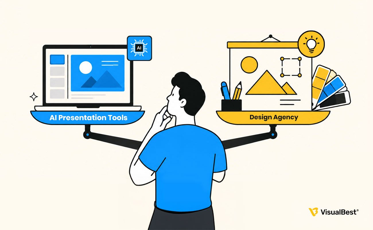
Q.5 Is it worth paying a design agency for a corporate presentation, or can AI tools do it?
AI tools are genuinely useful for generating a deck’s skeleton — layouts, structure, first drafts — and for low-stakes internal decks they’re often enough. Where they fall short is the part that matters most for high-stakes decks: the narrative hook, the emotional arc, the strategic restraint of knowing what to cut, and the brand-system thinking that makes a deck feel coherent. For investor pitches, board decks, and major sales or keynote decks, a specialist agency adds the layer AI can’t yet replicate. Match the investment to the stakes.
Q.6 Does great presentation design cost more in the US than in India?
Yes, often significantly. Specialist presentation design in the US and UK frequently runs three to four times the cost of comparable work from a top Indian agency, which is why a growing number of global founders and enterprises work with Indian specialists who deliver to international standards at a different price point. The quality gap has largely closed at the top tier; the pricing gap hasn’t. For a detailed breakdown, see our pricing guide linked below.
Related reading
- Presentation Design Cost in India (2026 Guide) — what professional decks actually cost, why prices vary 20x, and what’s worth paying for.
- Best Presentation Design Agencies in India (2026 Guide) — our comparison of India’s top studios, with strengths, tiers, and who they’re best for.
- Pitch Deck vs Sales Deck vs Corporate Deck – we explain the differences between the three and guide you in selecting the right deck presentation for the conversation you are about to have.