CASE STUDY
Honda India Foundation: Designing an 88-Page CSR Report That Reads Like a Journey
Honda India Foundation came to us for its Annual CSR Report 2025–26 with raw programme notes, data sheets and field photographs. We built the report from scratch, from content strategy to final design. The brief was clear: turn a year of work across five pillars, 30+ programmes and 16.2 million lives into a report that is easy to read, consistent from cover to back page, and unmistakably Honda.
- Annual Report
- Graphic Design
The Ask
Honda India Foundation wanted a partner who could take basic inputs and own the report end-to-end:
- Build the content structure and narrative, not just lay out supplied text.
- Simplify dense programme information so any stakeholder can follow it.
- Present large volumes of data (budgets, targets, beneficiaries) at a glance.
- Create a visual identity that feels distinct, consistent and premium.
- The report must be combined with a connected theme.
In short: start from a blank page, and finish with a report people want to read.
The Challenge
For this edition, we chose to redesign the report from the ground up. Looking back at the previous edition with fresh eyes, we saw the impact was there but the reading experience could go much further:
- Cluttered pages: too much competing for attention on every spread.
- Inconsistent design: layouts, icons and data styles changed from section to section.
- An overloaded colour palette: colour was decoration, not navigation.
- No sense of flow: sections sat side by side instead of building on each other.
- Little visual uniqueness: it could have been any company’s CSR report.
- Complex content: long, compliance-style text buried the outcomes.
The key question: how do you show the scale of 16.2 million beneficiaries without overwhelming the reader?
Our Approach
We treated the report as a content system and a design system, built together from day one.
1. Content strategy first
We turned scattered inputs into a clear reading path: Foundation → Leadership → Budget & Journey → Five Pillars → Volunteering, Social Media & Awards. Every programme follows the same rhythm, so readers always know where they are:
- The problem, in one plain sentence.
- What Honda did about it.
- The numbers, in an “Impact in Action” block.
- A real story from the field.
2. Simplifying complex content
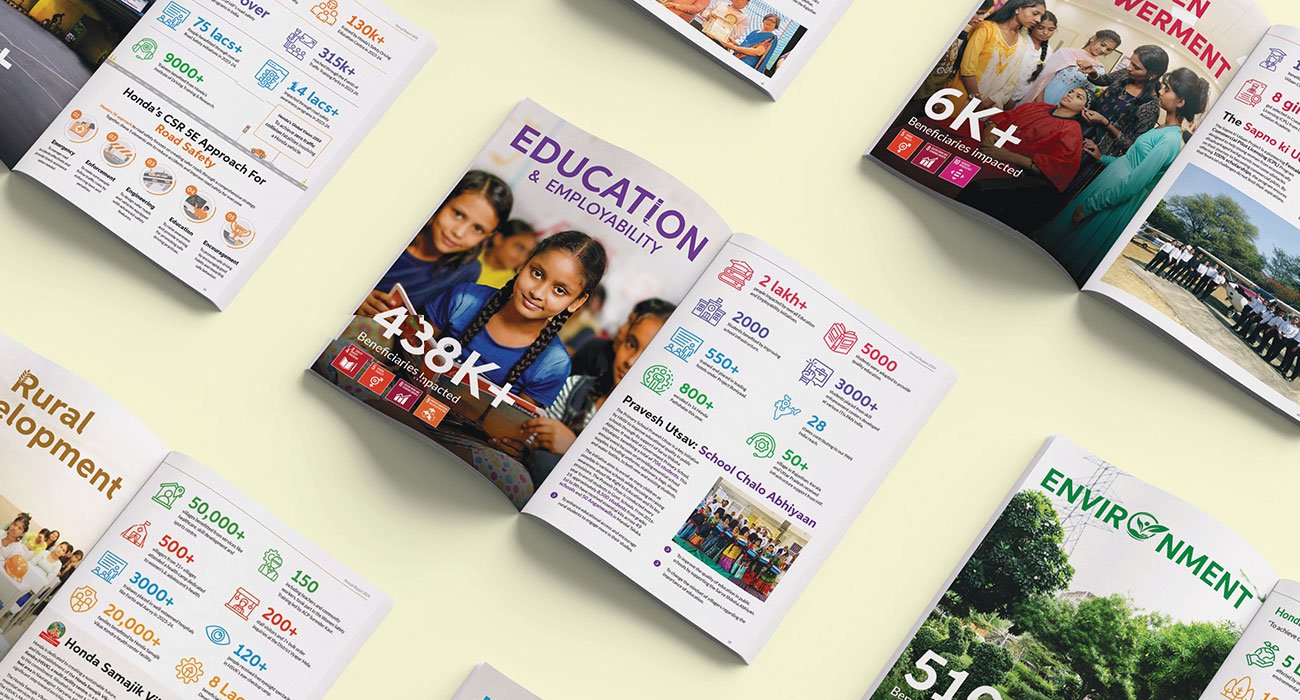
We rewrote compliance-style text into short, human copy with editorial headlines like “The Clinic That Comes Back” and “Building the Room Before the Lesson”. Before-and-after results became simple tables. Long lists became scannable stat cards.
3. A visual concept rooted in mobility
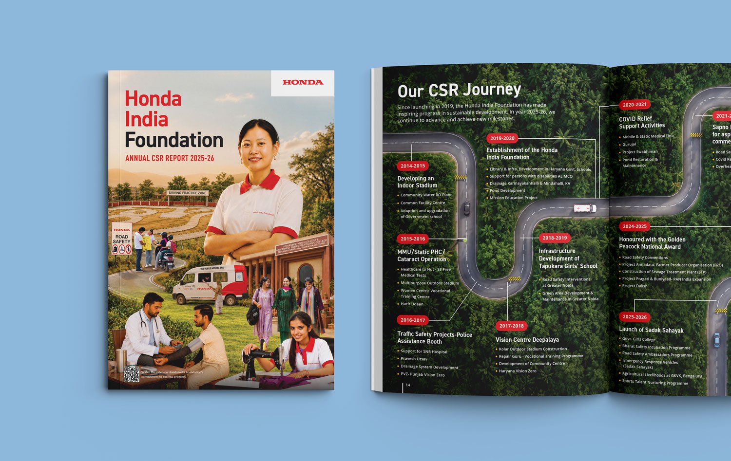
Honda moves people, so the report moves too. A dashed road line runs through the pages, and the CSR journey from 2014 to 2026 is drawn as a winding road. The cover brings all five pillars into one illustrated scene, with a QR code linking to the Foundation’s video.
4. A disciplined colour system
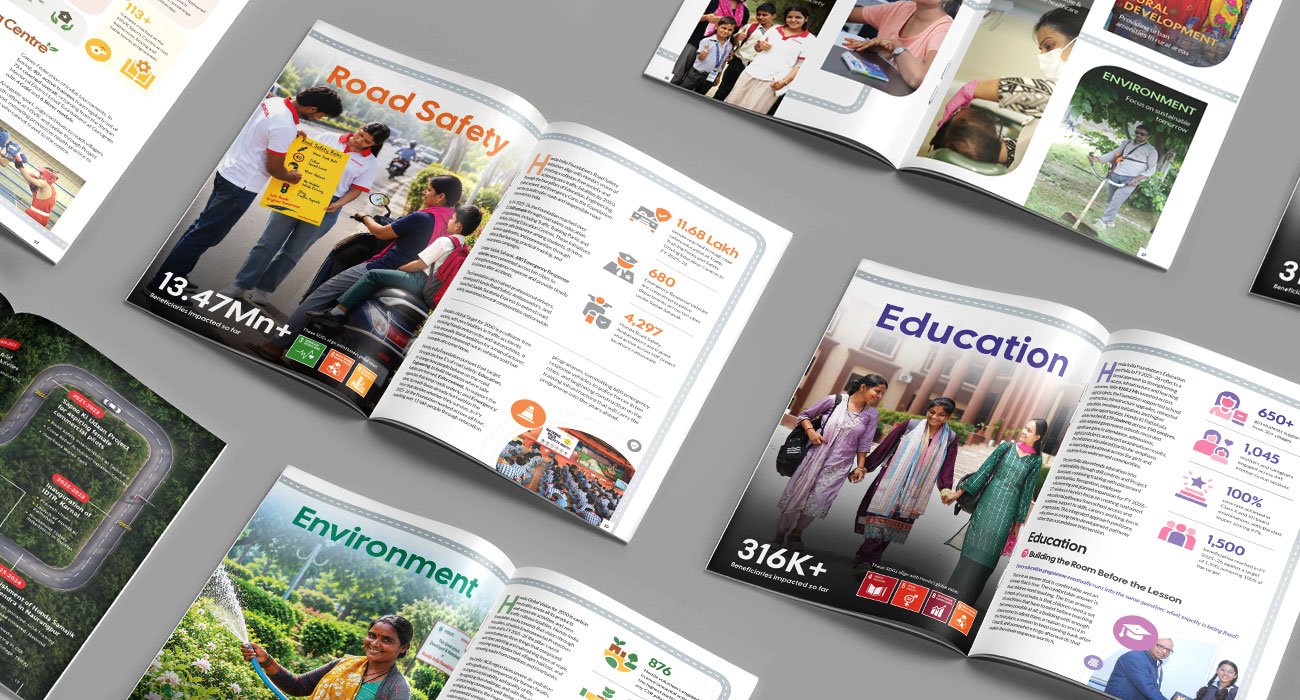
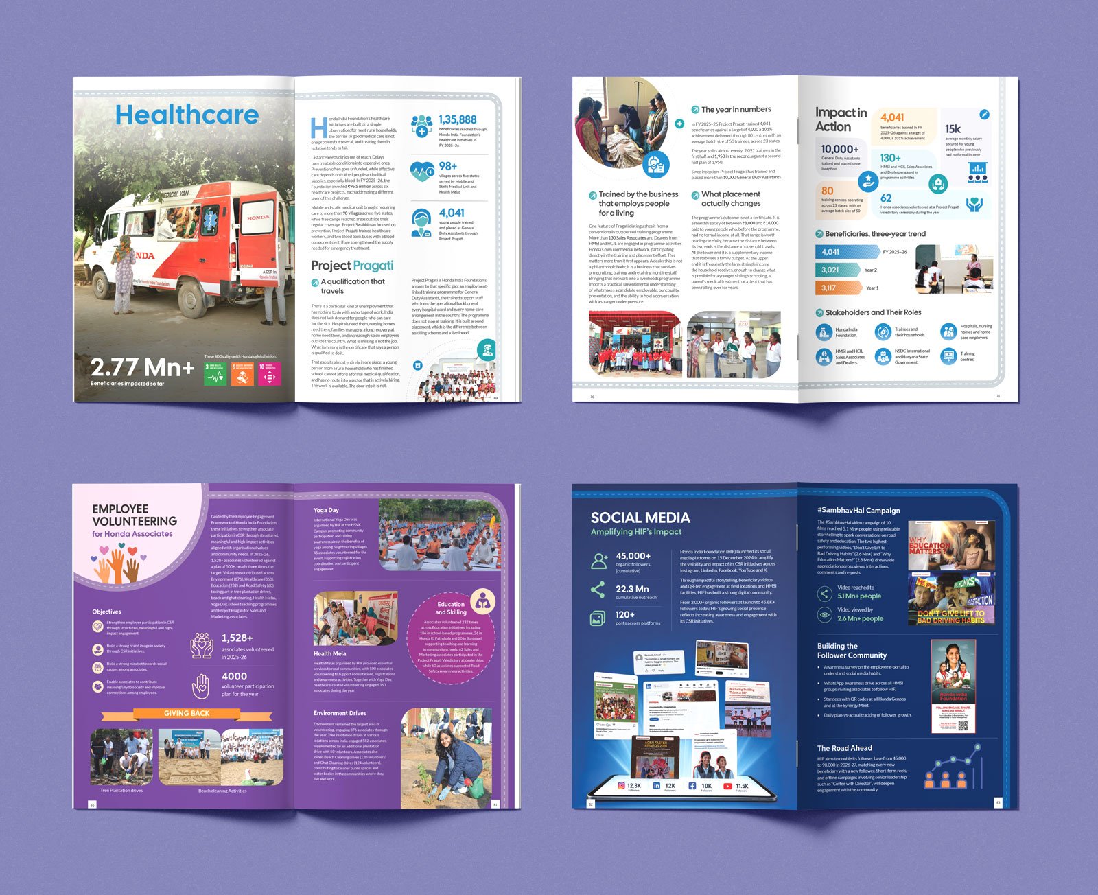
We replaced the crowded palette with one accent colour per pillar on a calm neutral base: orange for Road Safety, purple for Education, green for Environment, earthy brown for Rural Development and blue for Healthcare. Colour now tells readers which section they are in.
5. Consistency through modules
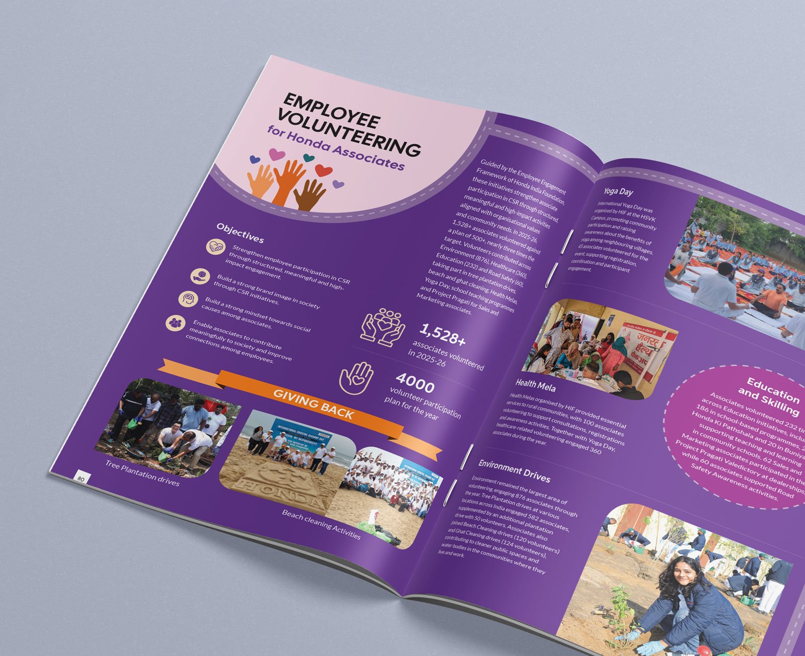
We designed a fixed set of building blocks used across all 88 pages: section openers with a headline beneficiary figure and SDG tiles, stat cards, “Impact in Action” grids, success-story panels and stakeholder icons.
6. Data made visual
Budgets, trends and growth became charts: cumulative CSR spend from FY 2019–20 to FY 2025–26, segment-wise spend, three-year beneficiary trends and an India map of programme locations.
The Outcome
Our redesign raised the 2025–26 report well beyond the previous edition:
| Before | After |
|---|---|
| Cluttered spreads | Clean pages with one clear focus each |
| Inconsistent layouts | One modular system across 88 pages |
| Too many colours | One accent per pillar on a neutral base |
| No flow | A road-journey concept linking every section |
| Generic look | A distinct, illustrated Honda identity |
| Dense, complex text | Short copy, stat cards and simple tables |
Most importantly, Honda India Foundation now has a report that tells its story, not just records it, and a design system it can build on for future editions.

Visual Best took our scattered inputs and turned them into a report that is clear, consistent and genuinely beautiful. The outcome exceeded what we imagined."
Vishnu Dixit
Chief Manager, CSR at Honda Motorcycle & Scooter India Pvt. Ltd.

Behind the Scene
Honda CSR Annual Report 2025-26
Inside Pages
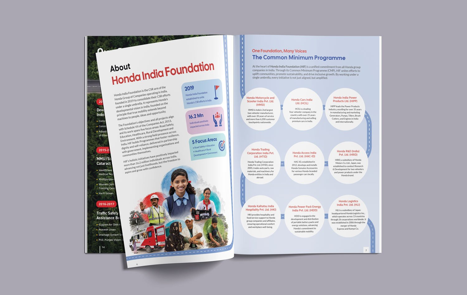
Inside Pages
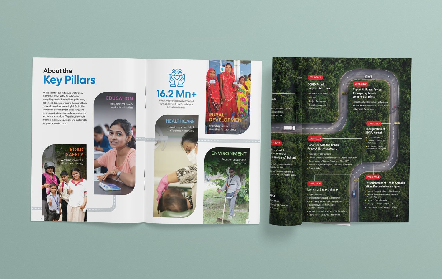
Pillar Page Design
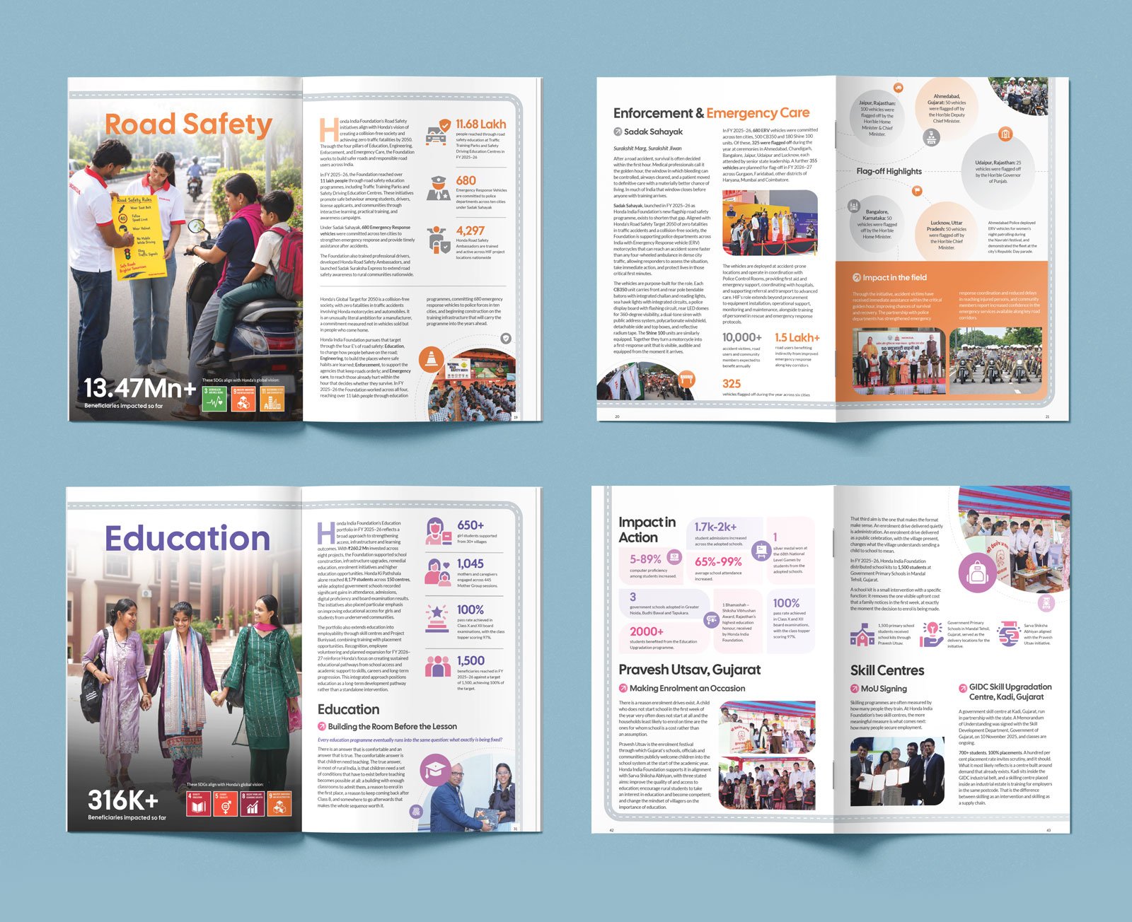
Pillar Page Design
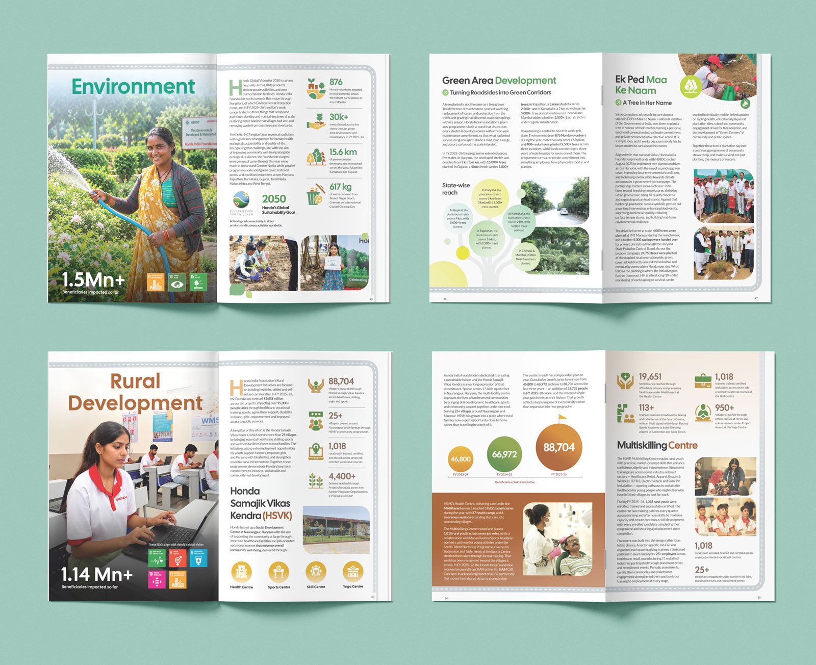
Pillar Page Design
Pillar Page Design
Read More Case Studies