Report Design , Strategy
10 Annual Report Design Mistakes Companies Make (and How to Fix Each) in 2026

I attended more than 20 client meetings this year, just for annual report projects. Some in-person, most on Zoom, from Mumbai boardrooms to Delhi corporate offices to conference rooms in Bangalore and beyond.
Something specific keeps showing up in almost every one of them, and it’s worth naming honestly. When Indian corporate teams brief us on their annual report, roughly 9 out of 10 conversations follow the same pattern. The team walks in with a fixed idea of what they want. They tell us exactly what they need us to produce. They know the cover style they want, the number of pages, the sections, sometimes even the specific charts and quotes. What they don’t do is ask us how we’d approach the report differently, what patterns we’ve seen work in this year’s reporting cycle, or whether the brief they’ve written is actually the strongest way to communicate what they want to say.
Only about 1 in 10 conversations opens with something like: “Here’s what we’re trying to communicate. Here’s our situation. How would you approach this? We’re open to being challenged if there’s a better way, and we’d genuinely like to understand your reasoning.”
That single difference, the willingness to be pushed versus the demand to be executed, is often what separates the reports that get read from the reports that get filed. Because every mistake in this post is a specific consequence of the “just make what I asked for” approach to report design. When there’s no room to challenge the brief, the brief carries all the accumulated blind spots into the final report. When there’s room to interrogate the brief before execution, most of these mistakes never happen in the first place.
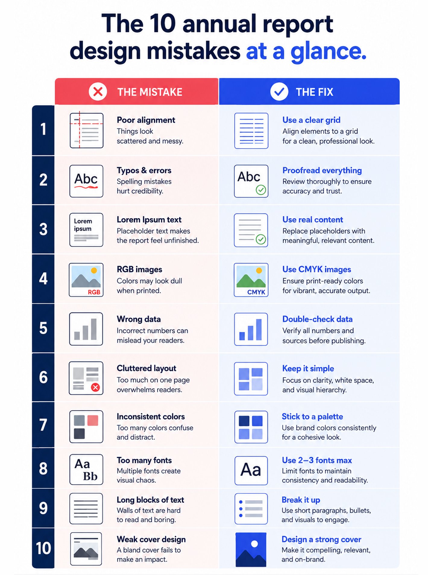
Here are the ten annual report design mistakes I see most often across those meeting rooms, and the practical fix for each. Some are obvious once named. Some genuinely aren’t. All of them get harder to fix the further into production you are, which is why the earlier a team is willing to be challenged, the better the report tends to be.
1. Designing the report without a central thesis

The mistake: The report summarizes a year rather than making an argument. Every section reads like a self-contained update: financial highlights, then business unit updates, then ESG metrics, then leadership messages, then customer stories. Each section is fine on its own. Combined, the report has no through-line. The reader finishes 180 pages without being able to summarize what the year was actually about.
Why it happens: Reports are typically assembled by multiple departments (finance, IR, HR, marketing, sustainability), each contributing their own section. Nobody owns the overall narrative. The design team gets handed a stack of content and tries to make it look coherent visually, which doesn’t fix the underlying problem.
The fix: Decide the central thesis before design begins. Every strong annual report is built around one argument the company is making to its stakeholders: transformation, resilience, operational discipline, strategic reinvention, sustainability leadership. That thesis then guides every section, every design choice, every visual, every headline. If your report can’t be summarized in one sentence, the design will never rescue it. Nail the thesis first.
2. Treating the cover as an afterthought

The mistake: The team pours weeks into financial narratives and business unit sections, then rushes the cover in the final week before production. The cover ends up either template-generic (stock imagery, corporate blue, company name), or trend-chasing (whatever visual style felt current at the moment), or overloaded (trying to communicate five key messages on one page).
Why it happens: The cover feels like decoration when the “real” content is inside. This is exactly backwards. The cover is what determines whether stakeholders open the report at all.
The fix: Design the cover with the same strategic care as the executive summary. It should signal the year’s thesis (see mistake 1), reflect the company’s brand identity, and use visual restraint. One strong visual, considered typography, essential information only. Colors that suit your industry (blue for finance and governance, green for sustainability, warmer palettes for consumer brands). Skip trend-chasing palettes that will date fast, and skip the “communicate everything on the cover” impulse.
3. Dense financial data with no visual hierarchy

The mistake: Financial pages filled with tables that continue for pages without visual differentiation. Every number sits at the same weight, every heading uses the same size, every column mirrors the last one. Even trained readers lose their place. Non-expert readers give up entirely.
Why it happens: Finance teams often want to include every disclosure. Design teams execute the volume literally, laying out data faithfully but flatly.
The fix: Establish clear visual hierarchy for financial content. Headline numbers (revenue, growth, key margins) get significantly larger typography and prominent placement. Supporting numbers get medium weight. Detailed line items get smaller, more compressed treatment. Use whitespace deliberately to give big numbers breathing room. Consider a two-column layout where the left column carries narrative context (“what this number means”) and the right column carries the underlying data. Regulatory disclosures can live in appendix sections rather than dominating the primary narrative pages.
4. Recycled leadership letters

The mistake: The Chairman’s message, CEO letter, and management discussion sections read like they could have been written for any of the last three years with minor find-and-replace. Generic themes (challenging environment, resilience, forward momentum), no specific insights, no acknowledgment of what actually changed, no candor about what didn’t work.
Why it happens: Legal review, PR anxiety, and template inertia combine to strip specificity from leadership communication. Everyone plays it safe. The result reads safe, which is exactly the wrong signal.
The fix: Rewrite leadership sections with specificity, current context, and a degree of honest reflection. Investors and stakeholders read these sections carefully looking for signal about how leadership thinks. A CEO letter that names two specific bets the company made this year, one that worked and one that didn’t yet, is dramatically more valuable than five pages of generic optimism. Design supports this by giving leadership sections editorial-quality typography and layout that signals “this is genuinely being said,” not “this is corporate boilerplate.”
5. Failing to translate data into narrative

The mistake: The report presents numbers without answering the reader’s implicit “so what” question. Revenue grew 12 percent. Fine. But why? What drove it? What does it mean for next year? What decisions did the company make that produced this outcome? Without context, the data sits inert.
Why it happens: Design teams sometimes stop at “make the number visible” rather than “make the meaning visible.” Data visualization becomes decoration rather than communication.
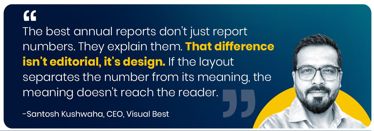
The fix: Every significant data point should be accompanied by context in the design layout. A revenue chart isn’t complete without a short paragraph explaining what drove it. A margin breakdown isn’t complete without commentary on the strategic decisions behind the numbers. Design accommodates this with layouts that pair data with narrative, not layouts that isolate them on separate pages. The reader should never have to hunt to understand what a number means.
6. Ignoring how the report will actually be read in 2026

The mistake: The report is designed as a print document even though 90 percent of readers will encounter it as a PDF on a screen, often a laptop or tablet, occasionally a phone. Two-page spreads that work in print break awkwardly when scrolled. Fine typography that reads well at book distance becomes squinty on screen. Interactive elements are absent. Digital navigation aids aren’t considered.
Why it happens: Report design tradition is print-first, and many report teams haven’t updated their mental model even as reader behavior has shifted decisively to digital.
The fix: Design for digital-first, print-adaptive. Test the report on a laptop, tablet, and phone before final production. Include a clickable table of contents, bookmarks, and internal cross-references. Consider a companion microsite version for major reports where genuine interactive elements (expandable data views, chart interactions, video embeds) can live. The print PDF is one output; it should not be the only consideration.
7. Inconsistent brand application across sections

The mistake: Different sections of the report look like they came from different companies. The finance section uses one visual language. The ESG section uses another. The customer stories section uses a third. Each section is fine internally, but the report as a whole reads as fragmented rather than unified.
Why it happens: Different departments contribute content and often bring their own visual preferences. Without a locked design system, small inconsistencies stack across 200 pages into visible incoherence.
The fix: Build a locked design system before production begins: exact colors, exact typography, exact chart styles, exact photography treatment. Every section applies the same system, even when the content is different. Section differentiation happens through accent color or layout variation within the system, not by abandoning it. Consistency across a long-format document reads as credibility. Inconsistency reads as organizational drift.
8. Photography that says nothing specific

The mistake: Generic stock imagery throughout the report. Smiling employees at desks. Handshakes. Abstract corporate imagery. Photos that could belong to any company in any industry. Nothing about the imagery signals that this is a report from a specific company doing specific work.
Why it happens: Real photography takes time and coordination. Stock is fast and cheap. The trade-off looks acceptable at each individual decision point and adds up to a report that looks anonymous.
The fix: Build a real photography library across the report year. Actual employees, actual workplaces, actual products, actual customers (with permission), actual events and moments. Where real imagery isn’t feasible, choose specific stock over generic stock, and pair it with strong typography and narrative that grounds it in your company’s context. Black-and-white photography can be an elegant equalizer when your available images vary in quality. Restraint reads as confidence.
9. Data visualization as decoration, not communication
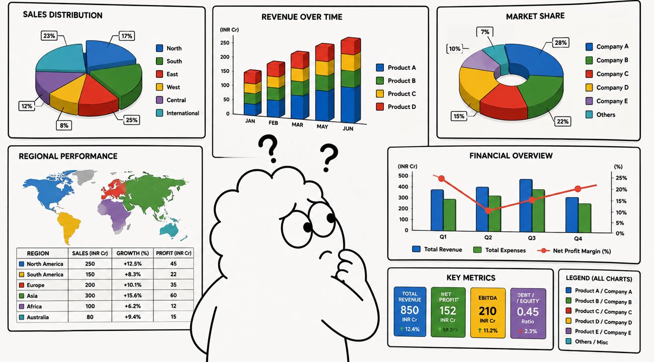
The mistake: Charts that look sophisticated but don’t clarify anything. Three-dimensional pie charts. Complex multi-series graphs with 12 data lines. Word clouds. Infographics that require a legend to decode. Visualizations optimized for appearing impressive rather than being understood.
Why it happens: Design tools make elaborate visualizations easy. The question of whether the visualization actually communicates gets lost in the technical possibility of creating it.
The fix: Every data visualization should pass the “five second test.” A reader should be able to grasp the main insight within five seconds of looking at it. Choose the simplest chart type that carries the meaning. Highlight the one number that matters using color or size. Use annotations to point directly at the insight rather than making the reader interpret. If a chart needs a legend to understand, redesign or replace it. Data visualization is a communication tool, not a decoration category.
10. Rushing the final production stage
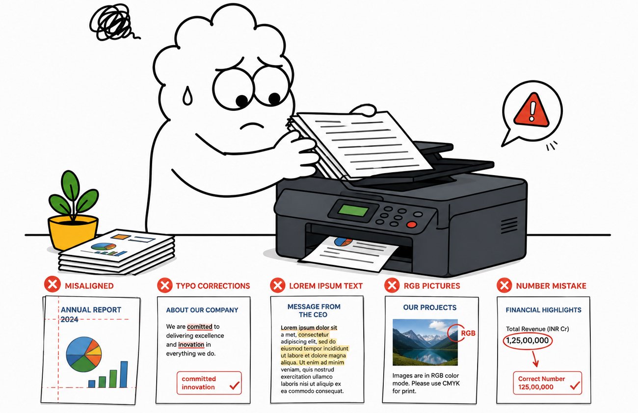
The mistake: The team spends five months on content and design, then compresses final production (proofreading, print quality checks, digital optimization, accessibility review) into the last week before deadline. Typos slip through. Print colors don’t match design. PDF file size is enormous. Digital versions don’t render properly on common devices.
Why it happens: Every report project runs behind. Final production is the compression zone where accumulated delays get absorbed. The result is that the most visible artifact of a six-month effort ships with preventable errors.
The fix: Plan the final production window as a hard-scheduled 3-week block, not a compression zone. Multiple rounds of proofreading (ideally by external editors who haven’t seen the content dozens of times already). Print proofing on the actual paper stock. PDF optimization for both quality and file size. Accessibility check for screen readers and color contrast. Device testing across common laptops, tablets, and phones. If final production is rushed, all the upstream work is compromised.

The pattern underneath the ten mistakes
Read the list back and a single theme runs through most of them: treating the annual report as a compliance document rather than a communication tool.
Every mistake in this list stems from that framing. When a report is seen as a compliance obligation to be completed, the thesis doesn’t matter, the cover is an afterthought, dense data goes uninterpreted, leadership letters recycle language, and final production gets rushed. When a report is seen as a strategic communication tool, all of those things get the attention they deserve.
The companies producing the strongest annual reports in 2026 aren’t spending dramatically more than their peers. They’re just approaching the exercise with different intent. The report is treated as a chance to shape stakeholder perception, not a box to check. That intent shift alone often does more for report quality than any specific design intervention.

Frequently asked questions
What’s the most common annual report design mistake?
Designing the report without a central thesis. Most reports summarize a year across disconnected sections rather than making one clear argument. The design can’t rescue a report that doesn’t know what it’s trying to say.
Why do most annual reports get filed instead of read?
Usually because they were designed as compliance documents rather than communication tools. Dense financial data without visual hierarchy, generic leadership letters, and print-first design decisions all quietly signal to readers that the report doesn’t want to be read.
Does annual report design actually affect business outcomes?
Yes. Peer-reviewed research finds that less-readable annual reports are associated with lower earnings persistence, longer audit lag, higher audit fees, and higher auditor turnover. Design quality has measurable financial consequences beyond just stakeholder perception.
Should we design our report for print or digital?
Digital-first, print-adaptive. Roughly 90 percent of annual report reading now happens on screens. Design for laptop, tablet, and phone viewing, then adapt for print production rather than the other way around.
How much does it cost to fix these mistakes with a professional partner?
For a mid-size annual report, ₹8 to ₹25 lakh typically covers a strong design-led production with a strategic thesis, proper hierarchy, and cross-format optimization. See our annual report design cost guide for the full breakdown.
Is inconsistency across sections really that visible?
Yes. Readers notice inconsistency even when they can’t articulate it. Small drifts in color, typography, and layout across 180 pages compound into a report that feels organizationally incoherent, which is exactly the wrong signal for a document meant to convey competence.
Can AI tools help avoid these mistakes?
Partially. AI can flag readability issues, suggest visualization improvements, and speed up production of routine sections. Strategic decisions (thesis definition, narrative arc, brand system architecture) still require human creative direction.
Related reading
📖 8 Best Annual Report Design Examples 2026, what strong annual reports actually look like this year.
📖 Best Annual Report Design Agency in India (2026 Guide), who to work with when you decide to invest properly.
📖 Annual Report Design Cost in India, what fixing these mistakes professionally actually costs.
📖 From Annual Report to Social Media Campaign, how to make a strong report do far more work.
📖 Why Businesses Should Invest in Professionally Designed Annual Reports, the underlying business case for the investment.