Design , Social Media Marketing , Strategy
10 Social Media Design Mistakes Companies Make (and How to Fix Each)
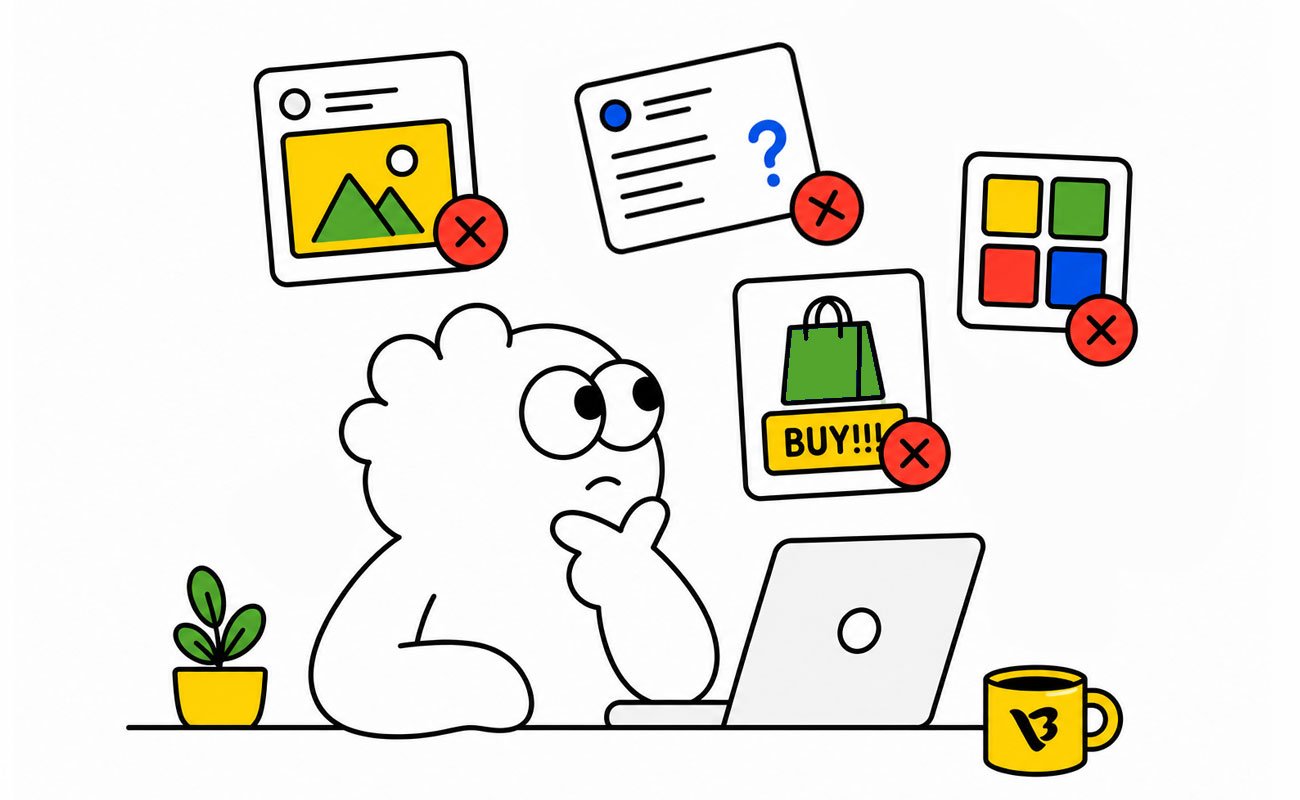
The average corporate Instagram post in 2026 holds attention for about 1.7 seconds. The average LinkedIn post: closer to two. That’s the window your design has to work in. Less time than it took you to read this sentence.
Most companies don’t lose engagement because their strategy is wrong. They lose it because their design is wrong, in ways that are invisible to the team making the posts and obvious to everyone scrolling past them. A logo two pixels off-brand. Text that requires squinting on a phone. A carousel where slide two doesn’t earn the swipe. None of these feel like problems when you’re approving the post on a 27-inch monitor. All of them quietly compound, post after post, into a feed that looks generic to your audience even when it feels polished to your team.
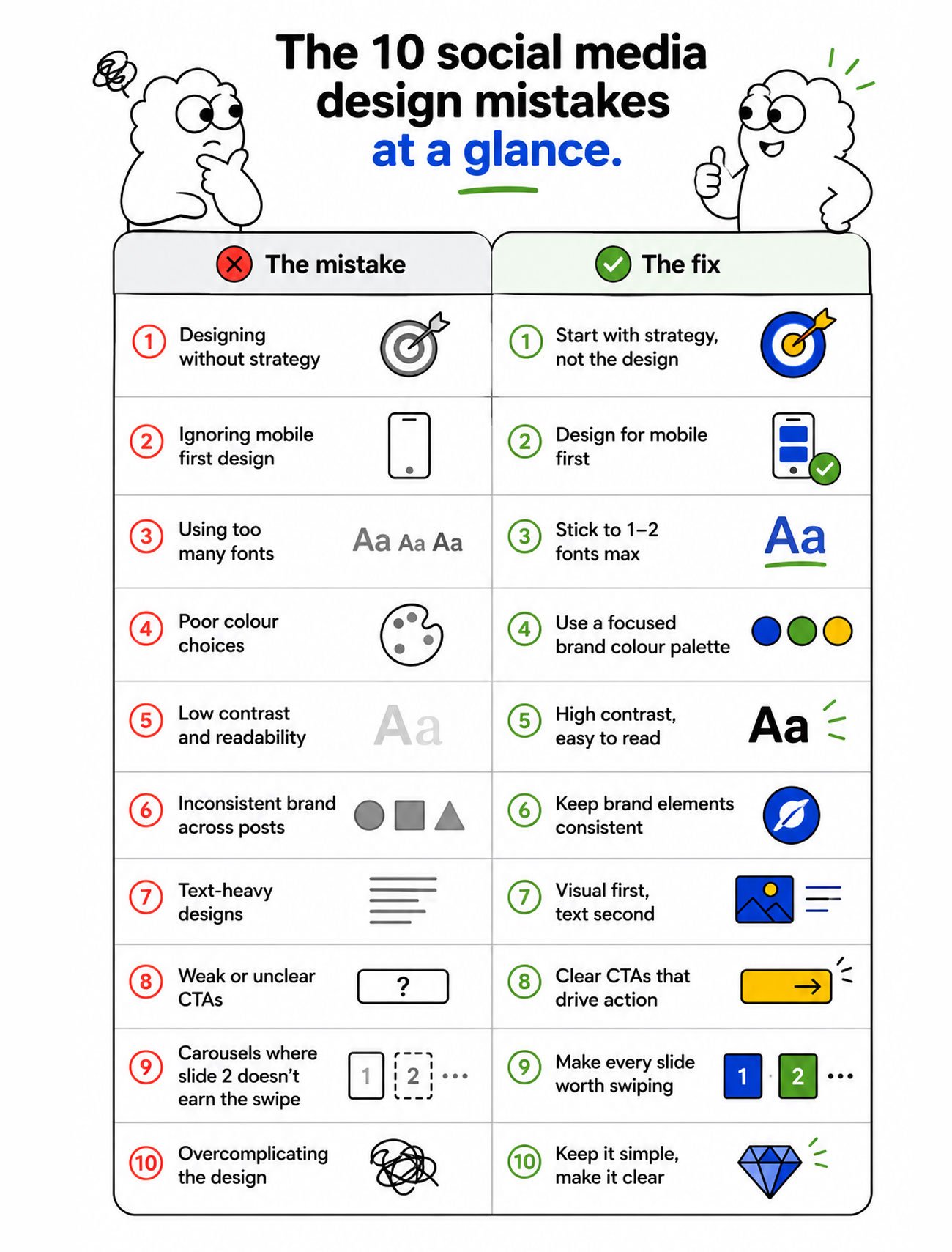
Here are the ten social media design mistakes we see most often in 2026, and the practical fix for each. None of them are strategy mistakes. All of them are visual execution mistakes that cost real engagement.
1. Designing for the monitor, not the phone
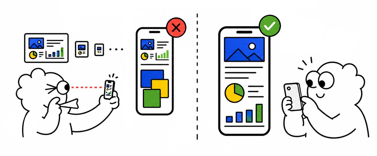
The mistake: Designs reviewed and approved on a desktop screen, then shipped to an audience scrolling on phones. Text that looks readable at 100% looks microscopic on a 6-inch screen. Layouts that feel balanced at full size feel cluttered in a feed. Charts that read clearly on a laptop become illegible.
Why it happens: Approval workflows in most companies are desktop-led. The marketing manager reviews a PNG on a monitor, the CMO approves it in a Slack thread on her laptop. The audience never sees that view of it.
The fix: Review every social asset on the device it will be consumed on. Pull it up on a phone before sign-off. If anyone has to zoom in, redesign. The rule of thumb in 2026: design type at minimum 30 to 40 pixels on the canvas for body content (not headlines), and test legibility from arm’s length on a phone before approval.
2. Inconsistent brand application across posts
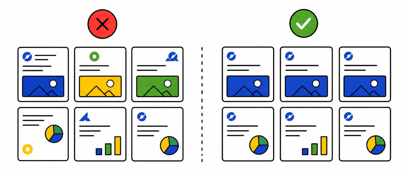
The mistake: Logo placement varies slightly post to post. The “brand blue” is actually three different blues over a quarter. Typography drifts because different designers used slightly different settings. Each post looks fine; the feed as a whole looks like a committee made it.
Why it happens: No locked design system. Each post is designed from scratch or from loosely-defined templates, and small inconsistencies stack into a feed that feels generic.
The fix: Build a master template system with locked colours (exact hex codes, no eyeballing), locked typography (defined sizes for each post type), locked logo placements (one consistent position across posts), and locked spacing rules. Every post built from the system, not from improvisation. Consistency is what makes a feed feel like a brand.
3. Carousels where slide 2 doesn’t earn the swipe
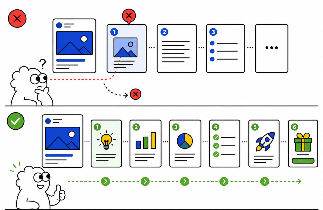
The mistake: A strong cover slide pulls the viewer in. Slide 2 is a recap of the cover, or a generic transition, or worse, a wall of text. The viewer doesn’t swipe. The carousel has effectively wasted its opening.
Why it happens: Most carousels are designed slide-by-slide rather than as a connected narrative. Each slide tries to be self-sufficient instead of pulling the reader forward.
The fix: Treat the carousel as a structured story with three parts: a hook on slide 1, escalating value on slides 2 through 7, and a clear call to action or resolution at the end. Every slide must answer “why should the viewer swipe again?” If a slide doesn’t earn the next swipe, cut it. Most carousels in 2026 are stronger at 5 to 7 slides than at 10.
4. Text-heavy designs that ignore how people scroll
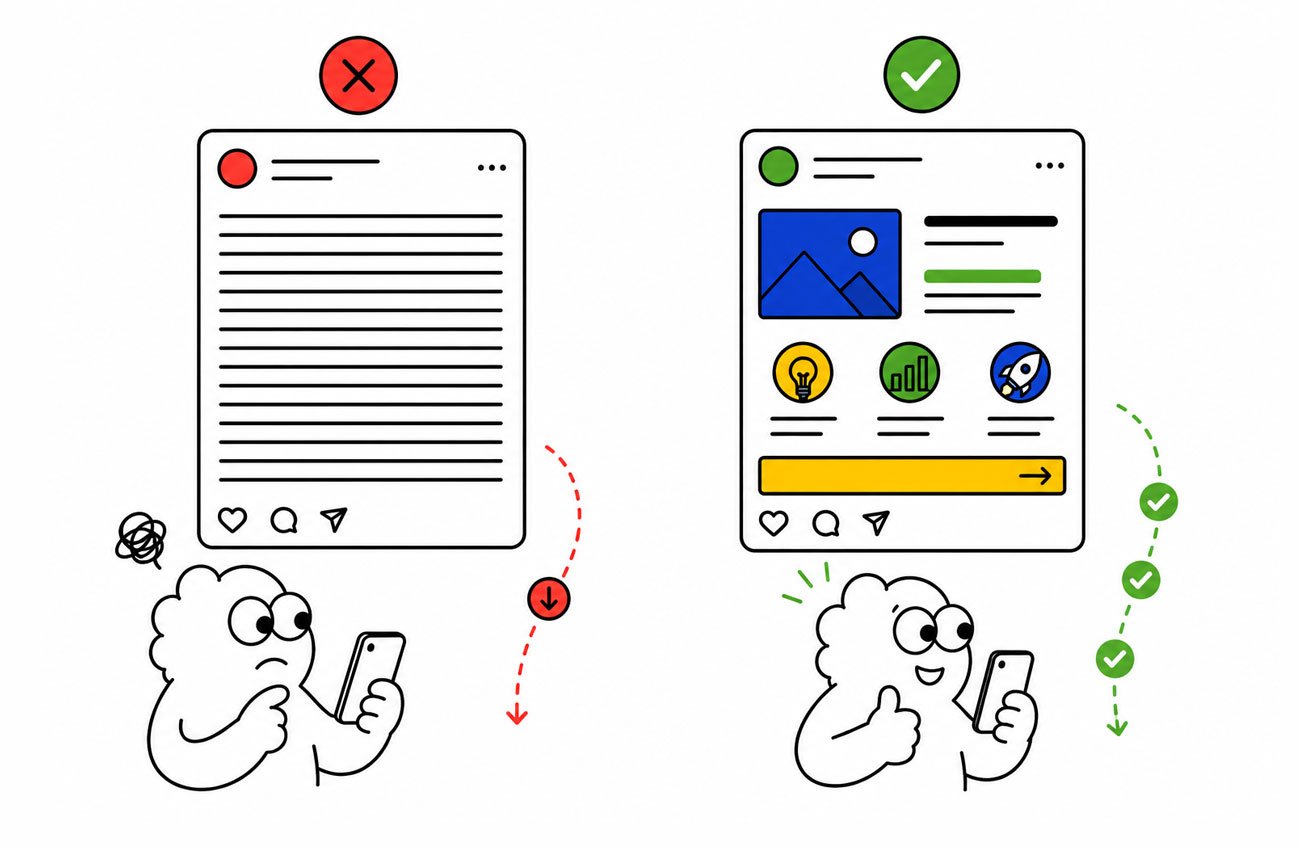
The mistake: Important information buried in dense paragraphs on the image. Captions that repeat what’s on the design. Headlines that take three lines to read.
Why it happens: Writers and designers work from desktop docs where reading 50 words on a graphic feels normal. On a phone in a feed, it isn’t.
The fix: Cap on-image text at one strong headline (5 to 10 words maximum) plus optional supporting line. Push detail to the caption, where reading behaviour is different. The image earns the stop; the caption earns the read. They do different jobs.
5. Photography that says nothing specific
The mistake: Stock photos of generic teams in glass-walled offices, generic handshakes, generic “diverse colleagues looking at laptops.” Photos that could belong to any brand, doing nothing to signal that this post is from yours.
Why it happens: Time pressure and budget pressure default to whatever’s available in stock libraries.
The fix: Build a real-imagery library, photos from your actual workplace, your real team, your actual product in use, your customers (with permission). Even a small library of authentic shots dramatically outperforms generic stock. Where you must use stock, choose specific over generic, and pair it with strong typographic treatment so the design carries the brand, not the photo.
6. Treating short-form video like longer video, just shorter
The mistake: A Reel or short with a slow opening, supporting context in the middle, and the payoff at the end. By the time the viewer gets to the payoff, they’ve scrolled past it.
Why it happens: Production teams trained on longer content default to the structure they know.
The fix: Front-load the hook. The strongest social video in 2026 puts the most interesting visual, the headline insight, or the surprising statement in the first 0.5 to 1.5 seconds. The middle pays it off. The end is short, with a clear next step. If the first second is setup, redesign the cut.
7. Designs that ignore platform aspect ratios
The mistake: One asset designed in 1:1, shoved into Stories at 9:16 with the top and bottom cropped, and into LinkedIn at 1200×627 with the sides cropped. Important content cut off, logo half-visible, key text squeezed.
Why it happens: Design teams produce “one master” and rely on automated cropping. Platforms don’t crop intelligently.
The fix: Native design per platform, or at minimum dedicated safe-zone planning in the master file. Either design four versions (1:1 for feed, 9:16 for Stories and Reels, 16:9 for LinkedIn and YouTube, 4:5 for Instagram portrait) or design one master with all four safe zones marked, then export each. Never let platforms auto-crop your brand.
8. Overusing trends that don’t match your brand
The mistake: A B2B fintech brand using a Gen Z slang trend. A premium consumer brand using a meme template. A legacy enterprise using TikTok-aesthetic. Trends adopted because they’re trending, not because they fit.
Why it happens: Social teams under pressure to “stay relevant” reach for what’s popular instead of what’s right for the brand.
The fix: Run every trend through a brand-fit test before adopting it. Three questions: would our most credible customer find this professional? Does it match our brand voice on our website and in our sales decks? If we removed our logo, would anyone know this came from us? If any answer is no, skip the trend. Looking current is good. Looking like you’re trying to be something you’re not is worse than ignoring trends entirely.
9. AI-generated visuals where craft is the point
The mistake: AI-generated imagery used on brand-critical posts, where the slightly-off proportions, the giveaway lighting, and the generic-feeling output undermine the brand’s credibility.
Why it happens: AI tools are cheap, fast, and convenient. The cost of using them shows up later, in audience perception, not in the production invoice.
The fix: Use AI where craft isn’t the point, internal posts, quick infographics, supporting B-roll, social listening responses. Don’t use it where craft is the point, brand campaigns, founder posts, hero visuals, anything tied to your brand identity. The rule: AI should reduce the cost of work that didn’t need craft. It shouldn’t replace work that did.
10. Posting without a visual hierarchy
The mistake: Designs where everything is the same weight, size, and importance. The eye doesn’t know where to land. The viewer’s brain decides not to do the work, and scrolls.
Why it happens: Internal review processes that add elements (“can we make the logo bigger?”, “can we add the tagline?”, “can we include the CTA?”) without removing any. Design by accumulation.
The fix: Design with one focal point per post. Decide the single most important thing on the canvas, make it visually dominant, and demote everything else. If a stakeholder asks to add something, ask what gets demoted in return. Visual hierarchy is what makes a viewer’s eye land where you want it to. Without it, the design doesn’t function.
What separates a great corporate social feed from an average one
Strip the trends and the platforms away and you’re left with a short list of principles. These are what we look for, and build toward, in every social engagement we run.
Designed for the device. Phone first, desktop second. Always.
Brand-system-driven. Every post built from a locked system, not improvised from scratch.
One focal point per post. Visual hierarchy decided, not accidental.
Carousel narratives, not slide collections. Every slide earns the swipe.
Real imagery wherever possible. Stock and AI as fillers, not as the brand.
Native to the platform. Designed for the format, not auto-cropped into it.
Front-loaded short-form video. Hook in the first second, every time.
Brand-fit before trend-fit. Trends only when they fit; ignored when they don’t.
Frequently asked questions
What’s the most common social media design mistake?
Designing for desktop and shipping to phones. Most approval happens on monitors; most consumption happens on small screens. Every asset should be reviewed on a phone before sign-off.
Why do my social media posts get low engagement despite good design?
Often it isn’t strategy, it’s specific design execution: text too small for mobile, weak visual hierarchy, no front-loaded hook on short-form video, or inconsistent brand application across the feed. Any one of those quietly costs engagement.
How long should text be on a social media post design?
Cap on-image text at one strong headline of 5 to 10 words, plus an optional supporting line. Push detail to the caption, where reading behaviour is different.
Should every social media platform have a different design?
At minimum, each platform’s native aspect ratio (1:1, 9:16, 16:9, 4:5) needs its own version or a master file with safe zones marked. Auto-cropping a single asset across platforms almost always loses important content.
Is it bad to use AI-generated images for social media?
Not bad, but context-dependent. Use AI for high-volume, low-stakes posts where craft isn’t the point. Avoid it for brand-critical work where the slightly-off feel of AI output undermines credibility.
How many slides should a social media carousel have?
Most carousels in 2026 perform better at 5 to 7 slides than at 10. Each slide should earn the next swipe. If a slide doesn’t, cut it.
What’s the biggest brand-consistency mistake on social?
Drift, in colour, typography, logo placement, spacing. Small inconsistencies stack across a feed into a generic look, even when each individual post seems fine.
Related reading
- 📖 Social Media Creative Design Cost in India 2026, what professional design across these formats actually costs.
- 📖 Best Social Media Design Agencies in India 2026, who to call when you need outside help.
- 📖 Can AI Presentation Tools Replace a Design Agency in 2026?, the AI vs human craft question, applied to creative work.
- 📖 10 Presentation Design Mistakes That Make Companies Look Unprofessional, the deck-design equivalent of this list.