Report Design , Trends
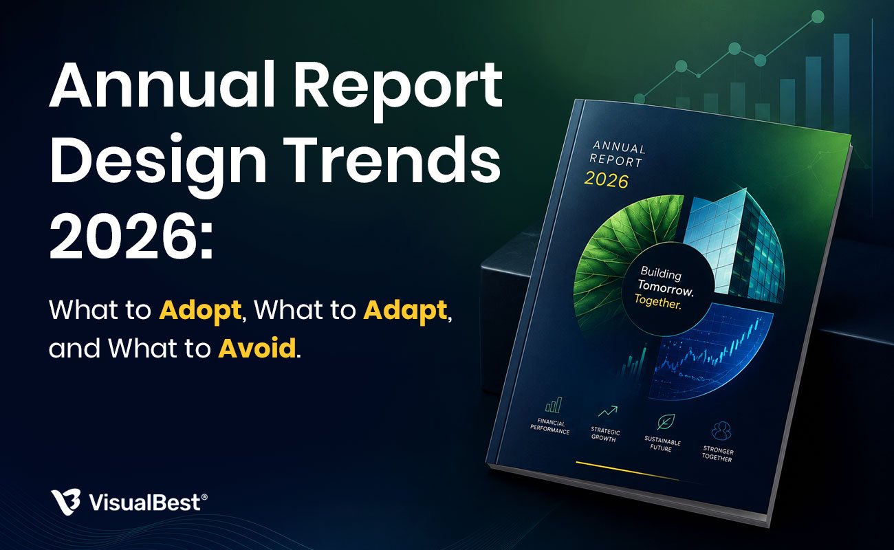
Annual Report Design Trends 2026: What to Adopt, What to Adapt, and What to Avoid
Regulatory shifts are doing something unusual to annual report design in 2026.
For most of the last decade, annual report trends were essentially aesthetic. Editorial layouts one year, minimalist covers another year, illustrated data visualizations after that. Design choices, driven by design opinion. Companies could adopt them or ignore them without meaningful consequence beyond how the finished report looked to an audience that mostly wasn’t reading it anyway.
That’s genuinely different this year. The 2026 reporting cycle is the first under fully effective CSRD and ESRS sustainability disclosure requirements in Europe, enhanced Bursa Malaysia rules in Asia, and tightening SEBI expectations in India. Interactive reports have moved from “innovative option” to “expected format.” Investor engagement with static PDFs continues to decline. Regulators want more transparency. Stakeholders want more accessibility. The reporting teams that treated 2025 trends as optional will find 2026 trends increasingly non-optional.
Which is exactly why a verdict guide matters more this year than any year before it. Some trends are worth adopting now, before they become mandatory. Some are worth adapting carefully rather than adopting wholesale. Some are worth actively avoiding because they’ll date fast or introduce hidden costs. This guide separates the three.
First, what’s actively becoming outdated
Start here, because most trend guides bury this section and it’s the most useful part. These are the design choices that read as current in 2024, defensible in 2025, and quietly dated in 2026.
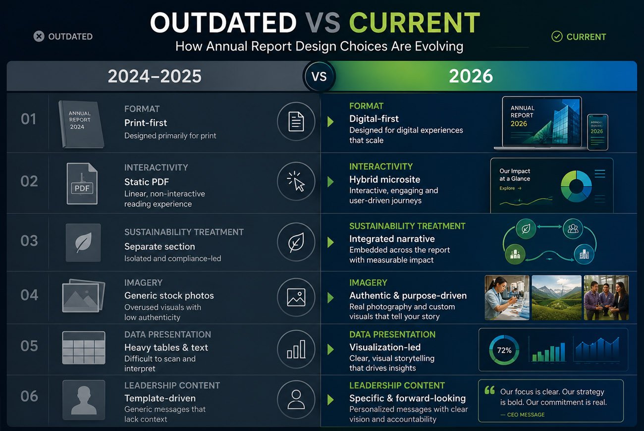
🔸 Print-first design with digital as an afterthought. The default report workflow for decades. In 2026, roughly 90 percent of annual report reading happens on screens, and designing for print first means designing for the smaller audience. The reports getting attention this year design digital-first and adapt for print, not the other way around.
🔸 Static PDF without any interactive layer. A polished static PDF is no longer the ceiling of quality. It’s the floor. Leading reports in 2026 pair the PDF with at minimum an interactive microsite version, clickable navigation, embedded video, and dynamic data views. Static-only reports look increasingly like the reporting equivalent of a company that doesn’t have a mobile-responsive website.
🔸 Standalone sustainability sections bolted onto financial reporting. The old pattern of “here’s the financial report, and here’s a separate sustainability appendix” is being replaced by integrated reporting where sustainability and financial narratives are woven together throughout. Regulation is accelerating this shift, particularly in Europe.
🔸 Generic stock imagery. Photos of anonymous smiling employees at desks, handshakes, generic office scenes. Reports leaning on stock look interchangeable with every other company’s report. Authenticity has become table stakes.
🔸 Dense financial tables as the primary presentation of data. Raw tables continue to belong in disclosure appendices. But primary financial storytelling in 2026 uses visualizations first, tables second. Reports still leading with tables signal “compliance document” rather than “communication tool.”
🔸 Recycled leadership letters and template-driven content. Chairman’s messages and CEO letters that could have been written for any year. Investors read these sections for signal, and generic language signals absence of thinking.

The 2026 trends, with a verdict on each
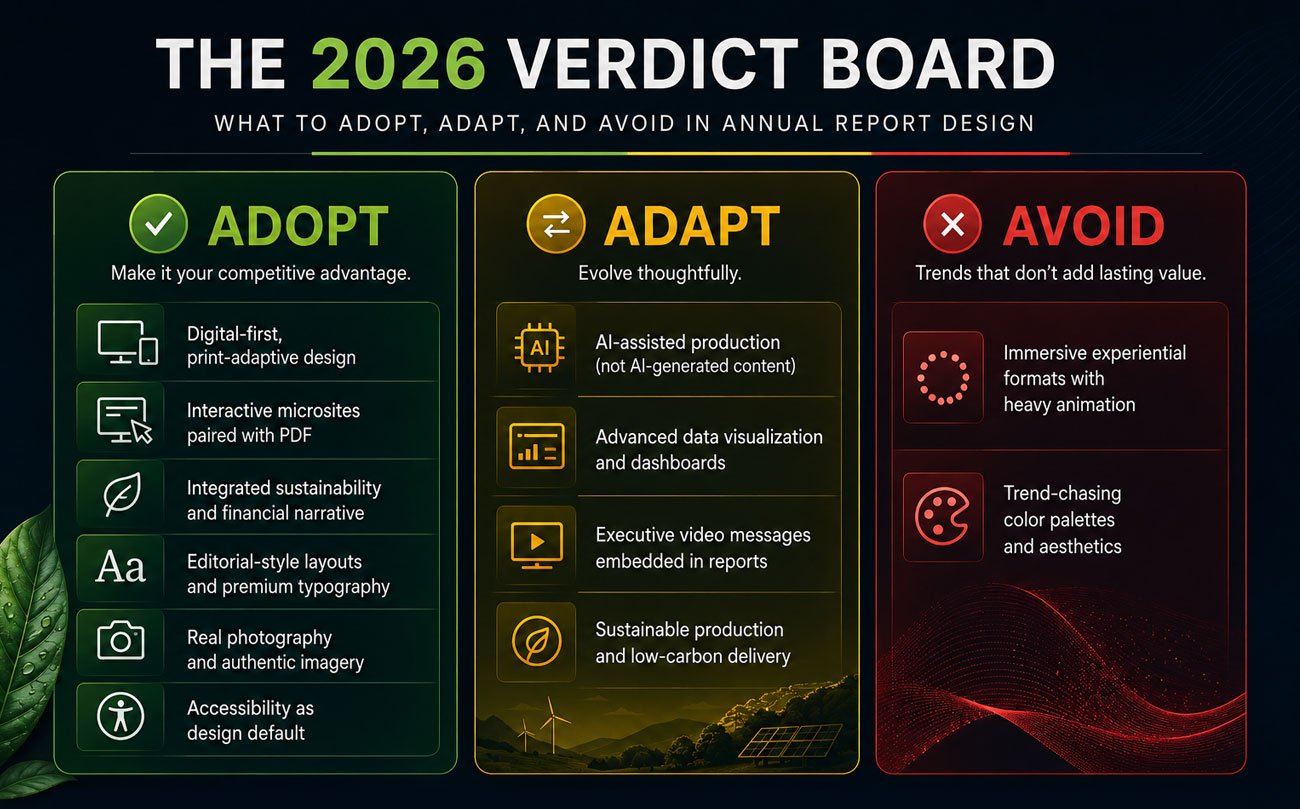
Each trend gets a verdict for corporate reporting use: adopt (do this), adapt (useful with a specific caveat), or avoid (skip it, or it will backfire).
Digital-first, print-adaptive design, ADOPT
Design the report for laptop, tablet, and mobile consumption first, then adapt for print production. This is now the dominant pattern for reports that get read. Companies still designing print-first are optimizing for a shrinking share of the audience.
The corporate caveat: listed companies with statutory print requirements need both formats. That’s fine. Digital-first doesn’t mean digital-only. It means the primary design decisions (layout logic, typography scale, image usage) are optimized for screen reading, with print as an adapted output.
Interactive microsites paired with the PDF, ADOPT
Beyond the PDF, publish an interactive web version of your report. Clickable navigation, expandable data views, embedded executive video messages, interactive ESG dashboards, video from customer stories. Companies like IBM, Nestle, and progressive Indian listed companies now treat this as standard rather than premium.
The 2026 baseline expectation for investor-facing reports: a well-designed microsite that behaves like a premium website rather than a document. This is where the “experiential reporting” trend is genuinely going.
Integrated sustainability and financial narrative, ADOPT
Weave ESG and sustainability information throughout the financial and strategic sections rather than isolating them in a standalone appendix. This is being driven partly by regulation (CSRD, ESRS, enhanced SEBI and Bursa Malaysia requirements) and partly by investor expectations that sustainability and financial performance are inseparable.
The corporate caveat: integration takes real editorial work. Bolting sustainability language onto financial narratives without genuine integration reads as greenwashing and does more harm than help. Adopt the pattern only if you’re willing to do the integration work properly.
Editorial-style layouts and premium typography, ADOPT
Annual reports increasingly borrow from magazine and editorial design: considered typography, generous whitespace, pull quotes, sophisticated grid systems, story-led pacing. The strongest reports of 2026 read more like premium publications than corporate documents.
Why it matters: editorial-style layouts signal that the report was designed with reader experience in mind, which is exactly the signal that gets stakeholders to actually read past the executive summary.
AI-assisted production, not AI-generated content, ADAPT
AI tools genuinely accelerate specific parts of report production: layout adaptation across formats, chart generation from raw data, first-draft copywriting for routine sections, content structuring, format multiplication for microsite variants. Roughly 76 percent of marketing teams now use AI-assisted tools in some form for reporting.
The corporate caveat, and it’s a firm one: AI-generated content in annual reports carries real risk. Strategic narratives, leadership letters, and material disclosures need human authorship. AI as an accelerant for production, human as author for content. Reports where AI has written the strategic sections read as generic, which is precisely what an annual report cannot afford to be.
Real photography and authentic imagery, ADOPT
Replace stock imagery with authentic photography of your actual employees, workplaces, customers, and operations. Where budgets are tight, black-and-white treatment of mixed-quality images can create cohesion without requiring reshoots. Restraint reads as confidence.
Why it matters: authenticity has moved from nice-to-have to expected. Stakeholders can spot stock imagery instantly, and it signals “we didn’t have anything real to show.”
Advanced data visualization and interactive dashboards, ADAPT
Complex data visualizations, interactive ESG dashboards, animated charts. Real value when they clarify complex information. Real distraction when they’re used to look sophisticated without actually communicating better.
The corporate caveat: every visualization should pass the five-second test. A reader should grasp the main insight in five seconds. Elaborate 3D charts, complex multi-series visualizations, and word clouds usually fail this test. Simpler visualizations that highlight the one number that matters usually pass it. Adopt selectively, based on communication value not on visual complexity.

Executive video messages embedded in reports, ADAPT
Short video messages from the CEO, CFO, or business unit heads embedded directly in the interactive report. Real engagement lift for the readers who watch them. Adds meaningful production complexity and requires the executives to be comfortable on camera.
The corporate caveat: executive video works when the person on camera is genuinely present and specific in what they say. It fails when the video looks like a corporate script read stiffly to the lens. Only adopt if you’re willing to invest in coaching, scripting, and multiple takes to make the video actually feel human.
Sustainable production and low-carbon digital delivery, ADAPT
The “Twin Transition” concept: treating digital and sustainability as inseparable goals. A heavy unoptimized PDF or bloated microsite emits meaningful CO2 per page view when consumed at investor-relations scale. Reports genuinely committed to sustainability increasingly consider the carbon footprint of their own digital delivery.
The corporate caveat: this is genuinely important but risks feeling performative if the rest of the report isn’t grounded in serious sustainability work. Adopt when it fits your broader ESG position. Skip when it would look like isolated virtue-signaling.

Accessibility as design default, ADOPT
Adjustable text sizing, keyboard navigation, screen-reader support, multilingual options, high-contrast layouts. All increasingly expected as regulation tightens and audience expectations shift. Accessible design is also just clearer design for everyone, so there’s no downside beyond the production effort.
Why it matters: annual reports are legally required to reach diverse audiences. Accessibility barriers now translate directly into audience exclusion and, increasingly, regulatory exposure.
Immersive/experiential microsite formats with heavy animation, AVOID
The premium “annual report as immersive interactive experience” with heavy animation, scroll-triggered effects, and elaborate transitions. Genuinely impressive when done well, and genuinely expensive. For most corporate reporting purposes, an interactive microsite with straightforward navigation outperforms a heavily-animated experience that impresses more than it communicates.
Why avoid it (for most companies): the ROI math rarely works outside of very brand-conscious, consumer-facing companies. Enterprise B2B reports, financial services reports, and NGO impact reports rarely benefit from the elaborate animation layer. Skip unless your brand genuinely calls for it.
Trend-chasing color palettes and design aesthetics, AVOID
Whatever visual style felt current when the design work started. Trend-driven color palettes date a report fast, which is a problem because annual reports circulate for years after their publication date. A report that looks distinctly 2024 in 2026 undermines its own credibility.
Why avoid it: annual reports need to age well. Choose color palettes and design languages that reflect your brand identity and industry, not the trending aesthetic of the moment. Restraint and timelessness outperform trend-chasing in this format specifically.

The filter that matters more than any trend
Every trend on this list is useless until it passes one test: does it serve the specific stakeholders you’re reporting to, in the specific context of your organization?
Interactive microsites are right for a listed technology company with global investors and wrong for a small NGO reporting to a local donor base. Editorial-style layouts are right for brand-conscious enterprises and wrong for tightly regulated financial services reports where restraint signals credibility. Executive video is right when your CEO is genuinely comfortable on camera and wrong when it would look forced.
Before adopting anything from this list, three questions:
🔸 Stakeholders: does this serve the people who will actually read this report, or just impress the design community?
🔸 Organization fit: does this match your organization’s brand, tone, and industry norms?
🔸 Sustainability: will this design decision still look defensible three years from now, when this report is still circulating?
Fail any one, and the trend is wrong for your report, regardless of how popular it is.
Frequently asked questions
What are the biggest annual report design trends in 2026?
Digital-first design, interactive microsites paired with PDFs, integrated sustainability and financial reporting, editorial-style layouts, and authentic photography lead the trends worth adopting. AI-assisted production, advanced data visualization, and executive video messages are worth adapting selectively. Heavy immersive animation and trend-chasing aesthetics are worth avoiding.
Should we still produce a PDF, or move to a purely interactive format?
Both. A hybrid model (PDF plus interactive microsite) is the 2026 standard for most corporate reports. The PDF handles statutory compliance, archiving, and print distribution. The microsite handles engagement, accessibility, and investor experience. Purely interactive formats work only when regulation allows it, which for most listed companies still requires the PDF version.
How much does an interactive annual report microsite cost?
Wide range depending on complexity. A well-designed microsite paired with a PDF version typically adds ₹4 to ₹15 lakh to the base PDF report cost for a mid-sized company. Fully custom experiential microsites with heavy animation can reach ₹25 lakh or more. See our annual report design cost guide for detailed benchmarks.
Is AI safe to use in annual report production?
For production assistance (layout adaptation, chart generation, first-draft routine sections, format multiplication), yes. For strategic content (leadership letters, material disclosures, narrative sections), no. AI as an accelerant for production is fine. AI as author for content carries real risk.
Do trends actually matter for annual reports, or should we just stay classic?
Both, at the same time. Some 2026 shifts (digital-first, integrated sustainability, accessibility) are becoming non-optional and ignoring them is genuinely risky. Other trends (heavy animation, trend-chasing palettes) will date fast and should be avoided. The skill is knowing which is which.
How often should our annual report design refresh?
The core visual system should evolve gradually, every 3 to 5 years, to reflect brand refinements without dating fast. The specific execution (data presentation, digital format, section structure) should evolve annually based on what worked and what didn’t in the prior cycle.
What about ESG and sustainability integration specifically?
For companies subject to CSRD, ESRS, enhanced SEBI, or Bursa Malaysia requirements, integrated sustainability reporting is increasingly non-optional. For companies not yet regulated, adopting integration now positions the report ahead of the regulation curve and signals seriousness on ESG to stakeholders.

Related reading
📖 10 Annual Report Design Mistakes Companies Make, the timeless errors that no trend will fix.
📖 8 Best Annual Report Design Examples 2026, what current annual report design actually looks like.
📖 Annual Report Design Cost in India, what modernizing a report system actually costs.
📖 From Annual Report to Social Media Campaign, making one report do the work of a year of content.
📖 Best Annual Report Design Agency in India (2026 Guide), who to work with when it’s time to invest properly.