Presentation Design
10 Presentation Design Mistakes That Make Companies Look Unprofessional (and How to Fix Each One)
Nobody tells you your deck looked amateur.
The investor just “went a different direction.” The prospect “decided to stay with their current vendor.” The board “wants to revisit this next quarter.” You’ll never hear the real reason, because the real reason is uncomfortable and unprovable: somewhere around slide four, the room quietly stopped taking you seriously.
Presentation design mistakes rarely announce themselves. They don’t crash the meeting. They just leak credibility, one slide at a time, until the decision tilts away from you for reasons no one can articulate. The frustrating part is that almost every one of these mistakes is invisible to the person who made it — and obvious to everyone watching.
This guide names the ten that do the most damage, why each one signals “amateur” to a professional audience, and exactly how to fix it. Not design theory. The specific tells that make a company look like it doesn’t have its act together — and the moves that make it look like it does.
Why this matters more than it feels like it should
Before the list, the uncomfortable truth underneath all ten mistakes: your audience’s attention is a fixed, draining budget, and bad design spends it on the wrong things.
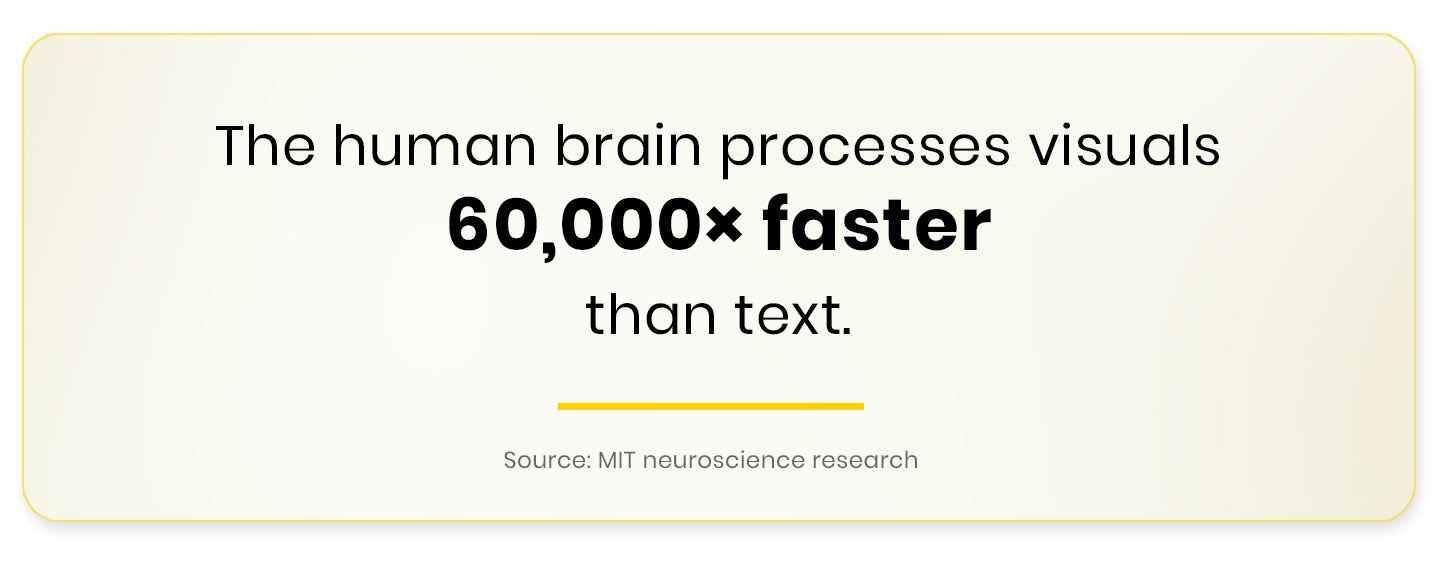
Keep that in mind as you read. Every mistake below is, at root, a way of spending attention you can’t afford to waste.
The 10 Presentation Design Mistakes
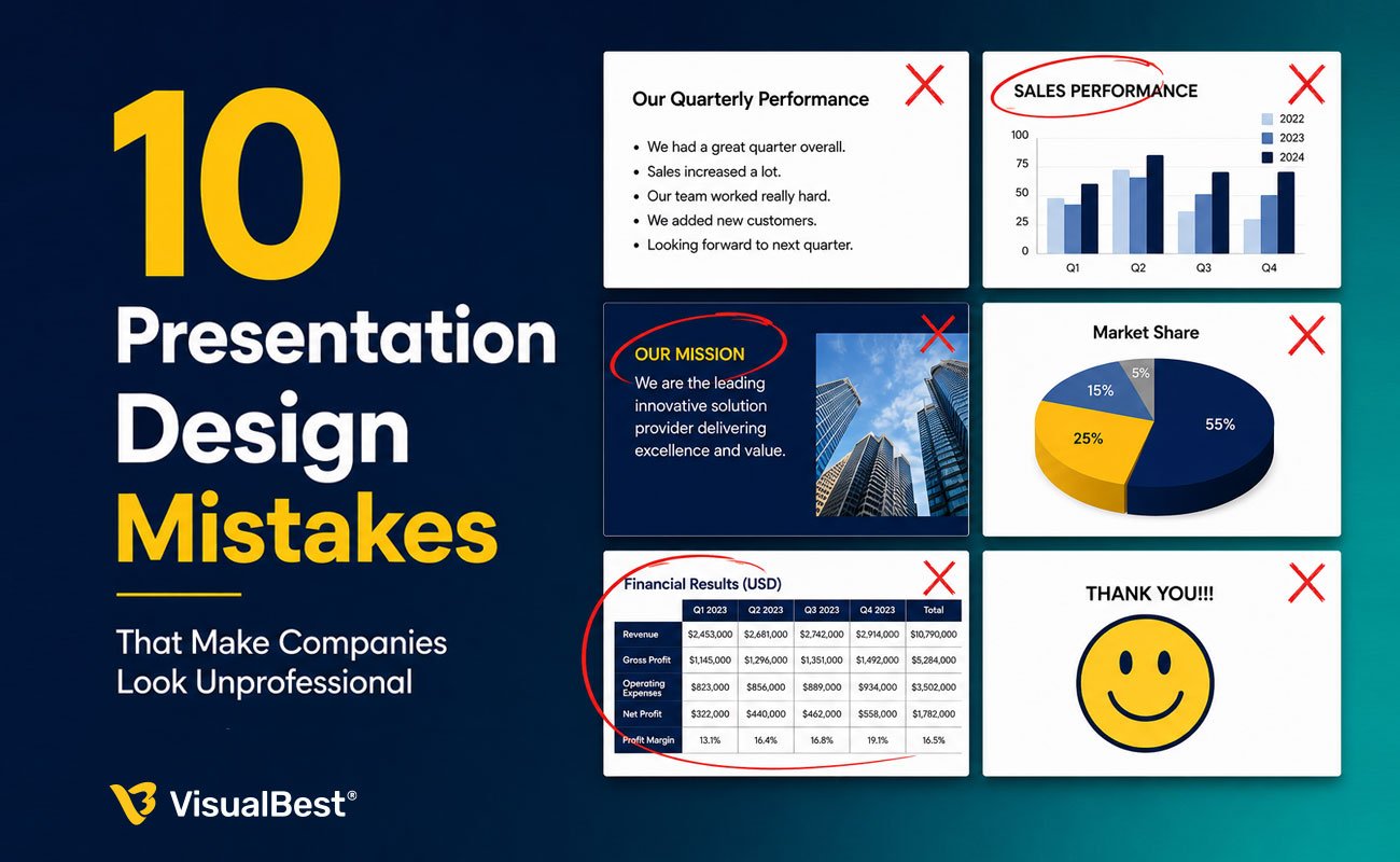
1. The wall of text
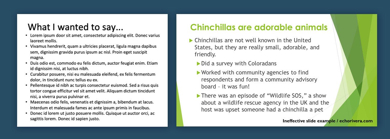
The tell: Slides packed with full sentences and paragraphs. The presenter reads them aloud. The audience reads ahead, finishes early, and disengages.
This is the single most common and most damaging mistake, and the research is brutal about why. When a slide is dense with text and a presenter speaks over it, the split-attention effect kicks in — the audience can’t process both streams, so they process neither well. You’re not reinforcing your point. You’re competing with yourself.
The fix: A slide is a headline and a visual, not a document. If you need the words, put them in the notes or a leave-behind. On screen: one idea, stated as a short headline, supported by one image or chart. If your slide works as a silent billboard — readable in three seconds with the sound off — it works.
2. The label headline
The tell: Slide titles that name a topic instead of making a point. “Q3 Results.” “Market Overview.” “Our Approach.”
A label tells the audience what the slide is about. It makes them do the work of figuring out what it means. Professionals lead with the conclusion.
The fix: Rewrite every title as the insight. Not “Q3 Results” but “Q3 revenue grew 40% — driven entirely by enterprise.” Not “Market Overview” but “The market tripled in three years and we’re under-indexed.” The title carries the message; the slide proves it. This single change does more for perceived competence than any visual upgrade.
3. Inconsistency that screams “assembled by committee”
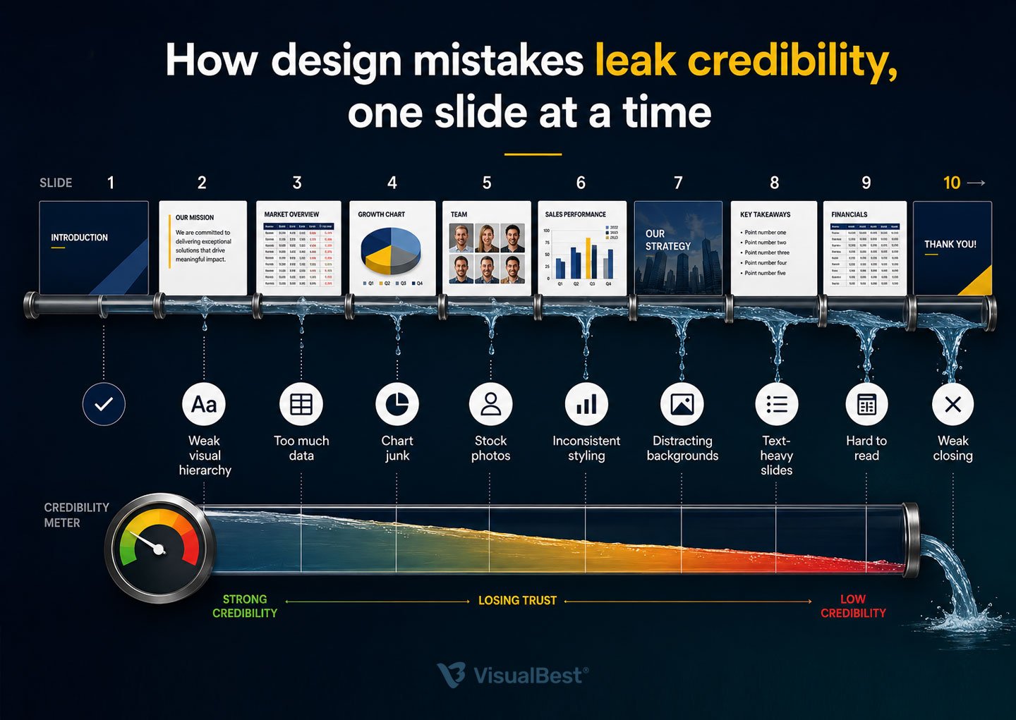
The tell: Three fonts. Five shades of the same blue. Logos at different sizes. Charts that each look like they came from a different company. Spacing that wanders.
Inconsistency is the fastest credibility leak there is, because it signals something deeper than sloppiness — it signals that no one is in control. A deck that can’t keep its own fonts straight makes an audience quietly wonder what else the company can’t keep straight.
The fix: Lock a system before you build a slide. Two fonts maximum. A defined colour palette with set roles (one accent, used sparingly). Consistent chart styling. Aligned spacing. If multiple people contribute slides, they build into the same locked template — no exceptions. Consistency reads as competence, every time.

4. Chart junk and the spreadsheet screenshot
The tell: A chart with twelve data series, unreadable legends, or — worst of all — a screenshot of Excel pasted into the slide.
This signals a failure to prioritise. Instead of guiding attention, the slide dumps raw information on the audience and asks them to figure it out themselves.
The fix: One chart, one point. Decide what the audience should notice first, highlight it, and mute everything else. Great presentation design isn’t data visualisation — it’s data storytelling.
5. Default everything
The tell: Default PowerPoint templates, default fonts, default colours, default animations. A deck that looks exactly like the software it was made in.
Defaults signal minimal effort. Your audience has seen thousands of them, and forgettable design quietly makes the message forgettable too.
The fix: Build even a simple visual system: one typeface, defined colours, clean layouts, and restrained motion. You don’t need elaborate design — just intentional consistency.
6. Stock-photo theatre
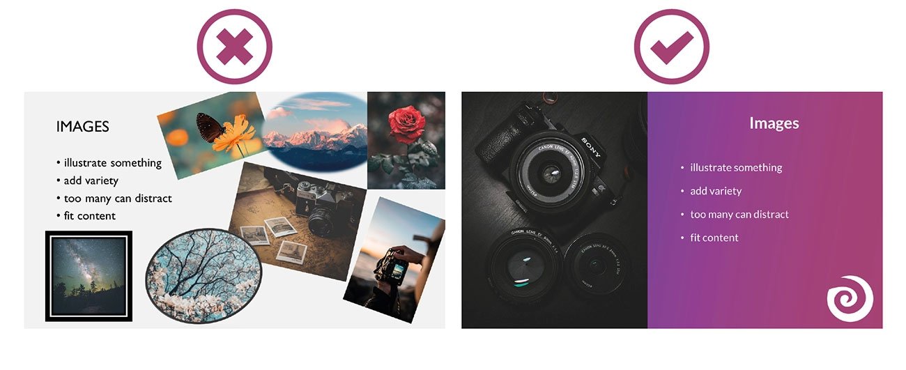
The tell: Generic handshake photos, smiling office teams, glowing “technology” backgrounds — visuals that could belong to any company.
Audiences recognise filler instantly. Generic imagery weakens credibility because it says nothing specific or real.
The fix: Use actual product screenshots, real customer moments, original visuals, or clean custom graphics. Authenticity almost always beats polish.
7. No visual hierarchy
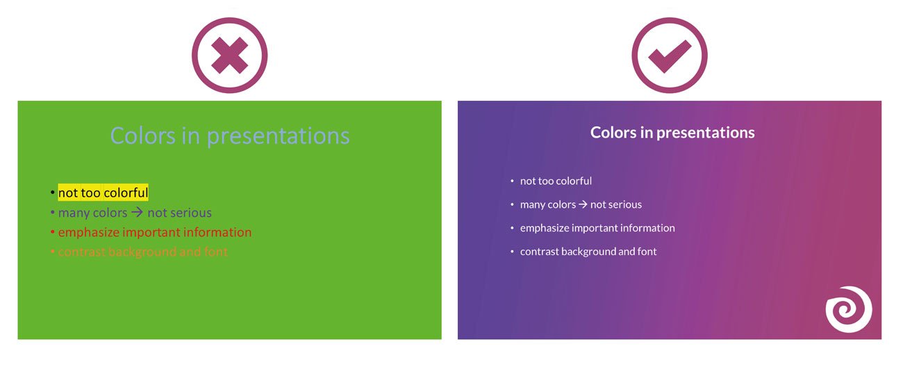
The tell: Everything on the slide feels equally important. Same size. Same weight. Same emphasis.
When nothing stands out, the audience doesn’t know where to look — and attention drops fast.
The fix: Give every slide one dominant idea. Use size, contrast, spacing, and whitespace to direct the eye. Good hierarchy reduces effort and increases clarity.
8. The deck that collapses without a narrator
The tell: Slides that only make sense when someone explains them live.
Modern decks are shared asynchronously — forwarded after meetings, opened on phones, reviewed without context. If the slide can’t stand alone, the message often disappears with the presenter.
The fix: Make every slide self-sufficient. Clear headline, clear context, clear takeaway. A strong deck should still communicate when the room is gone.
9. Animation and transition overload
The tell: Flying text, spinning transitions, bouncing elements, motion everywhere.
Overdesigned animation rarely feels impressive. More often, it distracts from the actual message.
The fix: Use motion only when it improves understanding — revealing a process, directing focus, or showing change. Otherwise, remove it. Simplicity feels more confident.

10. Ignoring how the deck will actually be viewed
The tell: Tiny text that’s unreadable from the back row. A light-background deck shown in a dark room. A 16:9 deck opened on a phone where everything is microscopic. Design that assumed one viewing condition and ignored reality.
This is the mistake that undoes all the others — a beautifully designed slide is still unprofessional if no one can read it in the room they’re in. Executives now read decks on phones as often as projectors, and a deck that ignores its viewing context looks careless regardless of its polish.
The fix: Design for the actual conditions. Large type (titles well above 40pt, body comfortably readable). Strong contrast for varied lighting. Test on a phone if it’ll be read on one, and from across a room if it’ll be presented. Match the format to where it lands.

The pattern underneath all ten
Read the list again and a single theme runs through every fix: respect the audience’s attention.
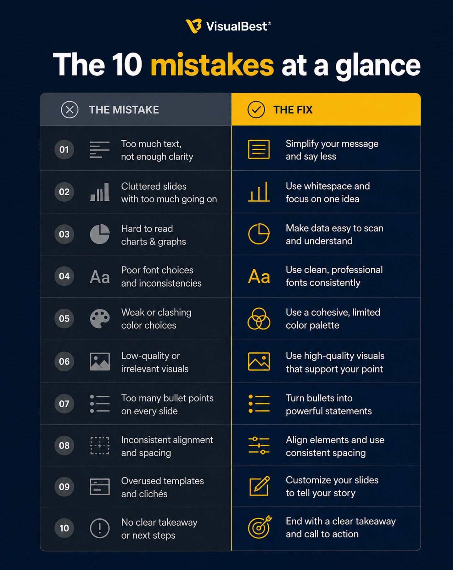
Walls of text, chart junk, default clutter, gratuitous motion — every mistake spends the audience’s limited cognitive budget on something other than your message. Every fix gives that attention back. That’s the whole discipline. Professional design isn’t about making slides prettier; it’s about removing everything that stands between your point and the person you need to convince.

A 60-second self-audit
Open your most important deck and ask:
🔸 Can I read each slide in three seconds with the sound off?
🔸 Does every title state a point, not just a topic?
🔸 Are my fonts, colours, and charts consistent from slide 1 to the last?
🔸 Does each chart make one clear point, with the conclusion in the title?
🔸 Would someone who wasn’t in the room understand it?
🔸 Can the person in the back row actually read it?
Every “no” is a mistake from this list, quietly costing you credibility. The good news: every one is fixable.
Related reading
- 📖 Best Corporate Presentation Design Examples in 2026 — what great decks do right, with real examples you can study.
- 📖 Presentation Design Cost in India (2026 Guide) — what fixing these mistakes professionally actually costs.
- 📖 Best Presentation Design Agencies in India (2026 Guide) — who to call when the deck has to win something.
Frequently Asked Questions
1. What is the most common presentation design mistake?
The biggest mistake is text-heavy slides. When audiences read and listen at the same time, comprehension drops. Strong slides use a clear headline, minimal text, and supporting visuals — not paragraphs.
2. How do I know if my presentation looks unprofessional?
Check for inconsistency, clutter, weak titles, unreadable charts, and slides that take too long to understand. If a slide can’t communicate its point within a few seconds, it likely needs simplification.
3. Why does presentation design affect professionalism?
People judge business quality through presentation quality. Messy slides signal disorganisation, while clean, consistent design builds trust, clarity, and confidence.
4. Should slides have a lot of text?
No. Dense slides overload attention and reduce retention. The best slides communicate one idea quickly, using short headlines and visuals instead of long paragraphs.
5. Can I fix these mistakes myself?
Yes — many issues like reducing text, improving consistency, and simplifying layouts are fixable internally. For high-stakes decks, professional design can significantly improve clarity and impact.
6. What presentation design trends matter in 2026?
The strongest trends focus on clarity: bold typography, cleaner layouts, better storytelling, accessible design, and AI-assisted workflows. The real differentiator is still strong narrative thinking.