Presentation Design
Presentation Design Trends in 2026: What to Adopt, What to Avoid, and What’s Already Outdated
Most “2026 presentation trends” lists are written to sell you templates. They tell you what’s new. They never tell you what’s over — because “stop doing this” doesn’t come with an upsell.
But for a corporate team, knowing what to abandon matters more than knowing what to adopt. The slide style that looked sharp in 2022 is the one quietly dating your brand in front of a board today. The trend you rushed to adopt last year might be the one making your presentation look like it’s trying too hard.
This isn’t a list of shiny things to add. It’s a verdict on each major 2026 trend — adopt, adapt, or avoid — through one filter that template shops never apply: does this actually serve a corporate, enterprise, or boardroom audience? Because a trend that’s perfect for a startup launch deck can be exactly wrong for a listed-company investor update.
If you want to see what the current corporate design looks like, our Best Corporate Presentation Design Examples in 2026 guide is the visual companion to this one. This post is about what to do with all of it.

First: what’s already outdated
Start here, because this is the part nobody publishes. These are the choices that no longer read as “professional” in 2026 — and several of them looked perfectly fine eighteen months ago. If your standard template still leans on these, it’s working against you.
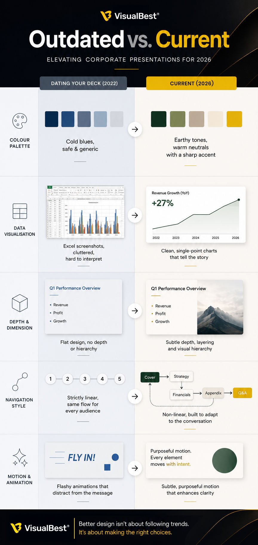
🔸 Cold corporate blue as a default. The era of the safe navy-and-grey corporate deck is closing. In 2026 the palette has shifted toward earthier, more considered tones — deep greens, warm neutrals, terracotta — with a single sharp accent reserved for the number that matters. Default blue doesn’t look trustworthy anymore; it looks like you didn’t choose.
🔸 The Excel screenshot. Pasting a copied spreadsheet graph onto a slide is now openly called a “presentation crime.” It signals that no one did the work of deciding what the data means. (More on the fix below — it’s the single highest-leverage upgrade available this year.)
🔸 Flat design everywhere. The flat, shadowless aesthetic that dominated the last decade is giving way to subtle depth — soft shadows, layering, and texture used to guide the eye. Pure flatness now reads as dated rather than clean.
🔸 The purely linear deck. Slide 1 → 2 → 3, every time, no matter the room. Increasingly, strong presenters build decks they can navigate non-linearly — jumping to the section a specific question demands. A rigidly linear deck signals a presenter who can’t adapt to the room.
🔸 Animation for its own sake. Easier-than-ever motion tools have made over-animation one of the most common risks of 2026. Flying text and spinning transitions don’t read as modern; they read as amateur. (Verdict section below.)
The 2026 trends, with a verdict on each
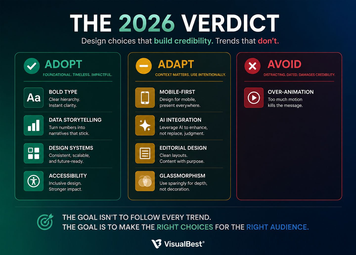
Now the trends themselves — but not as a wishlist. Each gets a verdict for corporate use: adopt (do this), adapt (useful, with a caveat), or avoid (skip it, or it’ll backfire).
1. Bold typography-led slides — ADOPT
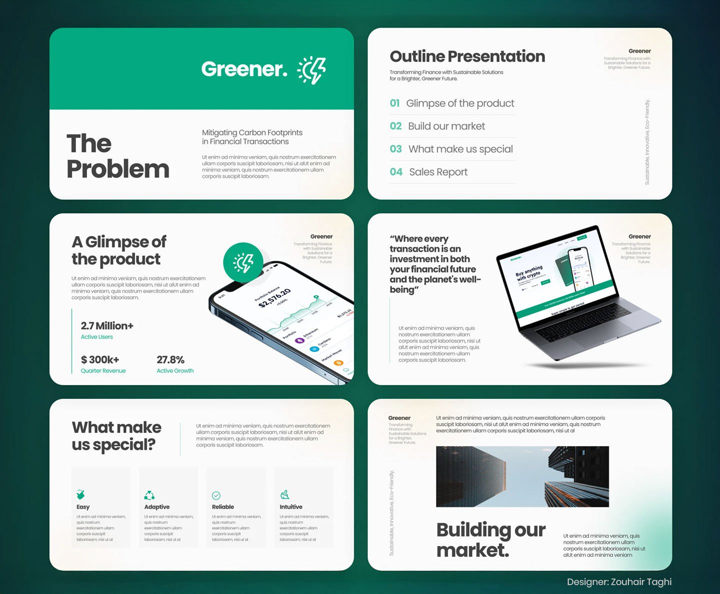
Large, expressive type as the main visual element rather than decoration is one of the defining looks of 2026, and demand for it has spiked sharply. For corporate decks it’s a genuine upgrade: a bold headline that fills the slide scans instantly, reads from the back row, and survives being viewed on a phone.
The corporate caveat: “bold” doesn’t mean “loud.” A listed-company board deck can use large, confident typography without shouting. Scale the type up; keep the tone measured. Adopt it — it’s clarity, not gimmickry.
2. Data storytelling over data dumping — ADOPT (without exception)
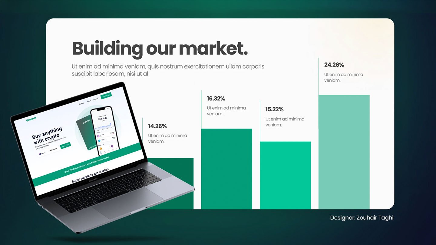
If you change one thing this year, change this. The shift from visualising data (here are the numbers) to narrating data (here’s what the numbers mean) is the clearest line between an amateur and an expert deck in 2026. Clean, single-point charts — with the conclusion stated in the title and only the relevant figure highlighted — replace the cluttered multi-series chart and the spreadsheet screenshot.
For corporate audiences this matters more than for anyone, because boards and investors are drowning in data and starving for meaning. The deck that tells them what the number means wins the room.
3. Mobile / vertical-first layouts — ADAPT
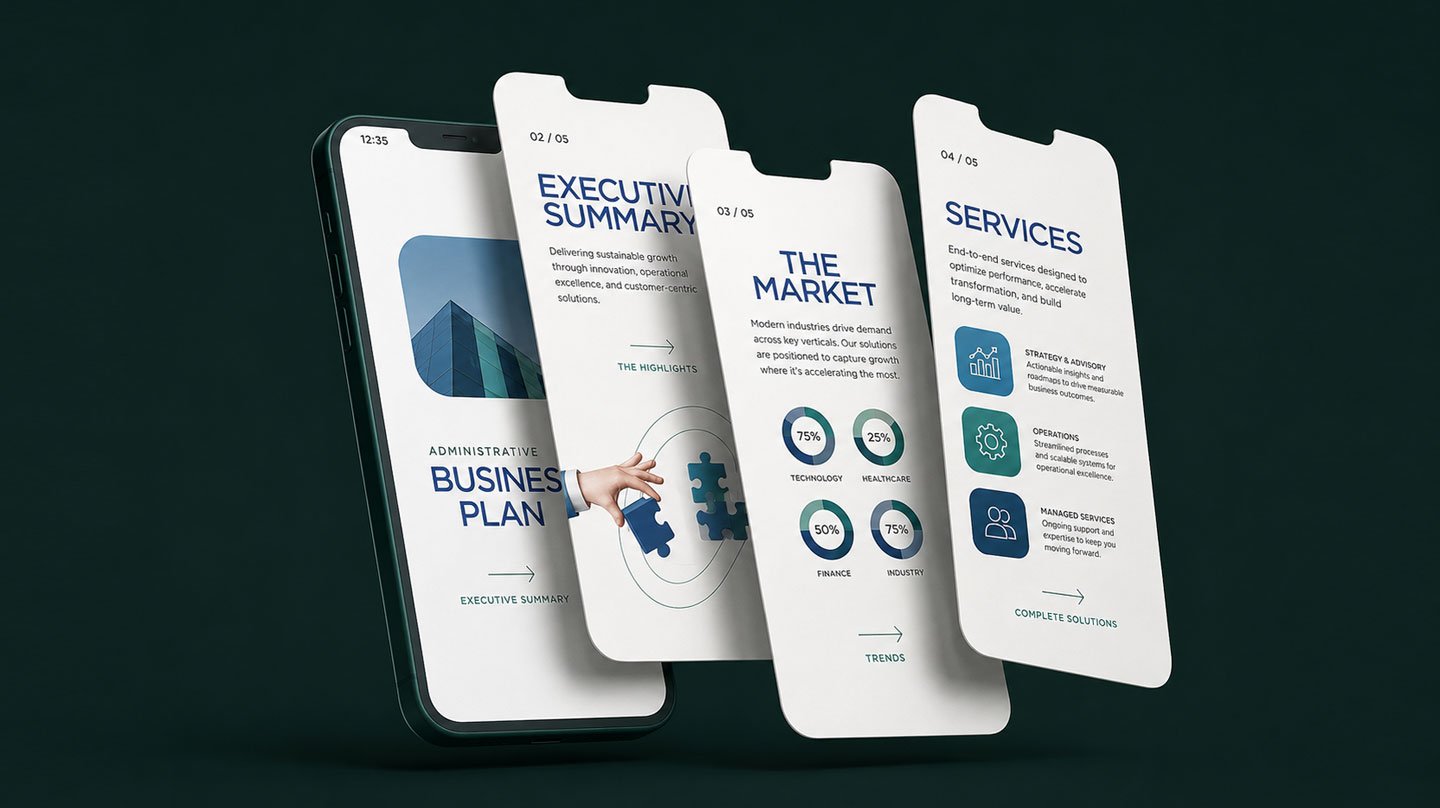
The “vertical slide” (9:16) is reportedly the fastest-growing format category of 2026, driven by executives reading on phones. The underlying truth is real: your deck will be read on mobile, and tiny text on a shrunk-down widescreen slide is a genuine failure.
The corporate caveat — why adapt, not adopt wholesale: most corporate decks still need to work in a boardroom, on a projector, and in a 16:9 leave-behind. Going fully vertical solves mobile and breaks everything else. The right move is designing 16:9 decks that survive mobile — large type, high contrast, generous spacing — and building dedicated vertical versions only where the deck is genuinely mobile-first (social, certain investor sends). Don’t abandon widescreen; make it mobile-resilient.
4. Design systems and “presentations as brand assets” — ADOPT
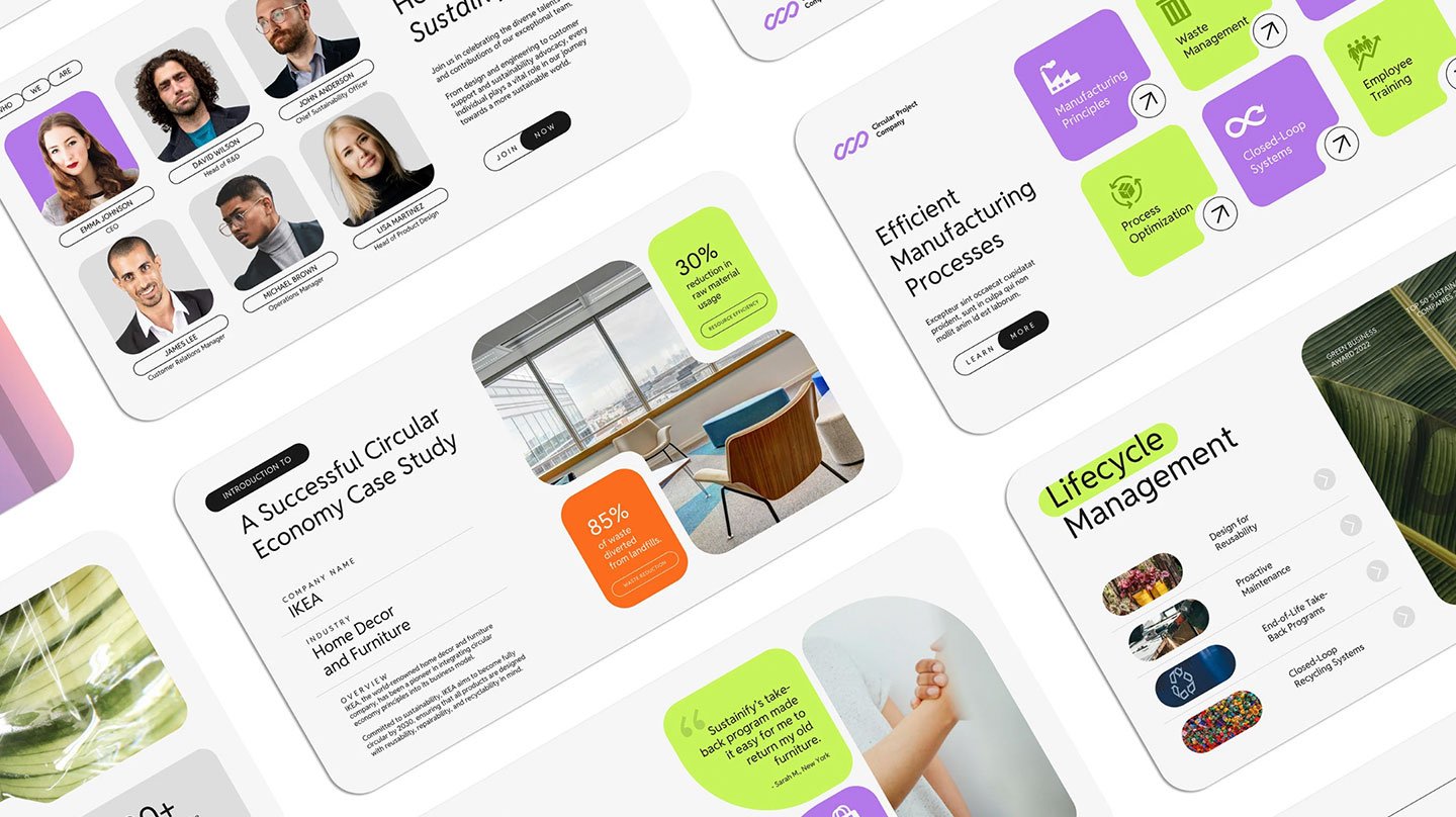
This is the most important trend for corporate teams specifically, and the least flashy. In 2026, presentations are increasingly treated as managed brand assets rather than disposable files — with standardised layouts, fonts, colours, and components that keep every deck on-brand across a distributed team. It’s especially dominant in corporate, SaaS, and enterprise environments.
For a company where dozens of people make decks, this is the difference between a coherent brand and chaos. A locked design system means the deck a regional sales lead builds looks like it came from the same company as the one the CMO presents to the board. Adopt it — and if you only have budget for one investment this year, make it your master template system.
5. Accessibility-first design — ADOPT
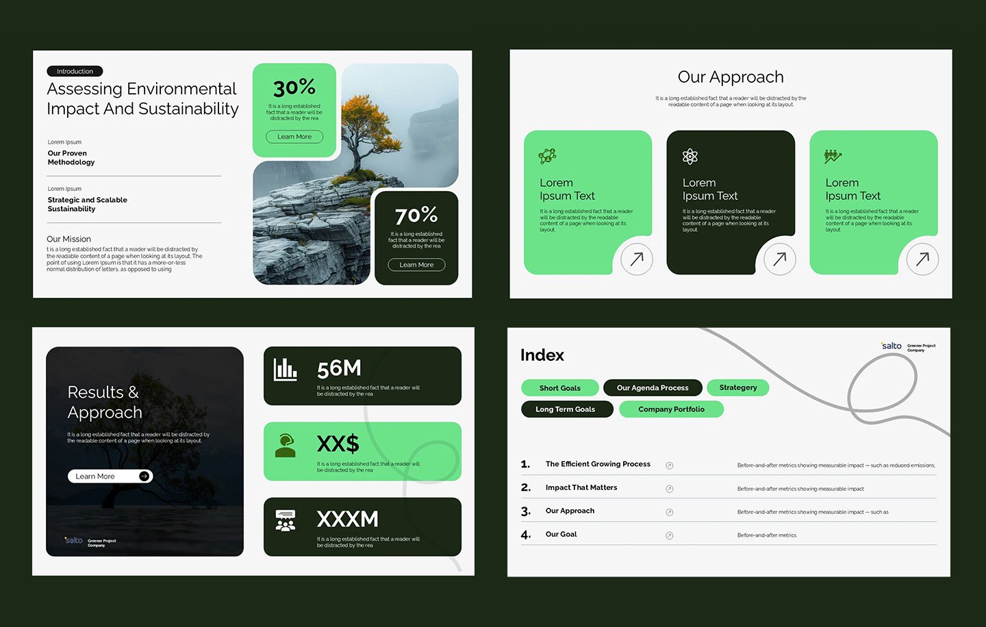
Clear hierarchy, generous type sizing, and strong contrast are increasingly treated as baseline principles rather than nice-to-haves, partly driven by tightening accessibility regulation. The quiet bonus: accessible design is clearer design for everyone, not just users with disabilities. There’s no downside and a compliance upside. Adopt it.
6. AI-assisted creation — ADAPT
AI now handles the skeleton — layouts, structure, first drafts — and the newest tools build brand and hierarchy rules directly into generation, shrinking cleanup and review cycles. For corporate teams producing volume, this is a real efficiency gain.
The corporate caveat: AI gives you the scaffold, not the argument. AI-generated decks still tend toward generic phrasing, irrelevant imagery, and an absence of narrative judgement — exactly the qualities a high-stakes deck can’t afford. Use AI to accelerate structure and formatting; keep the narrative, the emphasis, and the “so what” human. Adapt it as a tool, not an author.
Also Read: AI vs human creativity in design
7. Editorial / print-inspired aesthetics — ADAPT
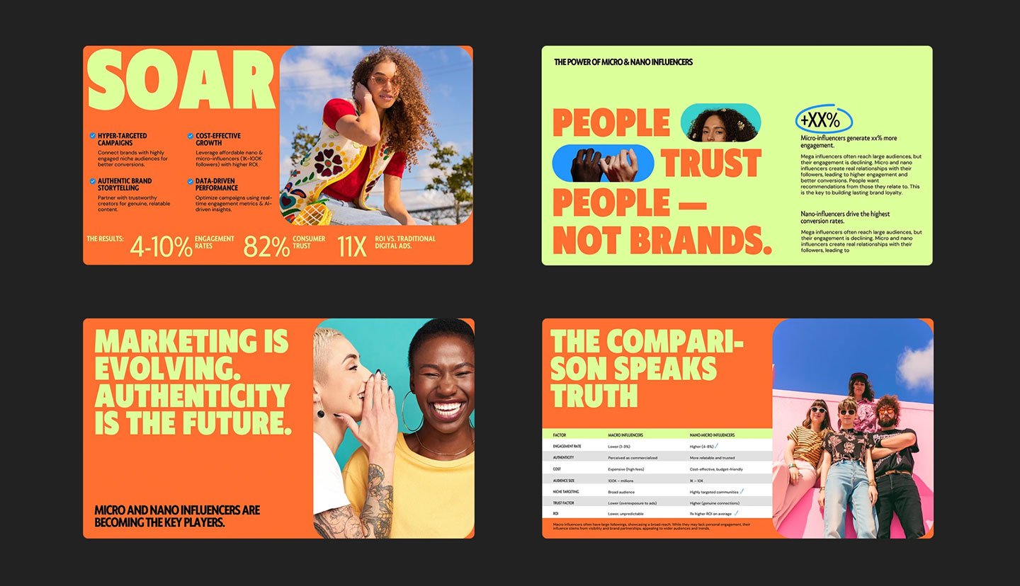
A rising 2026 look borrows from magazine and editorial design: wide margins, refined serif fonts, asymmetrical grids, strong photo hierarchy, pull quotes. Used well, it gives a deck a sophisticated, considered feel.
The corporate caveat: it’s a strong fit for brand decks, vision documents, and credentials presentations — and a weaker fit for dense operational or financial decks where structure matters more than editorial flair. Adapt it where the deck’s job is impression; skip it where the job is information.
8. Glassmorphism, bento grids, depth effects — ADAPT (sparingly)
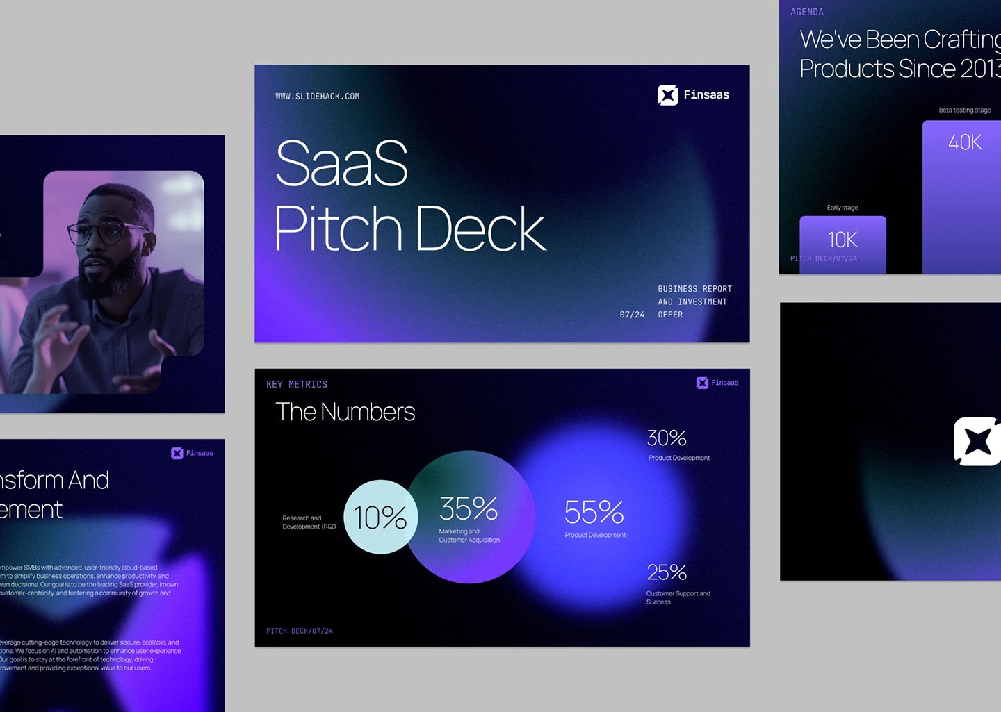
Frosted-glass panels, compartmentalised “bento” layouts, and subtle depth are prominent in 2026 and can genuinely help — guiding the eye, establishing hierarchy, showing where you are in a flow. Used judiciously (a couple of elements per deck), they add polish.
The corporate caveat: these are seasoning, not the meal. A glassmorphism panel on a slide that needed one clear sentence is decoration masquerading as design. Adapt them as accents; never let them lead.
9. Over-animation and flashy transitions — AVOID
The one clear “avoid.” Motion tools are easier than ever in 2026, which is exactly why over-animation is a rising amateur tell. Animation should reveal a process, direct attention, or show change over time — and otherwise disappear. For corporate audiences, restraint reads as confidence. A clean cut between slides beats any transition effect.
The filter that matters more than any trend
Here’s the thing every trend list buries: the trend itself is almost never the point. The point is whether it fits your brand, your audience, and your context.
A bold-maximalist treatment is right for a product launch and wrong for a sombre quarterly financial report. A retro-tech aesthetic is fun for a gaming startup and disqualifying for a medical or BFSI pitch. The most expensive presentation design mistake in 2026 isn’t ignoring a trend — it’s adopting one because it’s popular, in a context where it actively undermines you.
So before adopting anything from this list, run it through three questions:
🔸 Brand: does this fit how our company should look and sound?
🔸 Audience: will this help this specific audience absorb the message, or distract them?
🔸 Context: does the occasion — board meeting, pitch deck vs sales deck vs corporate deck, keynote, investor update — call for this, or fight it?
If a trend fails any of the three, discard it. Trends are seasoning. Your message is the meal.
How to introduce a trend without breaking your brand system
A practical note, because this is where teams actually get stuck. You can’t just bolt a 2026 trend onto a presentation design the night before a board meeting — and you shouldn’t.
The right sequence:
- Change the master template, not the individual deck. Update your locked system once — palette, type, chart styles — so every future deck inherits the change consistently. One-off updates create exactly the inconsistency that signals amateur.
- Introduce one change at a time. Refresh the palette this quarter, the data-chart style next. A deck that adopts five trends at once looks like it’s trying too hard. Evolution reads as confident; reinvention reads as panic.
- Test it on the hardest audience first. If a refreshed style holds up in front of your board or your most conservative client, it’ll hold up anywhere. If it makes them blink, you’ve learned something cheaply.
- Keep a “do not touch” list. Some elements — your logo treatment, your core brand colour, your signature chart format — are recognition assets, not trend candidates. Decide what’s off-limits before you start.
Frequently asked questions
1. What are the biggest presentation design trends in 2026?
The strongest trends in 2026 are bold typography, data storytelling, presentation design systems, and accessibility-first layouts. Mobile-first formats, AI-assisted creation, editorial aesthetics, and glassmorphism should be used selectively. Over-animation is the one clear trend to avoid. The bigger shift: decks now need to work without a presenter.
2. What presentation design styles are outdated in 2026?
Cold corporate blue palettes, Excel screenshot charts, overly flat design, rigid linear decks, and decorative animation now make presentations feel dated. If your master template still relies on these, it may be quietly hurting credibility.
3. Should corporate presentations use vertical (9:16) slides in 2026?
Sometimes — but not as the primary format for most corporate decks. Executives increasingly read slides on phones, but boardrooms still run on widescreen. The better approach is designing 16:9 decks that remain readable on mobile.
4. Is it worth following presentation design trends for corporate decks?
Yes — selectively. Ignoring trends completely can date your brand, while blindly following them can hurt clarity. The right approach is adopting trends that improve communication and ignoring ones that distract from the message.
5. How often should a company update its presentation template?
Most corporate teams should review and refresh their master template yearly. Design expectations evolve quickly, and outdated templates can quietly weaken brand perception.
6. Does using AI make presentations look unprofessional?
Not inherently. AI is useful for structure, layouts, and first drafts. The problem comes when teams rely on it entirely. Strong corporate decks still require human judgement, narrative clarity, and strategic thinking.
Related reading
- Best Corporate Presentation Design Examples in 2026 — the visual companion to this guide: what current corporate design actually looks like.
- 10 Presentation Design Mistakes That Make Companies Look Unprofessional — the timeless errors that no trend will fix.
- Presentation Design Cost in India (2026 Guide) — what modernising a corporate deck system actually costs.